Calm Sleep
A Plan for Tonight
Senior Product Designer
Calm’s first new product in over a decade. The content was there, but nearly three quarters of users never came back after day one. I replaced the library with a daily plan.
- iOS and Android
- 4 months, concept to global iOS launch, September 2025
The role.
Senior Product Designer, concept through launch
The team.
3 designers, 1 PM, 4 engineers. I partnered with the Principal Product Designer to architect and ship it, owning the plan surface, Sleep Readiness, and the onboarding-to-plan logic.
The timeline.
July 2025 to October 2025
The problem.
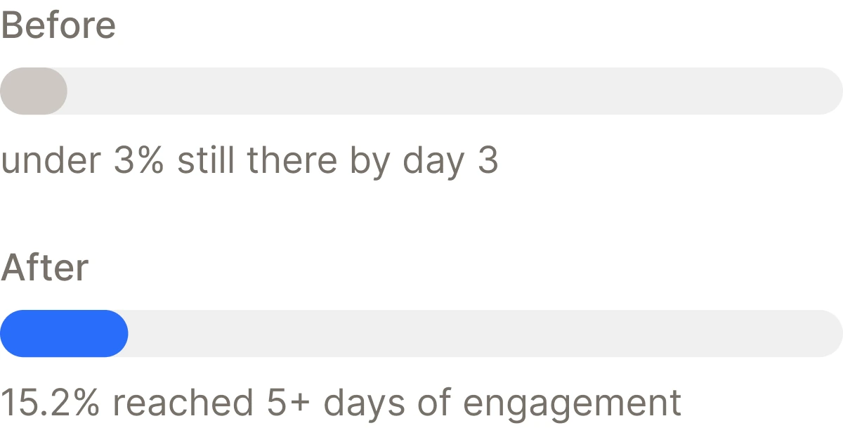
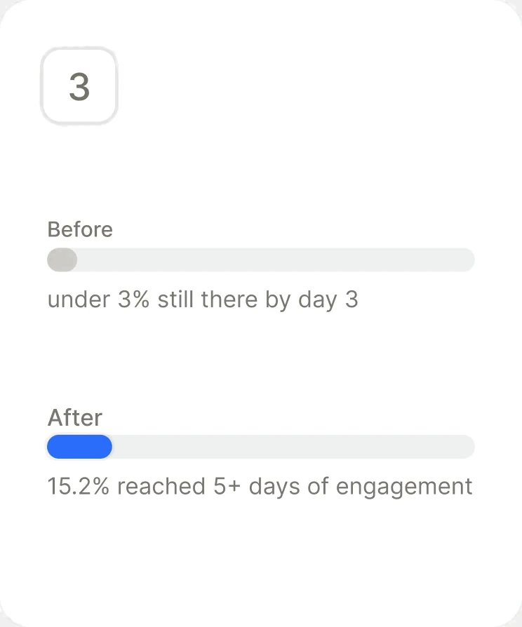
73–74% of users who opened Calm Sleep never came back after day one. Retention fell below 5% by day 1 and under 3% by day 3. The content was there. The entry point wasn't.
The bet.
Replace the content library with a daily plan built from each user's onboarding answers, and one score that makes progress visible.
What I did.
I helped map the 7 evidence-based sleep levers into the core of every plan item, then designed the plan and Sleep Readiness from start to finish alongside the principal designer. Testing reshaped priorities twice before launch, and I also built the design system that supported the product.
What happened
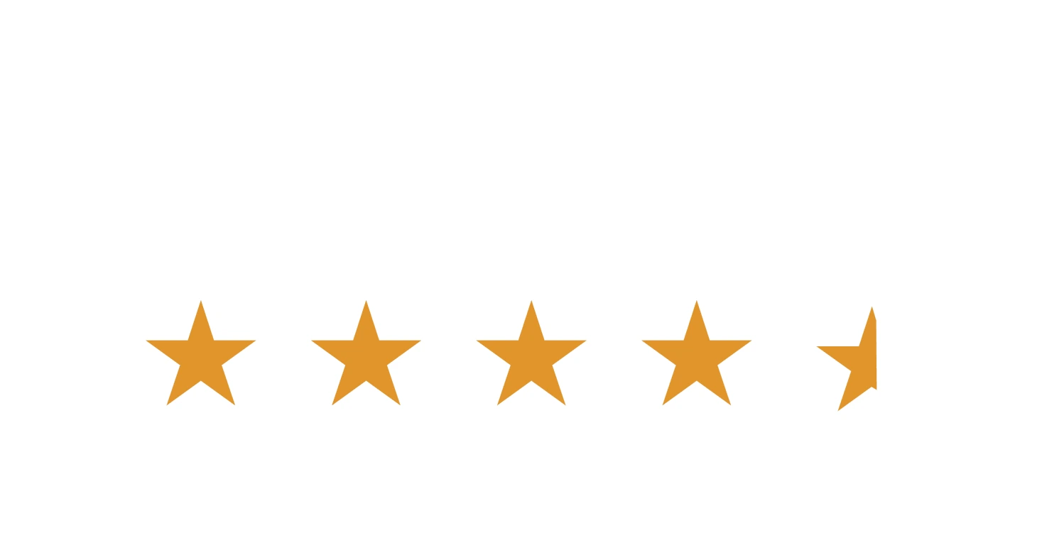
Calm’s first new product in 12 years launched on iOS in four months, with a 4.7 star rating and install-to-paid above target in both markets.
4.7 stars
App Store rating at launch
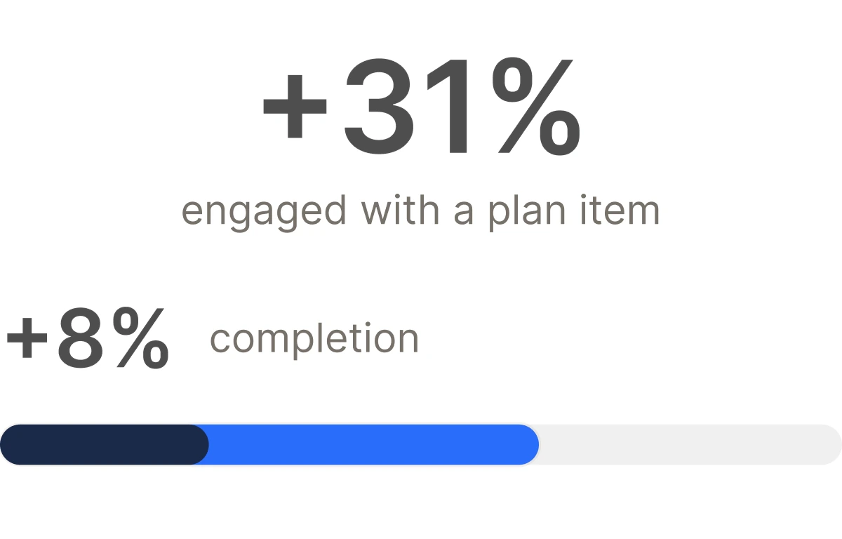
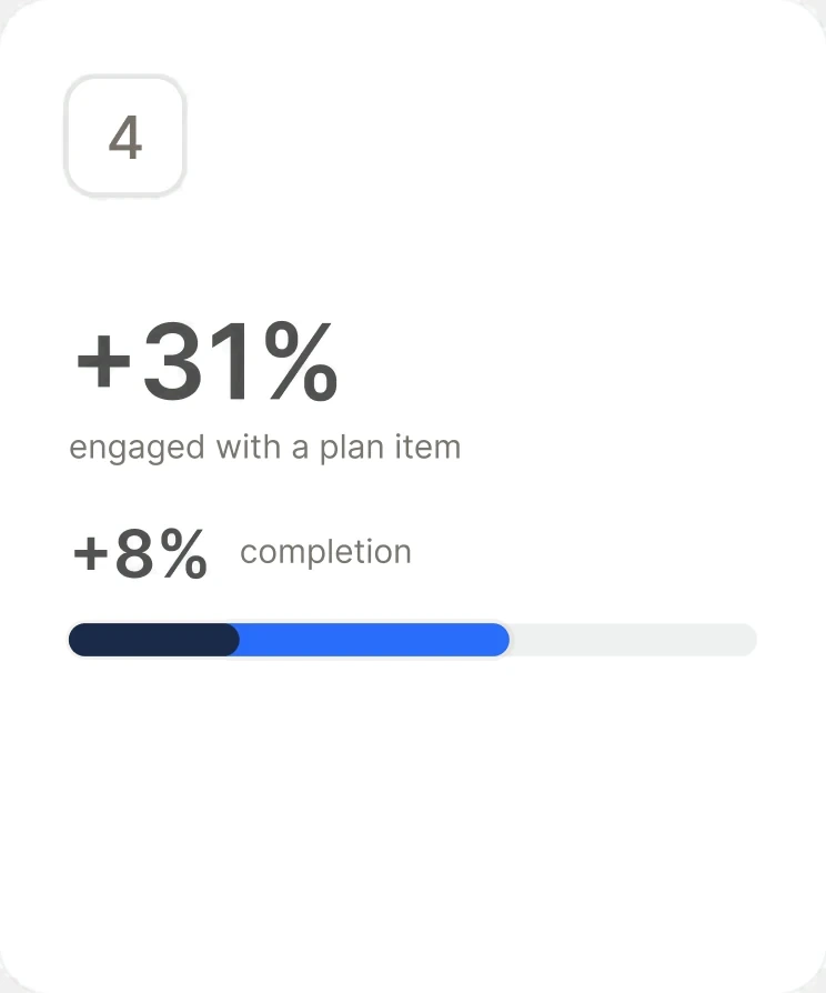
+31%
Users engaging with a plan item, with +8% completion
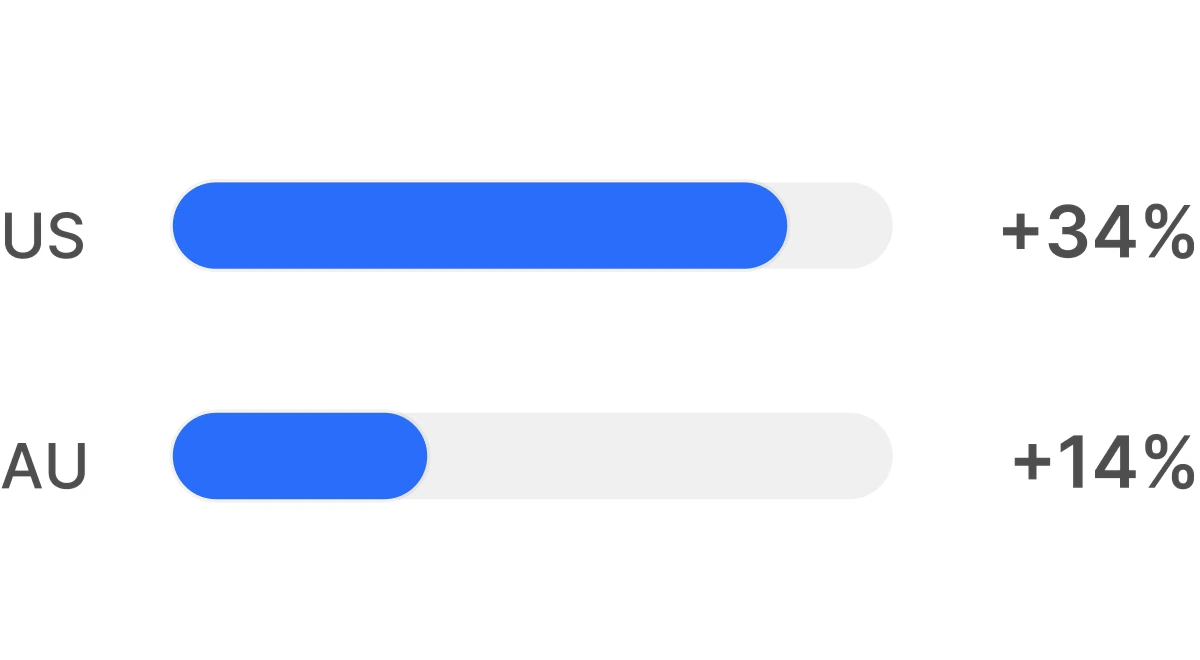
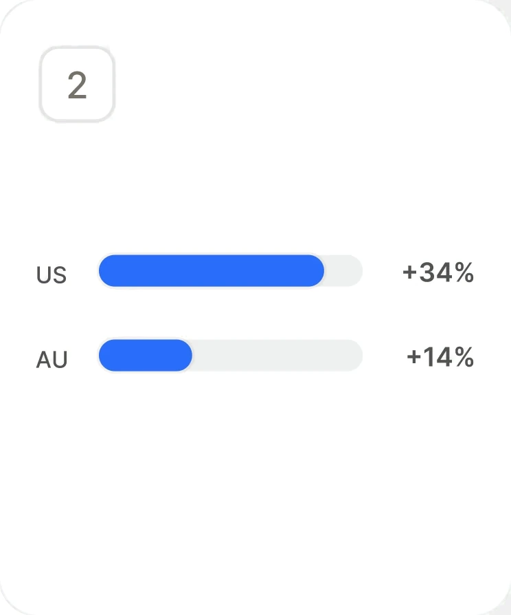
+34% / +14%
Install-to-paid against target, US and AU
“Eric became my design partner right away. Together we turned product requirements into fully fleshed-out concepts, shipping the product within months of his start. When I moved off the team, Eric took over Calm Sleep.”
Replaced the library with a plan
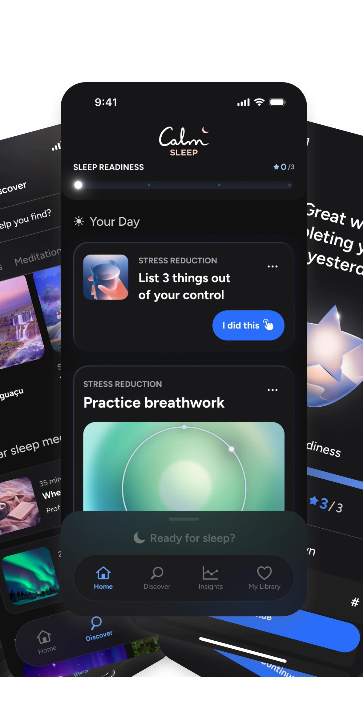
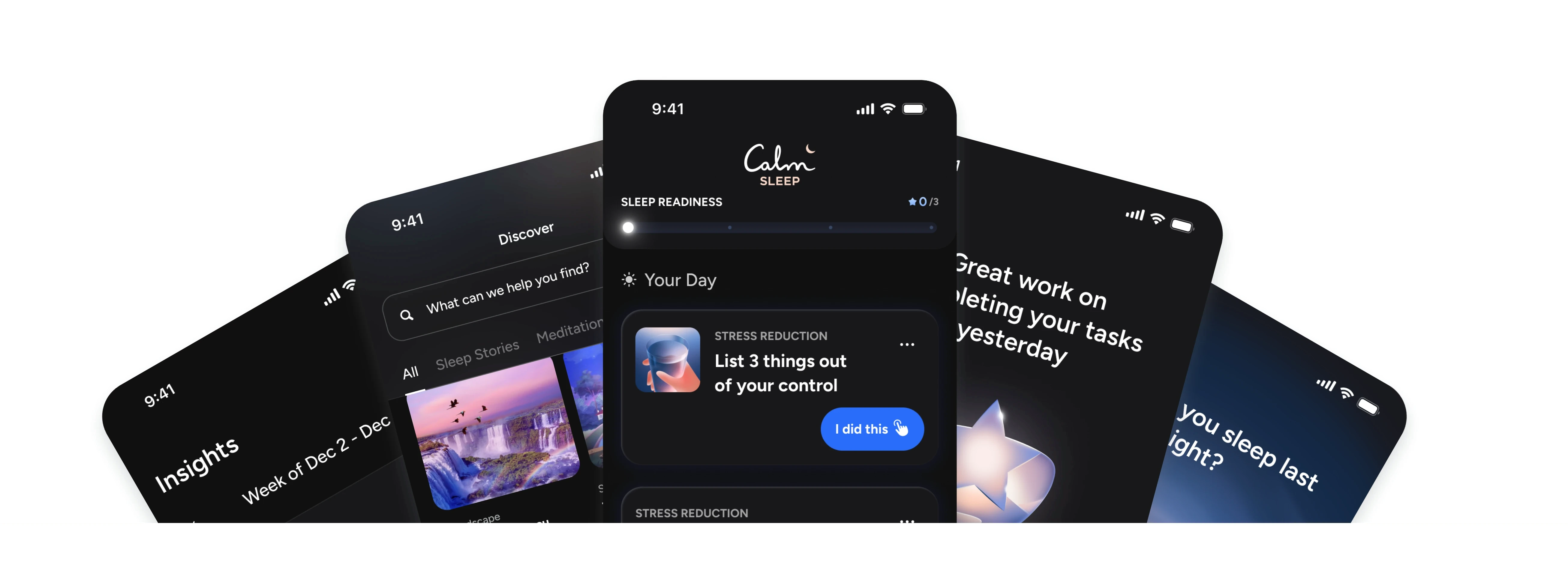
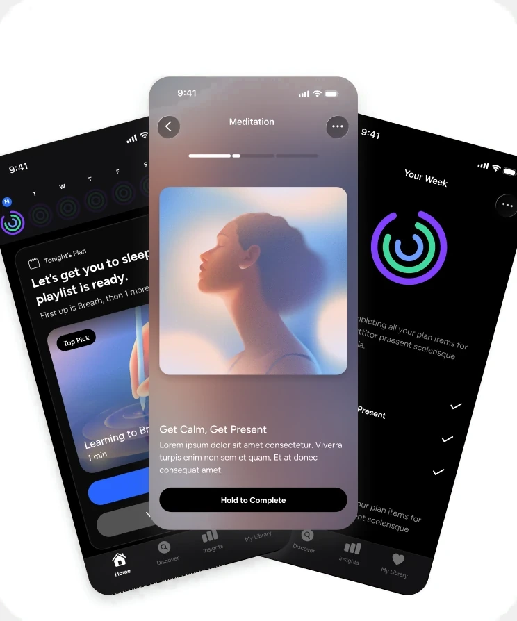
Calm Sleep had good content and no way in. Browsing assumes you know what you need, which at 11pm nobody does. I replaced the library with a daily plan: a curated set of tasks tied to each user's onboarding answers, with a Sleep Readiness score that made progress visible. Every plan item maps to one of the 7 evidence-based levers that actually move sleep quality, so the personalization is grounded in science rather than preference.
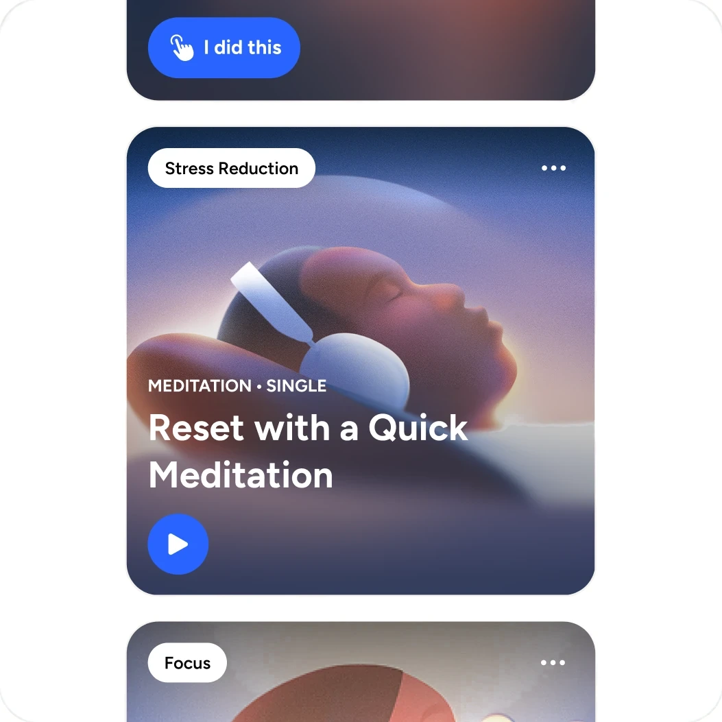
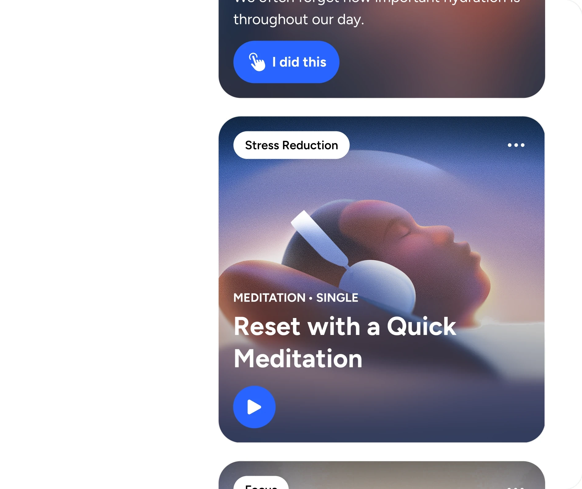
A plan for tonight, not a library to browse.
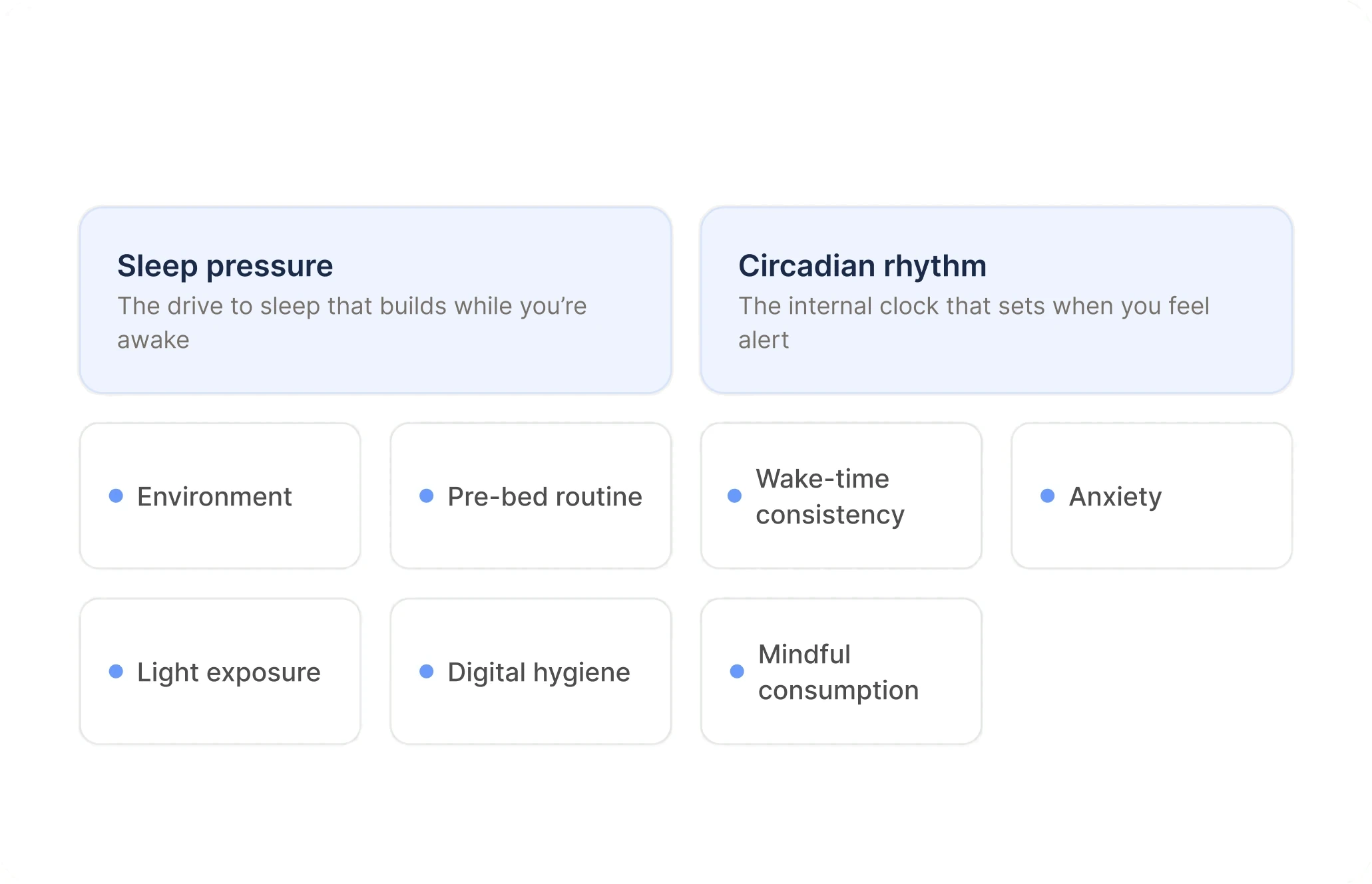
Seven levers, not seven categories
Sleep pressure, circadian rhythm, environment, pre-bed routine, wake-time consistency, anxiety, and light exposure became the backbone of every plan item.
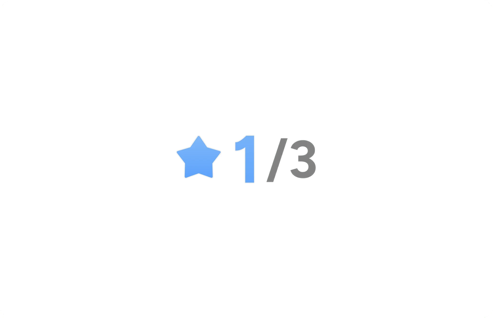
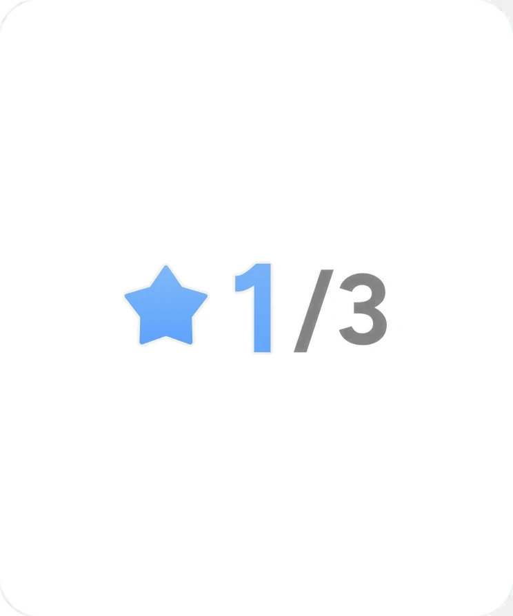
One number for progress
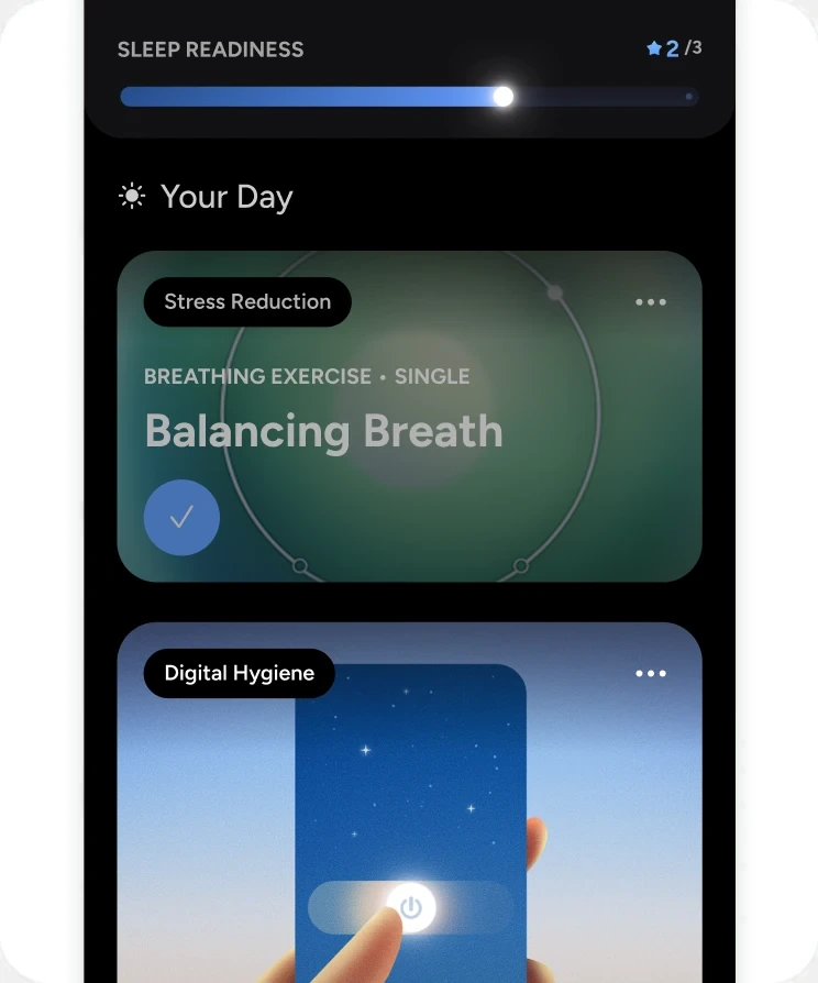
Sleep Readiness gives users a single measure that reflects last night, so progress is visible without reading a chart.
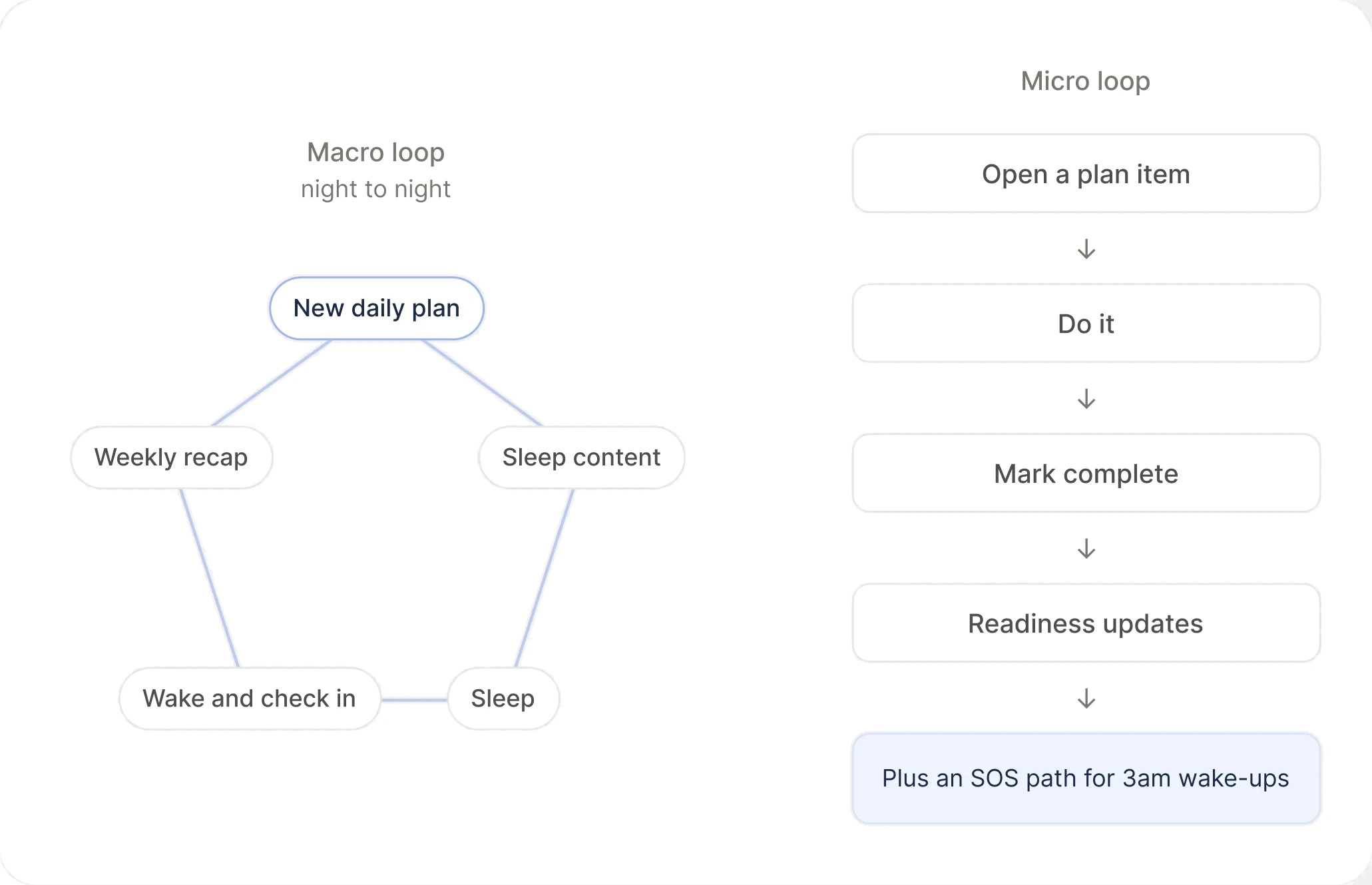
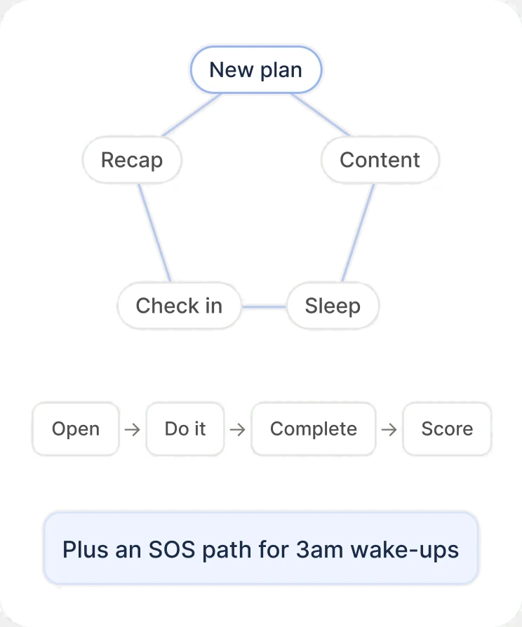
The habit loop underneath
A macro loop (plan, content, sleep, check-in, weekly recap) and a micro loop for finishing a single item.
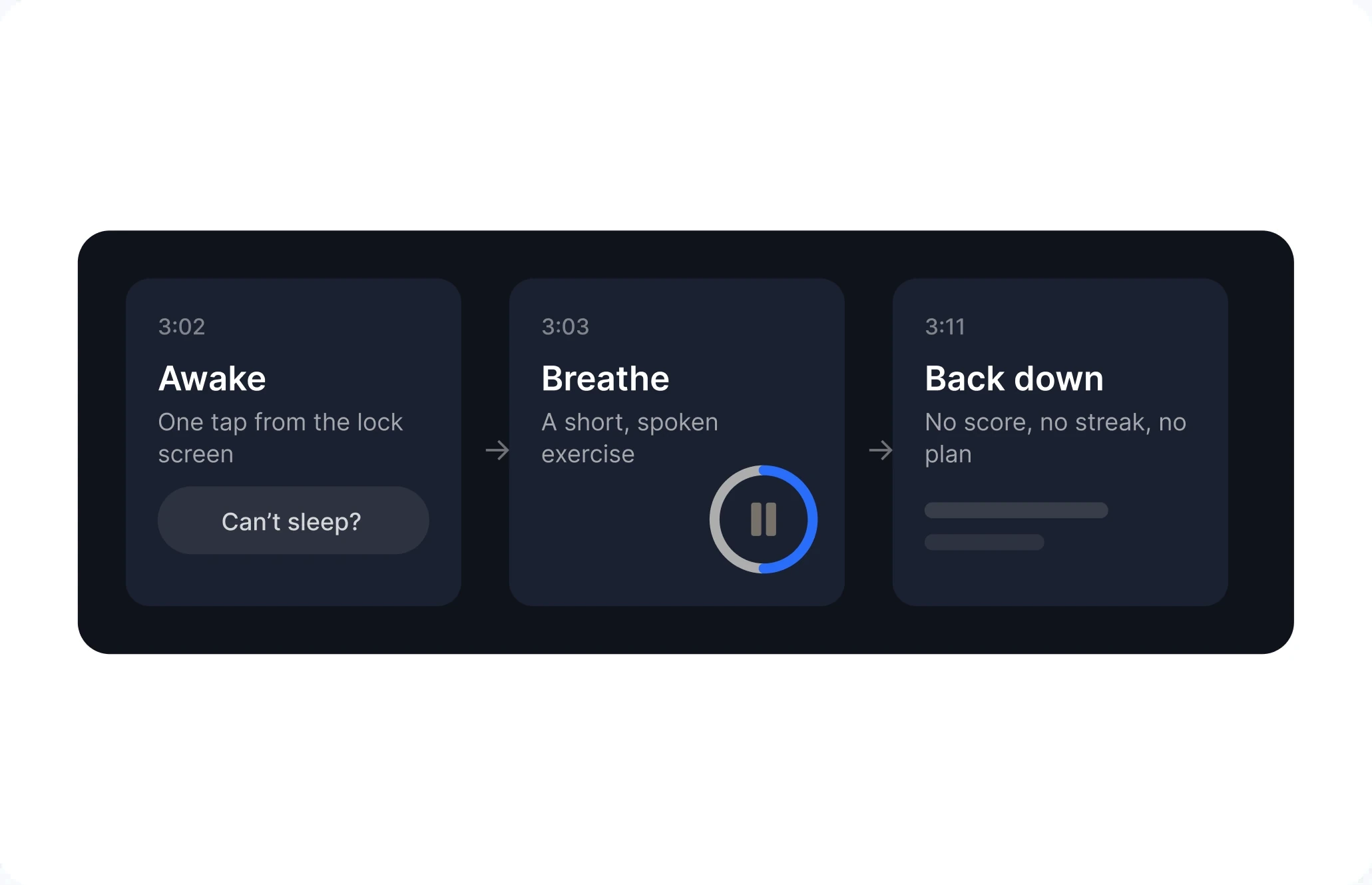
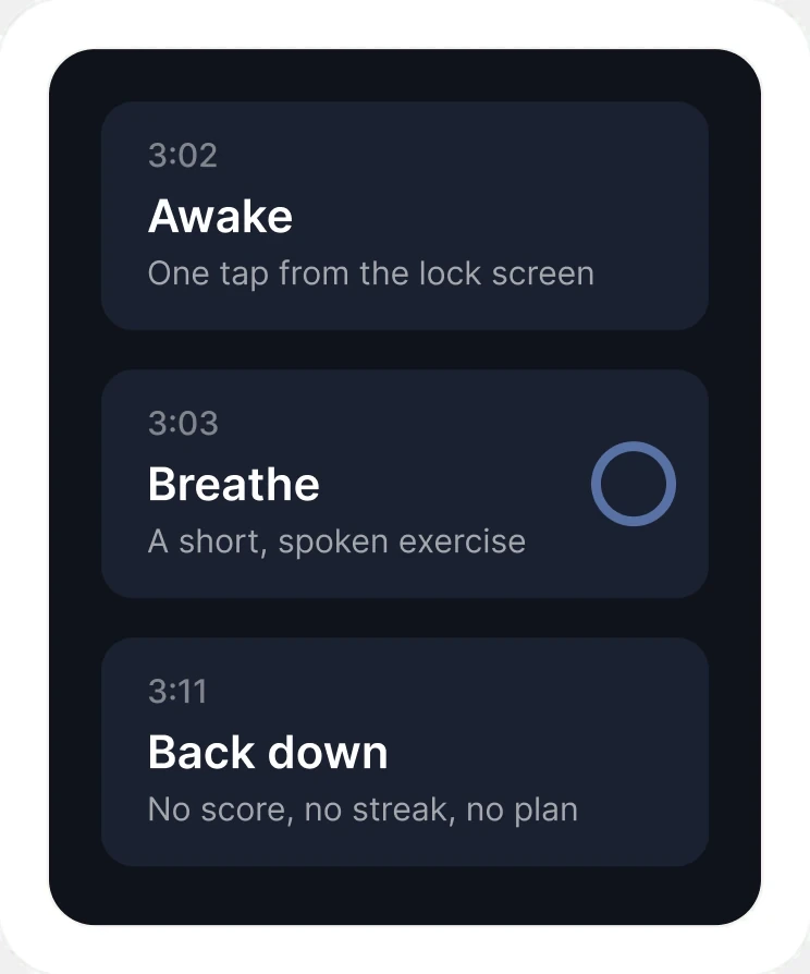
A path for 3am
A dedicated SOS flow for middle-of-the-night wake-ups, when the daily plan isn't what you need.
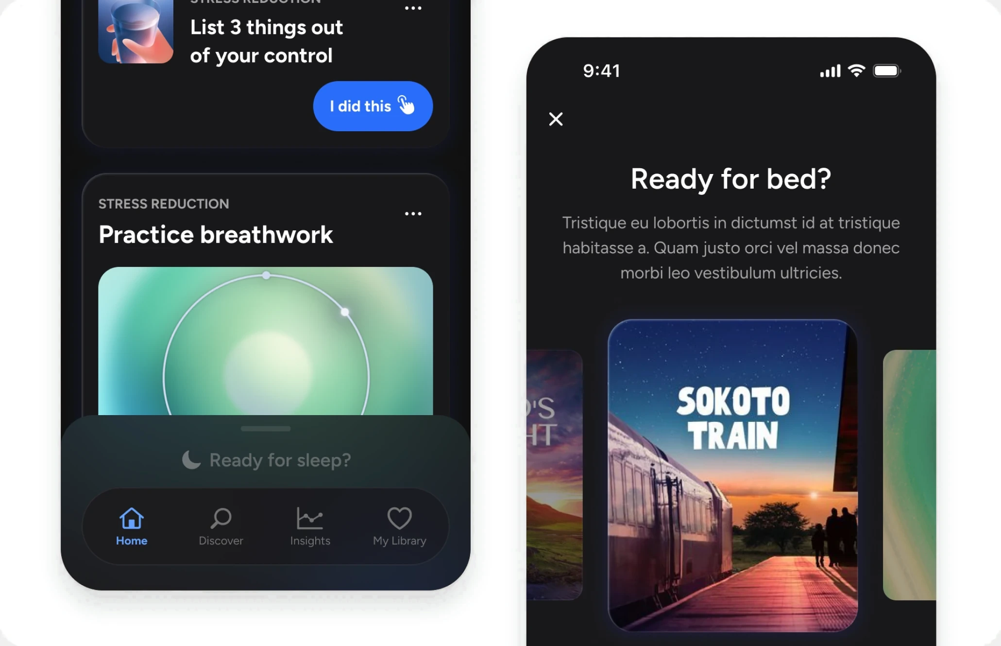
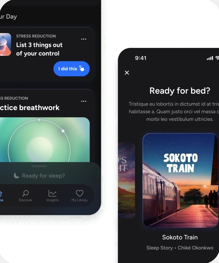
The Ready for bed sheet (SOS Flow)
How that dedicated SOS flow materialized. A single sheet the user can pull up from their Home screen.
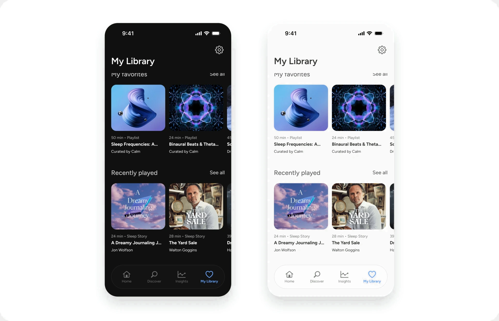
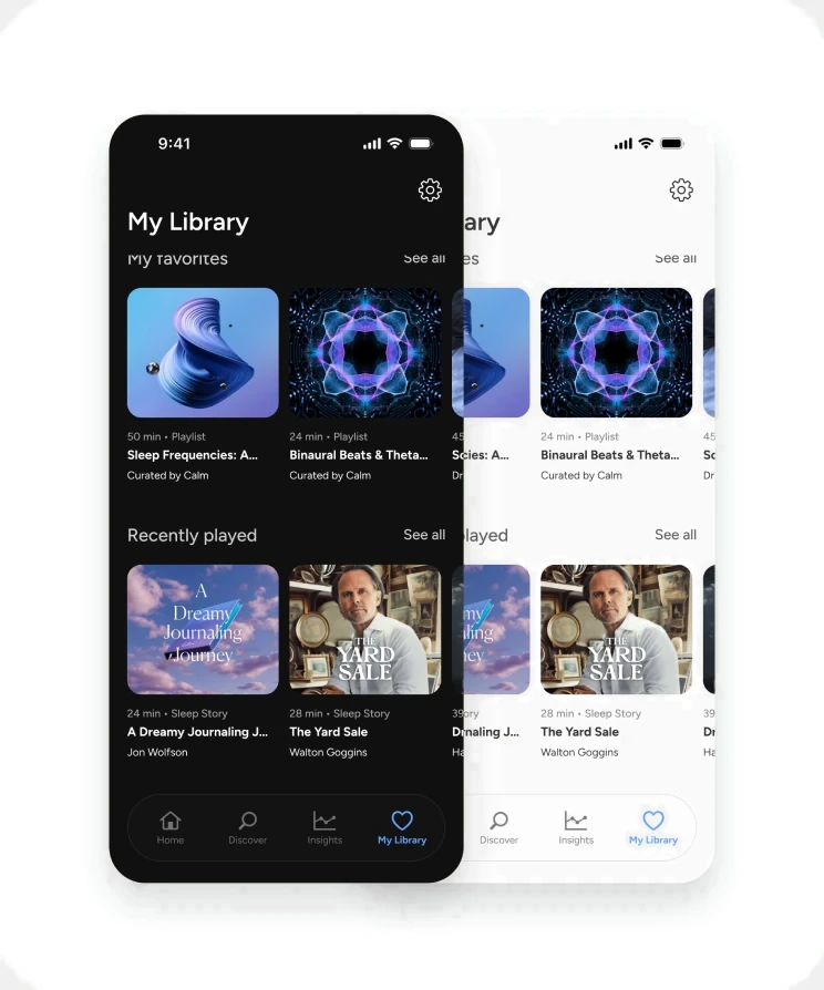
Day and night
The interface shifts treatment between daytime planning and nighttime use.
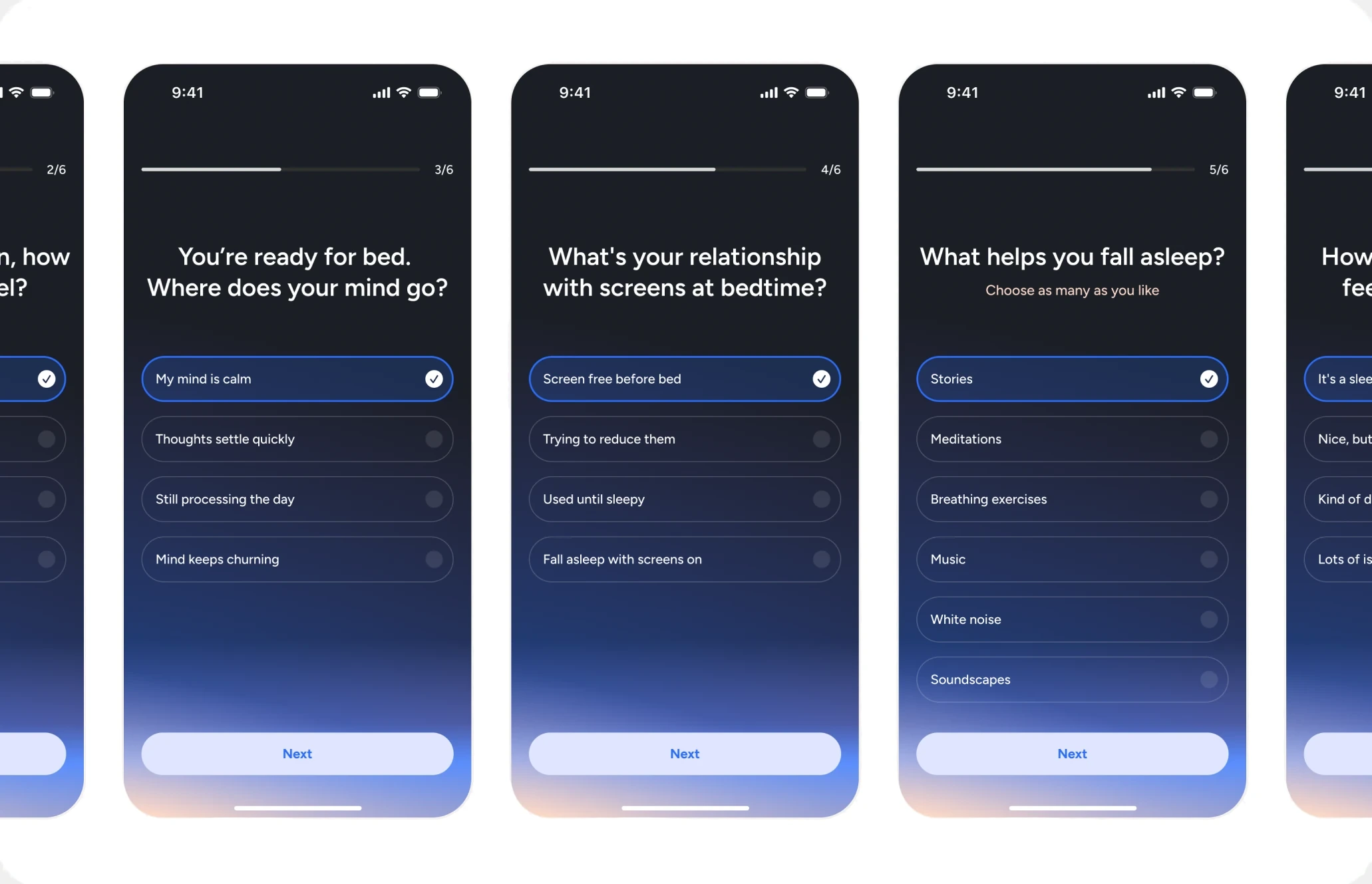
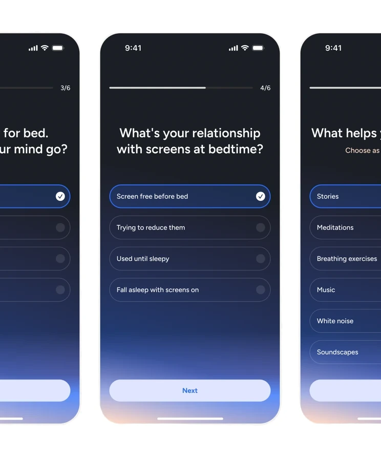
The questions that build the plan
Onboarding asks about the levers, not about preferences. Each answer maps to a lever, so the plan that comes out is built from what's actually keeping you up.
Made the mechanics legible before making them smarter
Early testing showed users understood what the plan was for but not how it worked. What counted toward Sleep Readiness wasn't clear. The tempting move was more personalization. I prioritized making the scoring logic immediately legible instead, because tuning a system users don't trust yet only compounds the problem.
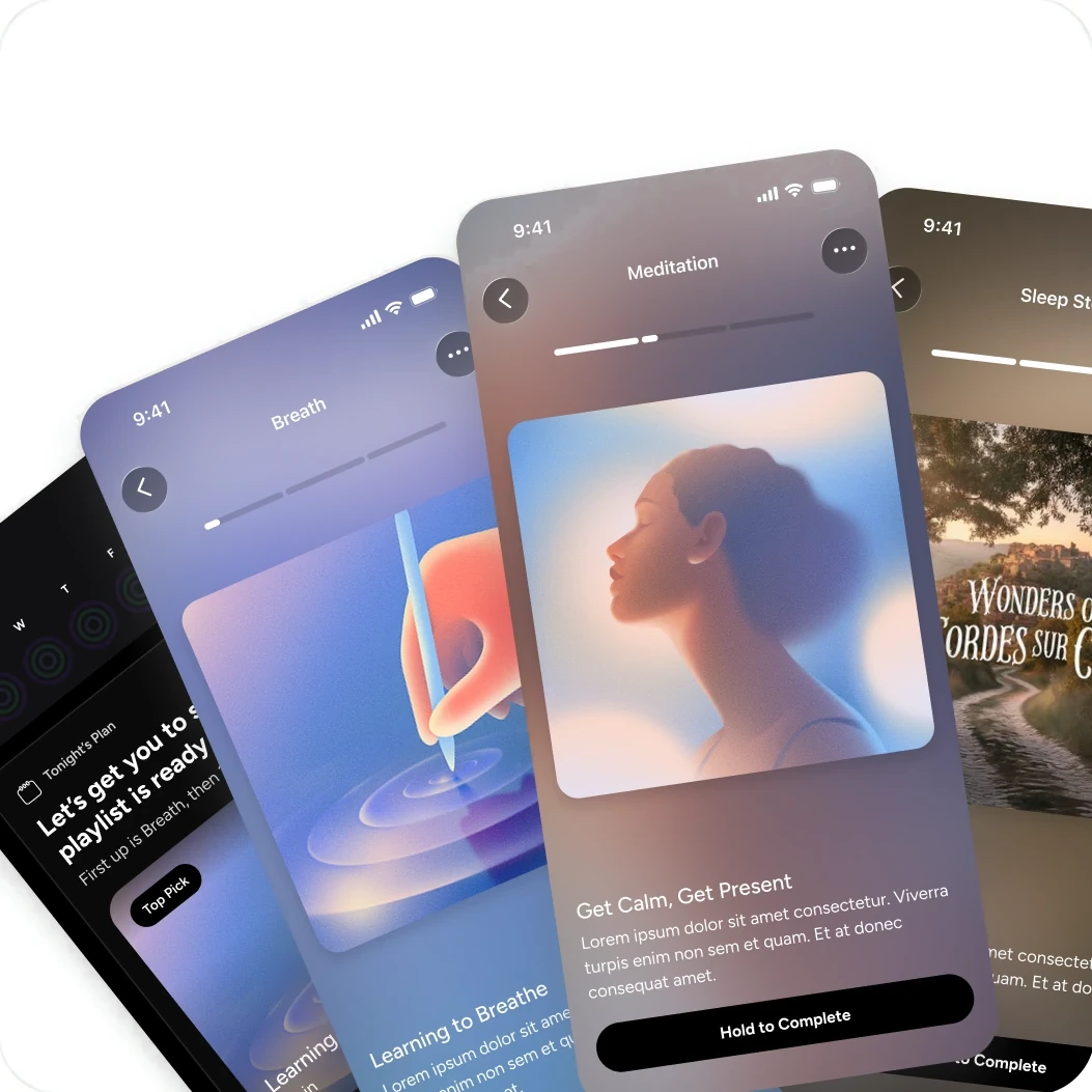
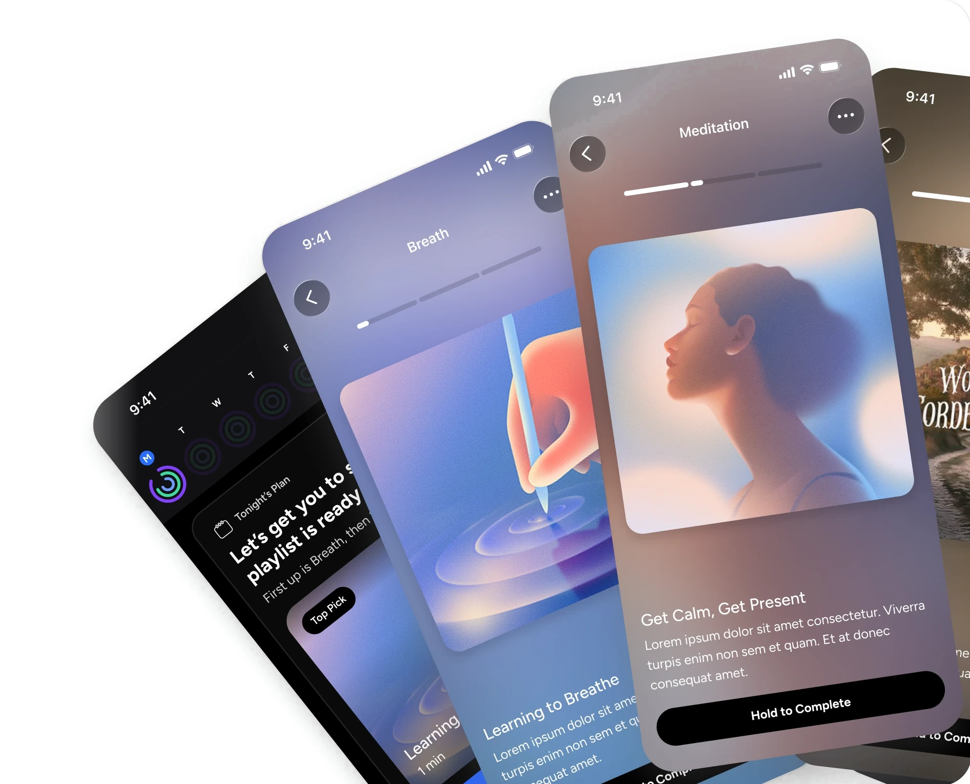
Before and after: what counts toward your score, made obvious.
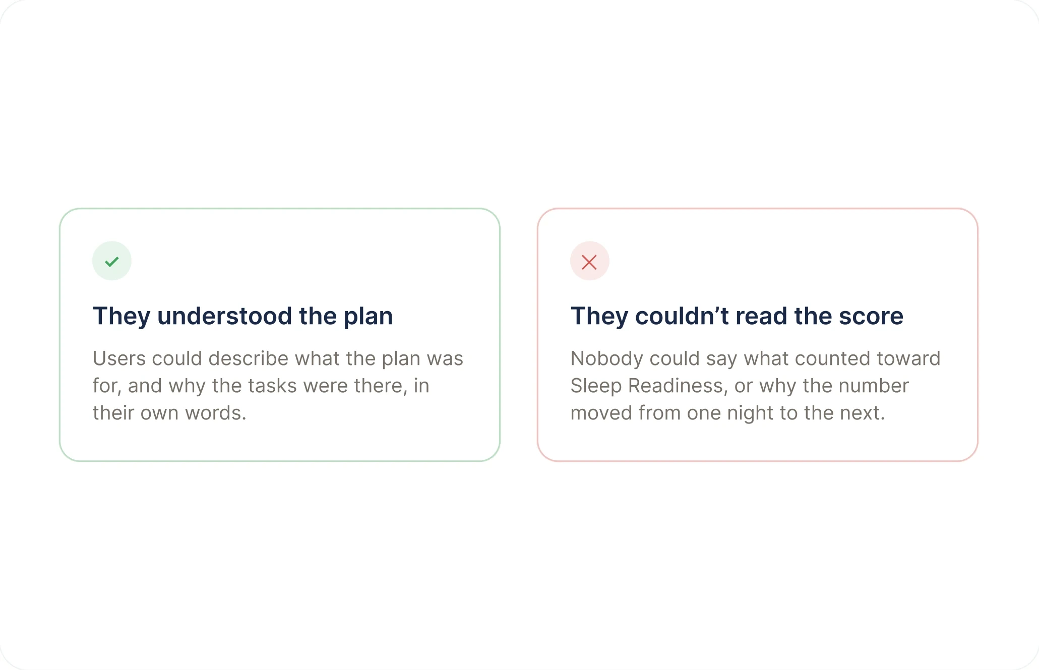
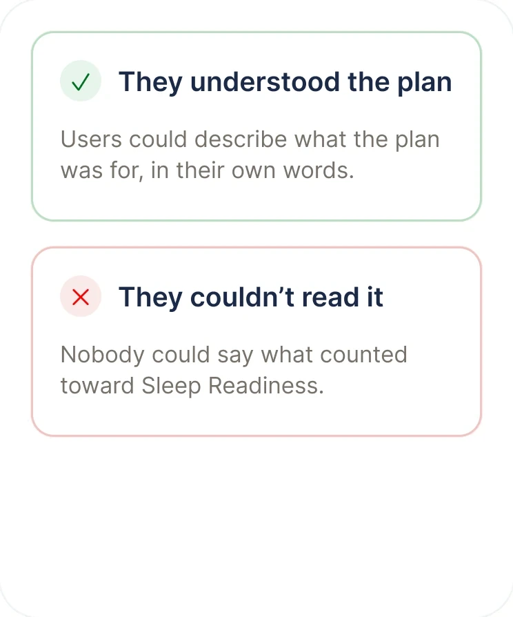
They understood the plan, not the score
Users could describe the plan's purpose in their own words, but not what counted toward Sleep Readiness. A score nobody can predict is a score nobody trusts.
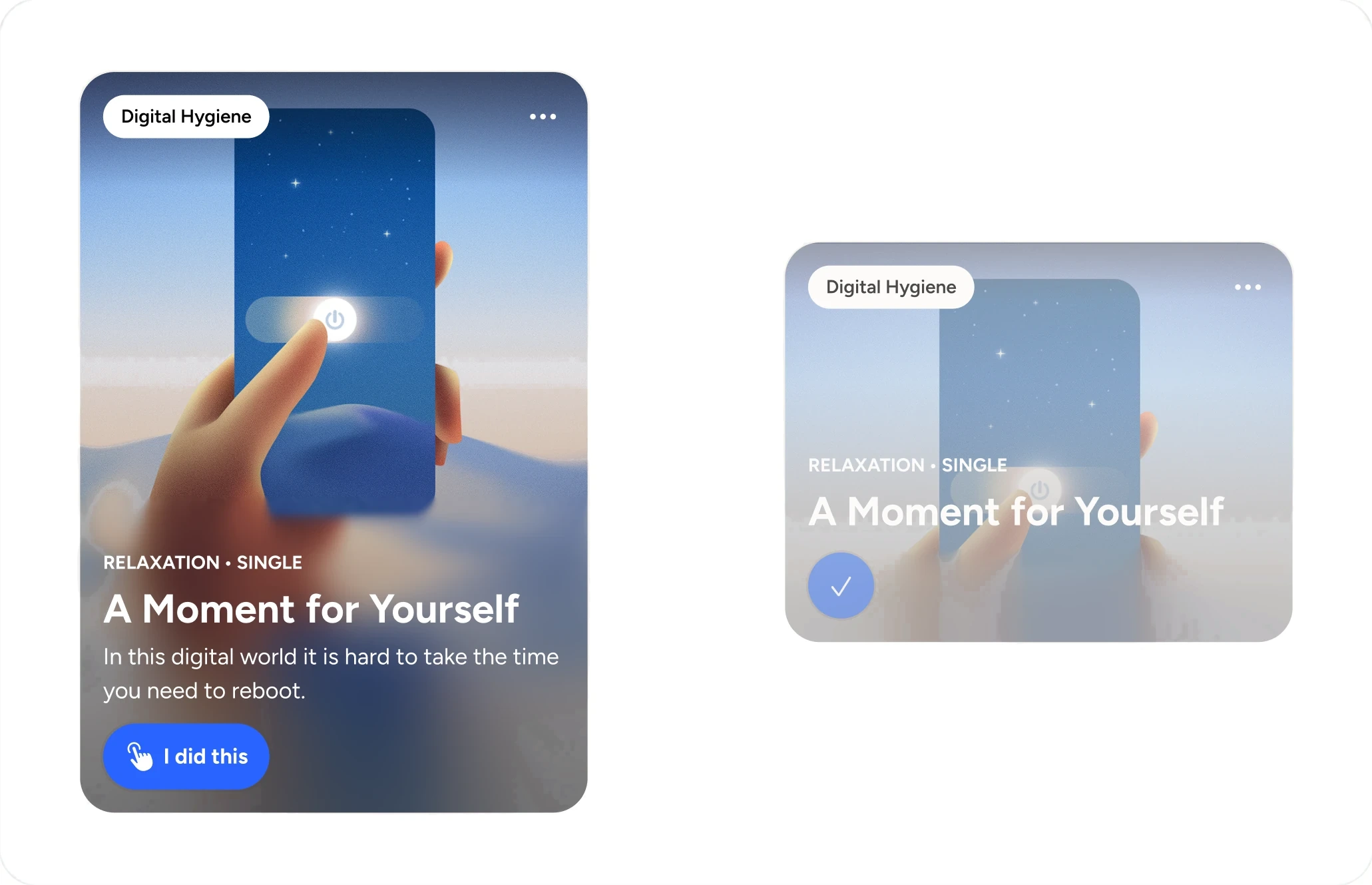
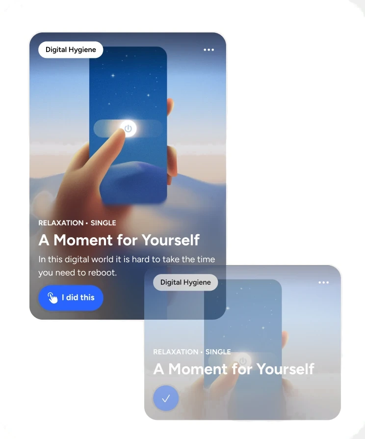
Plan item states
So a user can see what the system is counting. Default vs completed states.
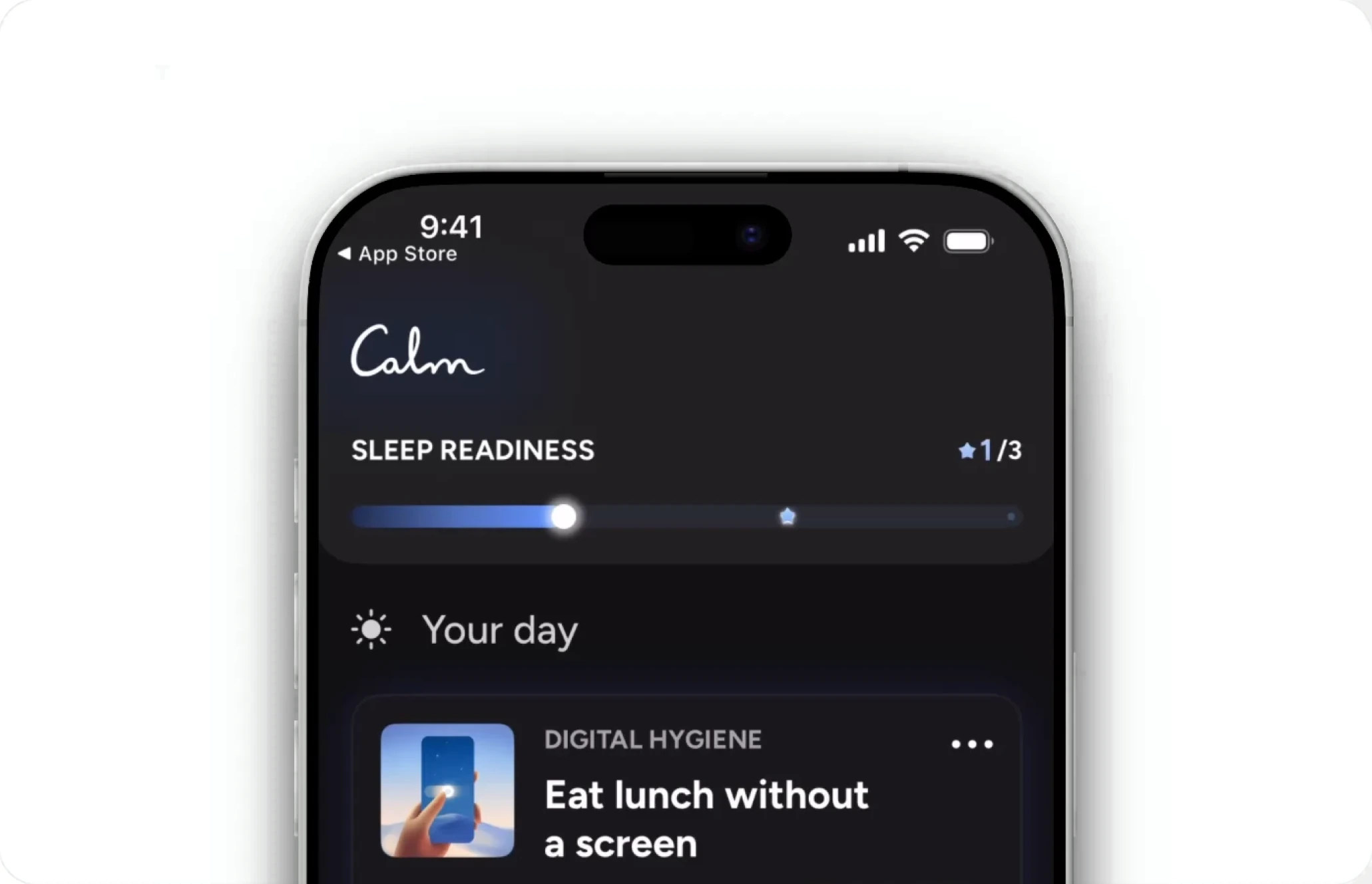
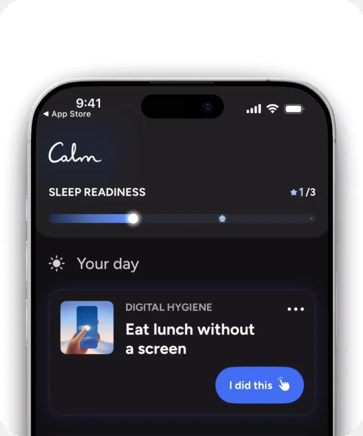
The score, explained in place
The progress bar animated as the user progressed within their plan.
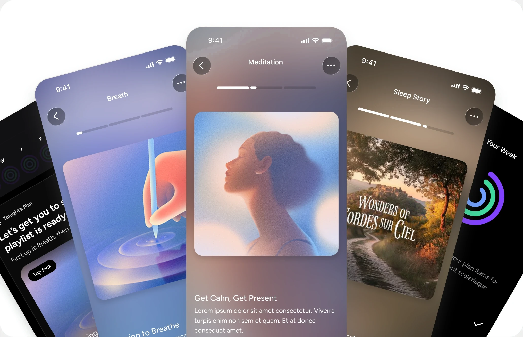
What I didn't build
More personalization, until the mechanics were understood. A progressive player experience so users could be more hands free between their plan items.
Cut the plan surface, not just the content
Users described the tasks as short and manageable, but the screen still read as a checklist. The fix wasn't fewer or shorter tasks. It was tightening the surface itself, which is the difference between "here's your plan" and "here's everything you could do."
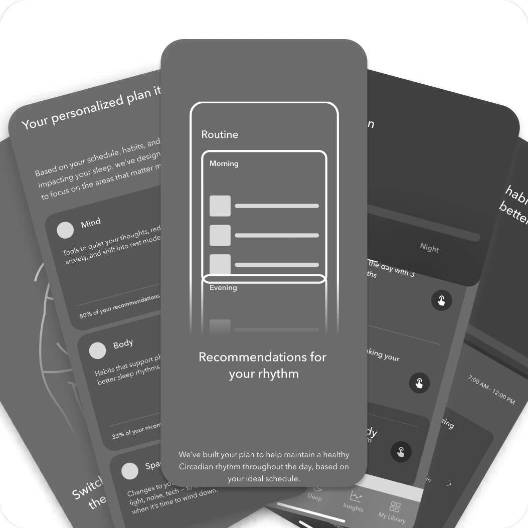
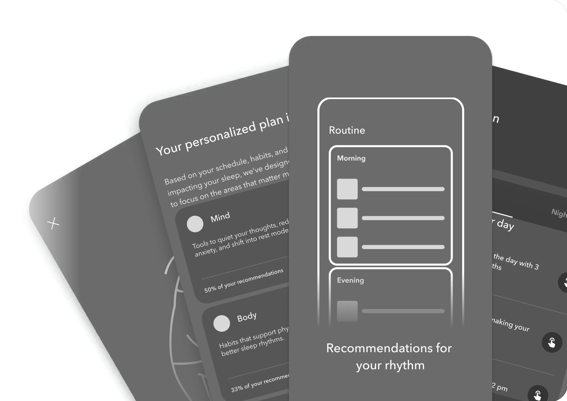
A plan you finish, not a list you face.
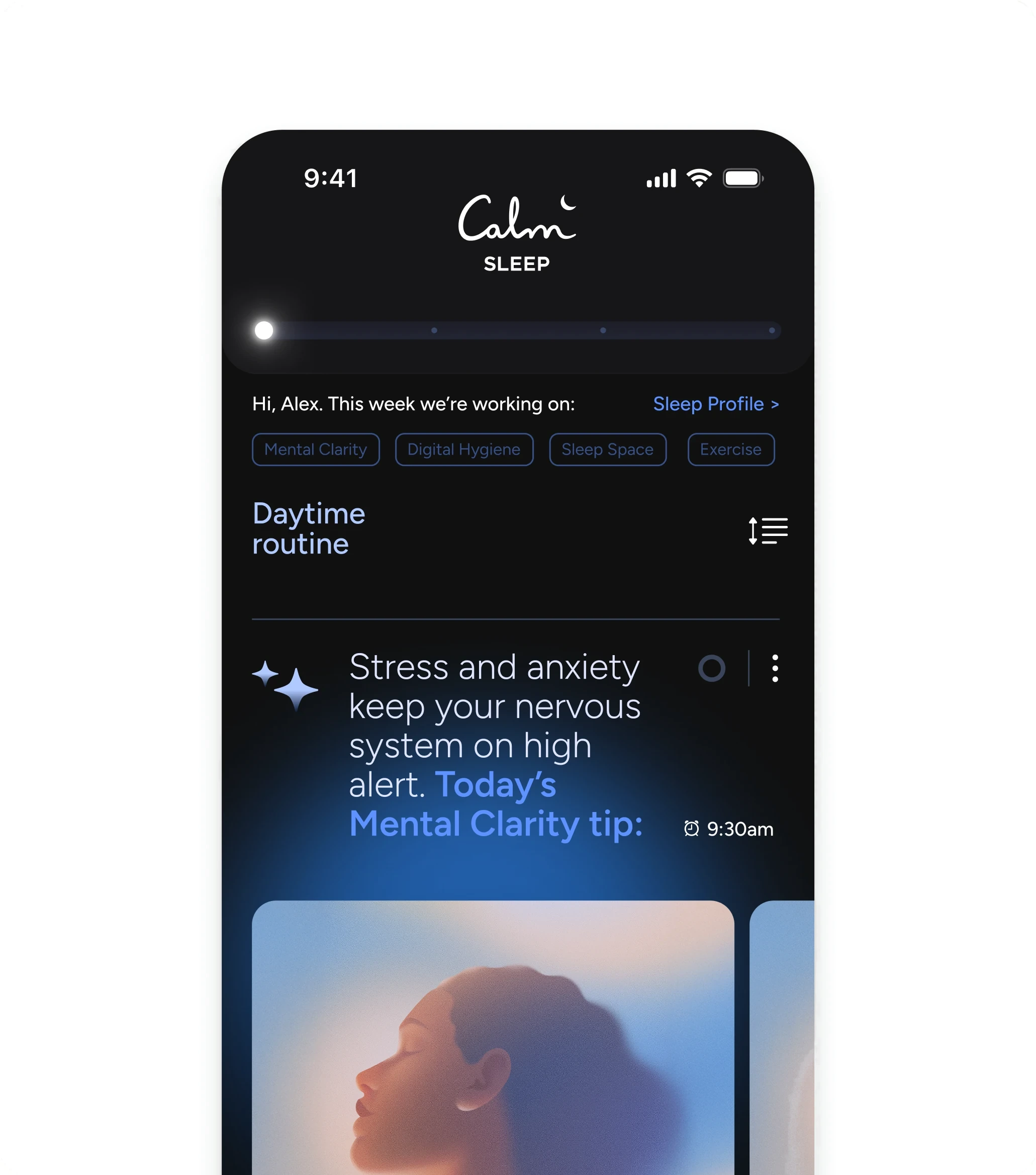
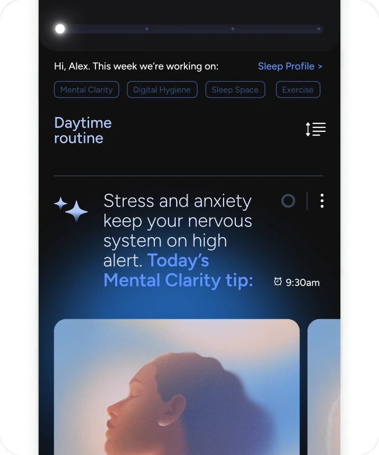
Manageable tasks, overwhelming screen
The content tested well while the surface didn't.
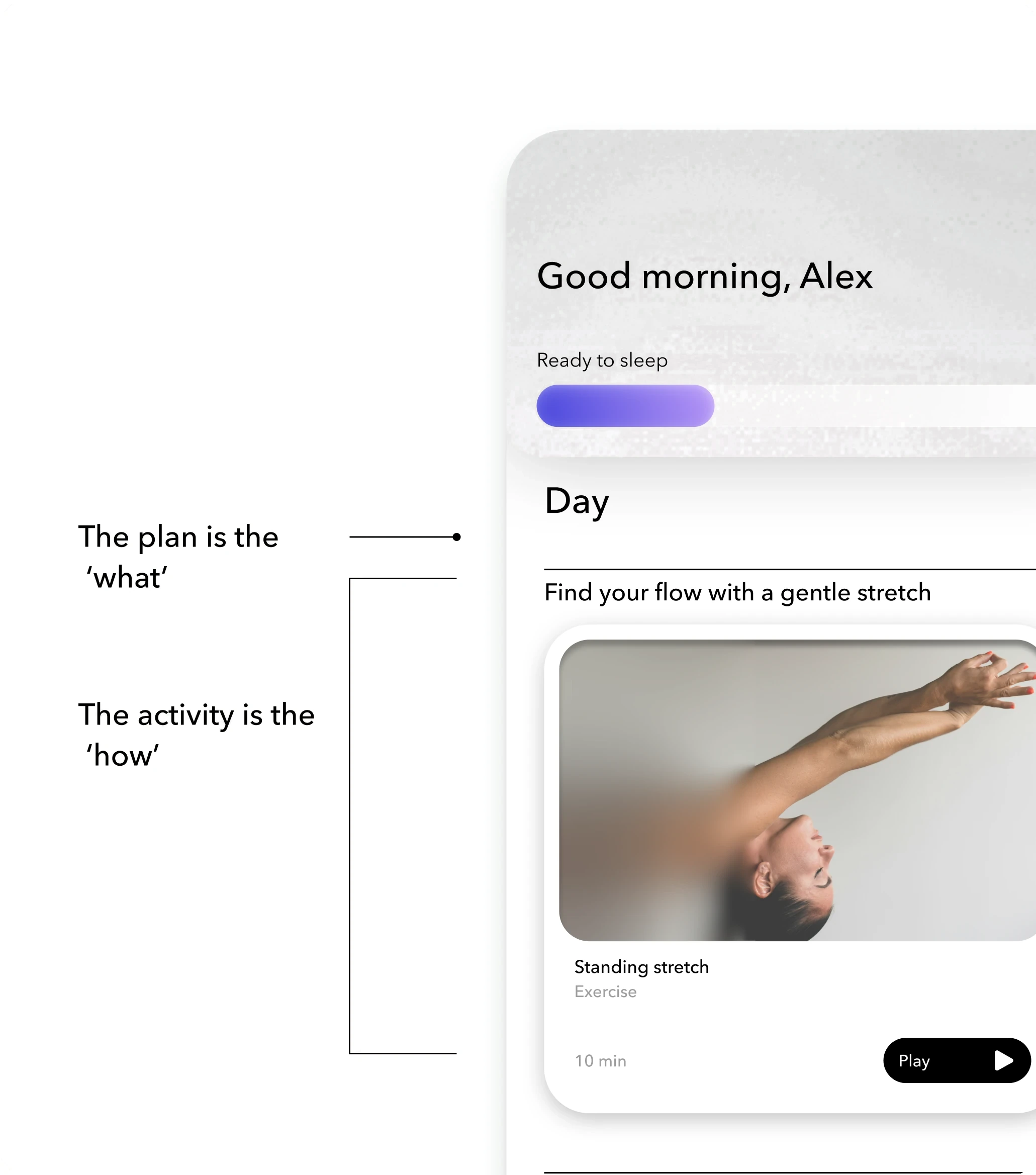
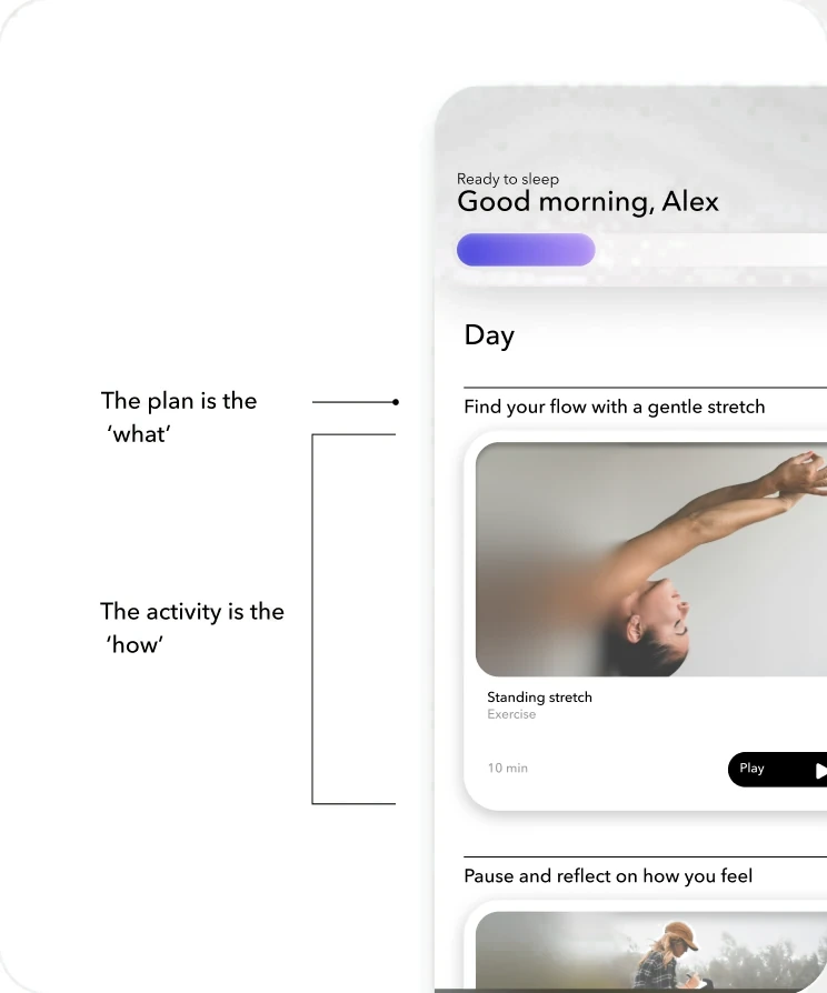
Mid-fidelity plan screen
Where the surface got cut down.
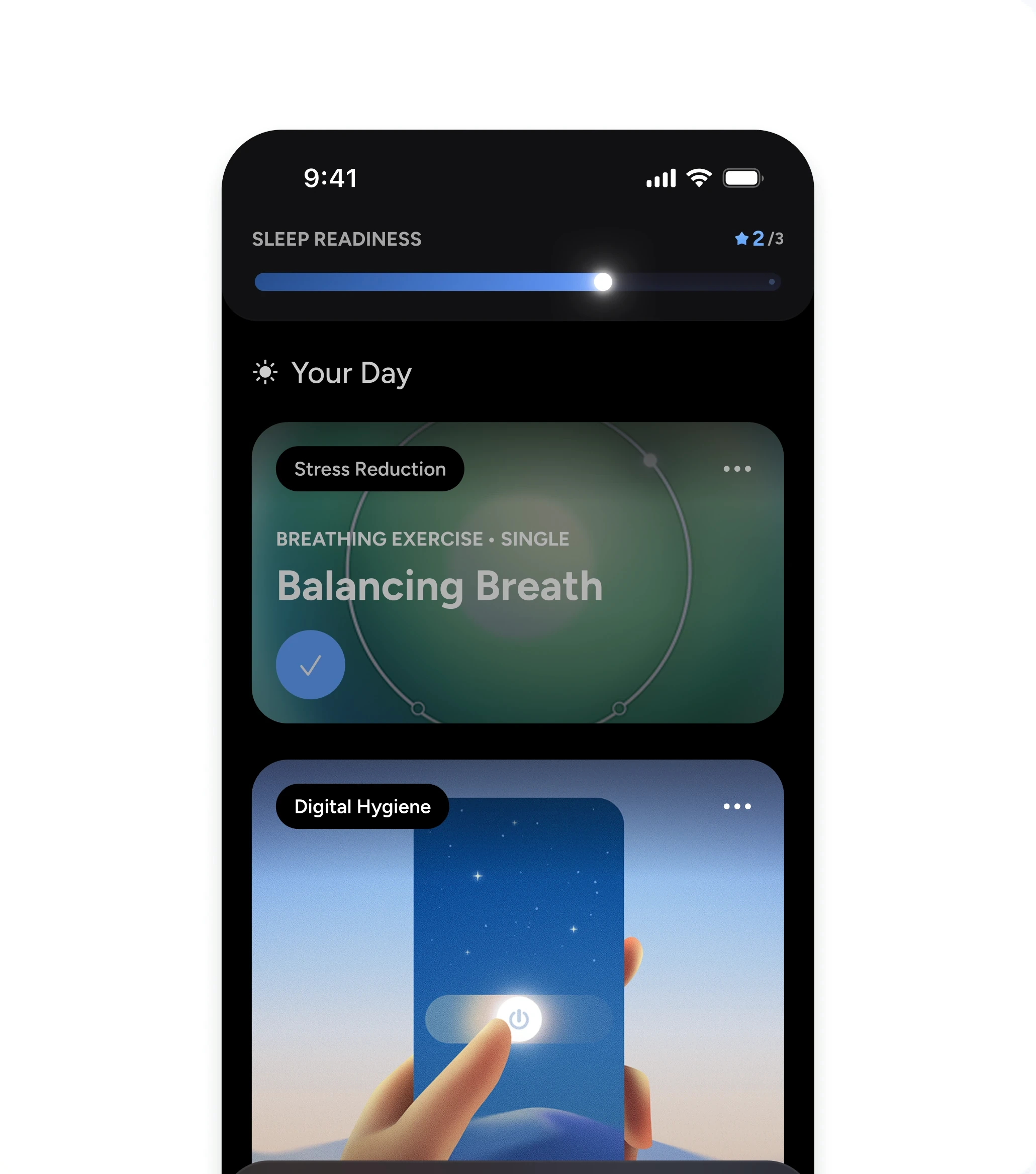
Plan, not checklist
With what's left off.
Where the plan was going
A plan you play rather than a plan you check off: tonight's items queued in order, and the week visible above it. It never shipped, but it's the version I'd build next, and it aimed straight at the two drop-offs in the data.
“I heavily rely on that SOS sheet. I have trouble selecting whats best for me at night. I wake up in the middle of the night and it helps so much.”
What I achieved
Results
4.7 Stars at Launch
Calm's first new product in over a decade, from concept to global iOS launch in four months.
More Users Paid
Install-to-paid came in 34% above target in the US and 14% above in Australia.
People Came Back
5+ day engagement reached 15.2%, against a starting point where 73–74% of users never returned after day one.
The Plan Got Used
+31% of users engaged with a plan item, with +8% completion.
A Brand Built for Sleep
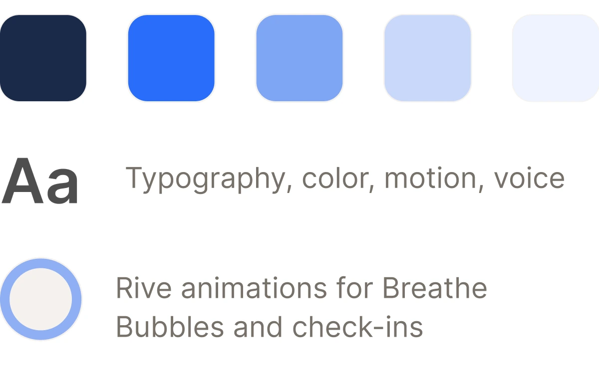
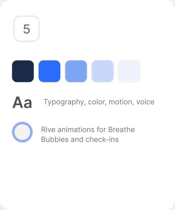
Color, typography, motion, and voice, including Rive animations for Breathe Bubbles and check-ins.
Progressive Player Plans Never Shipped
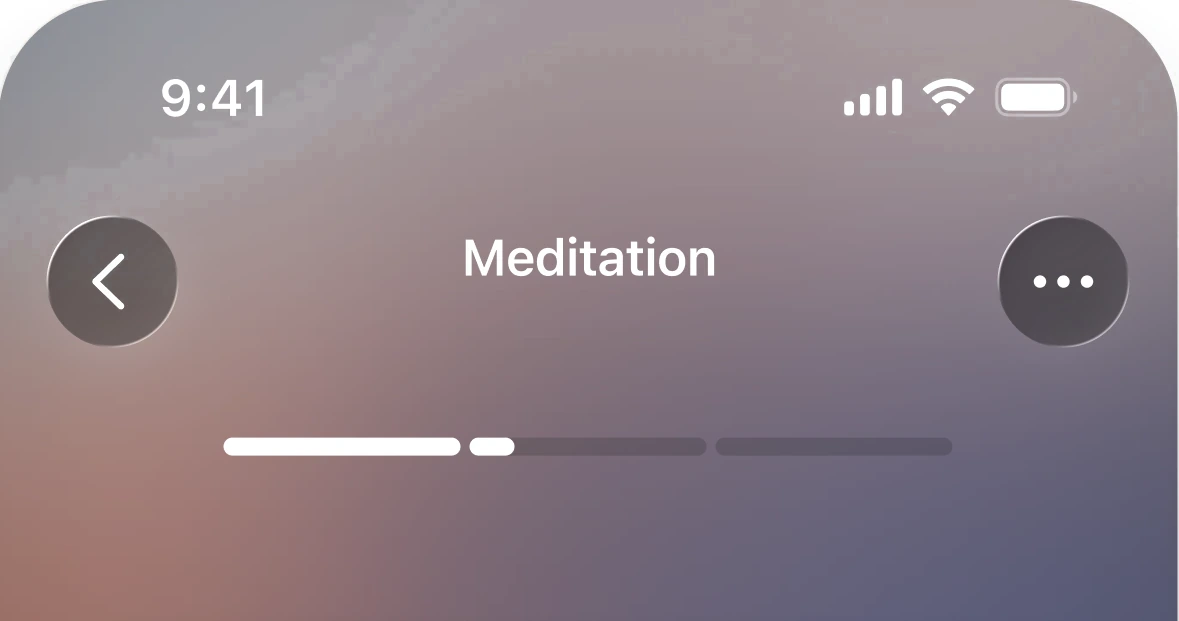
A guided, sequential content experience aimed at the two drop-off points in the data. It was explored and tested, but it stayed exploration.
4.7 Stars at Launch
Calm's first new product in over a decade, from concept to global iOS launch in four months.
More Users Paid
Install-to-paid came in 34% above target in the US and 14% above in Australia.
People Came Back
5+ day engagement reached 15.2%, against a starting point where 73–74% of users never returned after day one.
The Plan Got Used
+31% of users engaged with a plan item, with +8% completion.
A Brand Built for Sleep
Color, typography, motion, and voice, including Rive animations for Breathe Bubbles and check-ins.
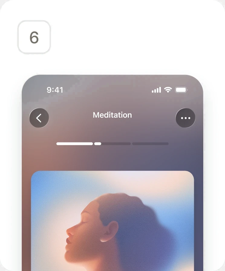
Progressive Player Plans Never Shipped
A guided, sequential content experience aimed at the two drop-off points in the data. It was explored and tested, but it stayed exploration.
Reflection
What I’d change
Strategically
The biggest lesson wasn't about personalization. It was about trust. Users don't engage with a system they don't understand, however well it's tuned to them. Legibility first, then trust, then personalization. That sequence is what I'd carry into any product trying to change behavior.
Technically
The MVP shipped with Rive animations driving the home surface, and on device in SwiftUI they didn't hold up. Post-MVP we pulled them out and rebuilt the screen with less motion and clearer hierarchy, which I think is the better design. The lesson is that motion has to be tested on a real device early, not at the end, because "it works in the file" says nothing about how it runs.
Get in touch
Open to new work, and always up for a conversation about product, design systems, or shipping design straight through to code.
Site designed and built by Eric Fillingame