
Experian • Consumer Credit
Three Questions, One Tab
Senior Product Designer
Users came to Experian to learn their score, what affects it, and how to improve it, and had to jump between two sections to get the answers. I designed CreditHub, the tab that answers all three in one place.
- Web, iOS and Android
- Zero-to-one, research through launch
The role.
Senior Product Designer, sole designer, research through high fidelity and shipped
The team.
1 Senior Product Manager, 4 Engineers, 2 UX Writers, 1 UXR Researcher, 1 Design Systems Partner
The timeline.
June 2021 to March 2023
The problem.
Credit information was split across Reports and Scores. Users couldn't find their score or what affected it, and many gave up before getting an answer.
What I proposed.
Stop linking the two sections and build one Credit tab organized around the three questions users actually asked.
What I did.
I designed CreditHub end to end, as the sole designer, and shipped it in three phases, testing each one with users before the next.
What happened
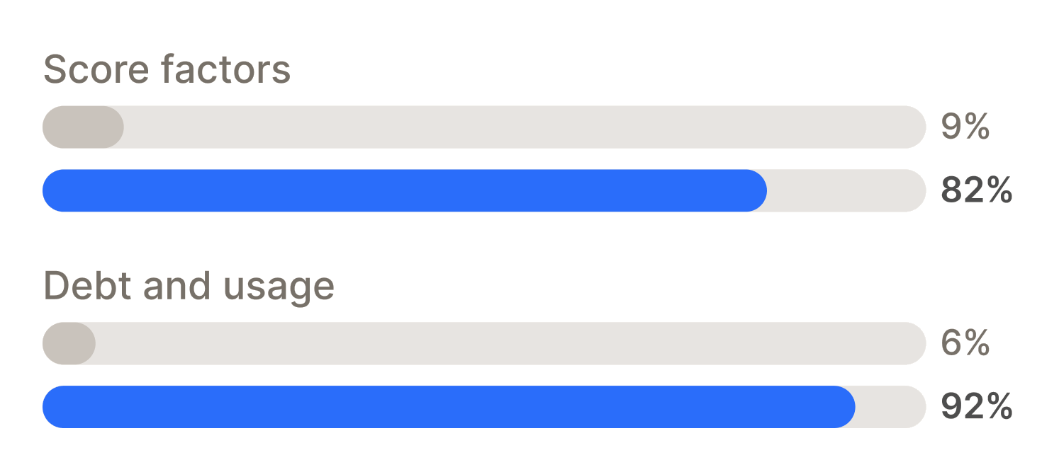
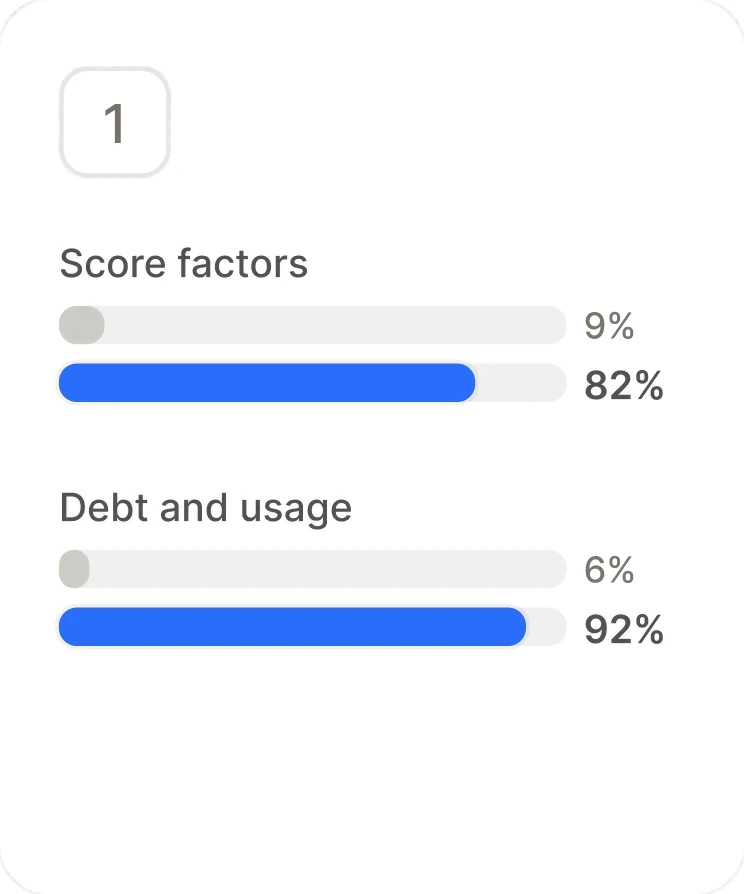
Task success rose on every tested task, including finding score factors from 9% to 82%. Free-to-paid conversion rose 5.25%, and paid churn fell from 7% to 5%.
9% to 82%
Users who could find what affects their score
6% → 92%
Users who could find their debt and credit usage
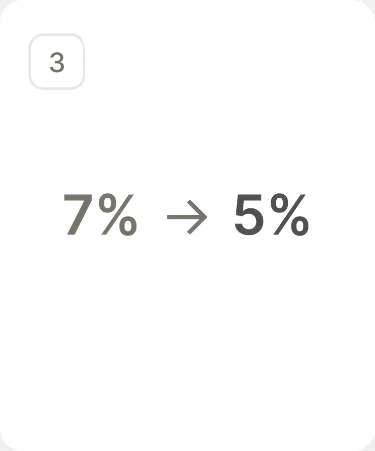
7% → 5%
Paid churn in the first month after launch
Merged two sections into one tab instead of linking them
Users' three questions were answered in two places. Linking Reports and Scores would have been the easier fix. I consolidated the content into one Credit tab, organized around the questions users asked rather than how the data was stored, and kept the full report one tap away.
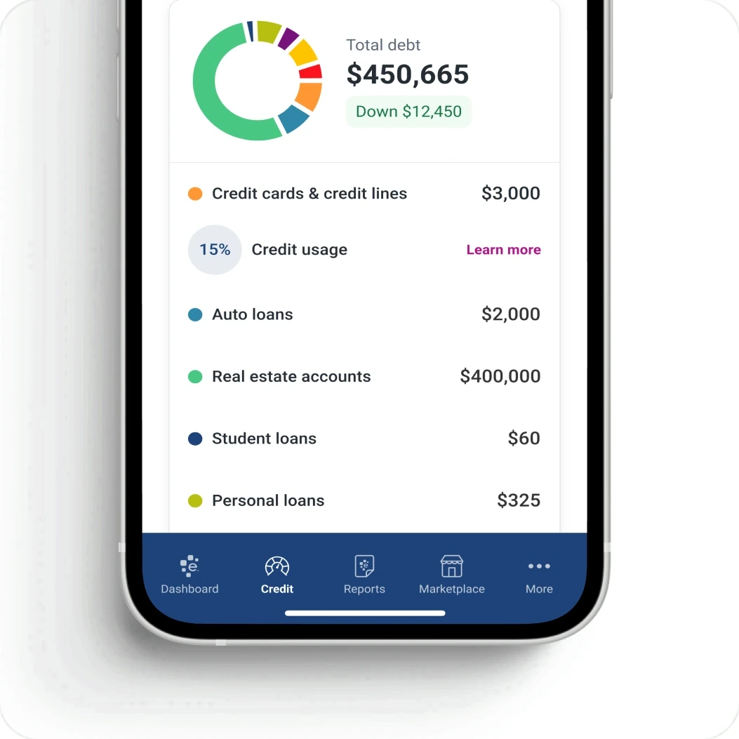
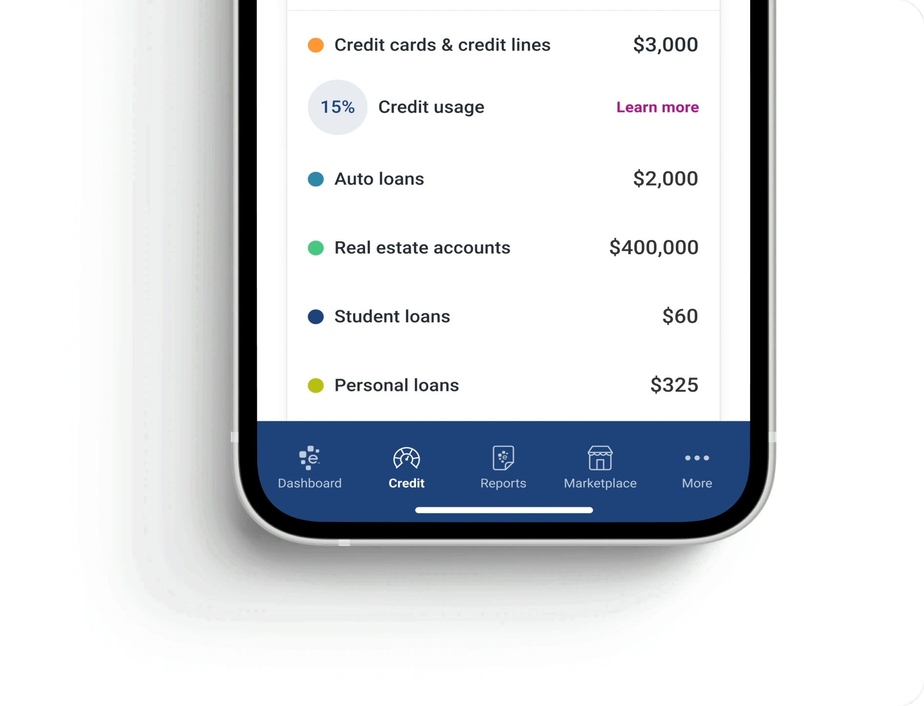
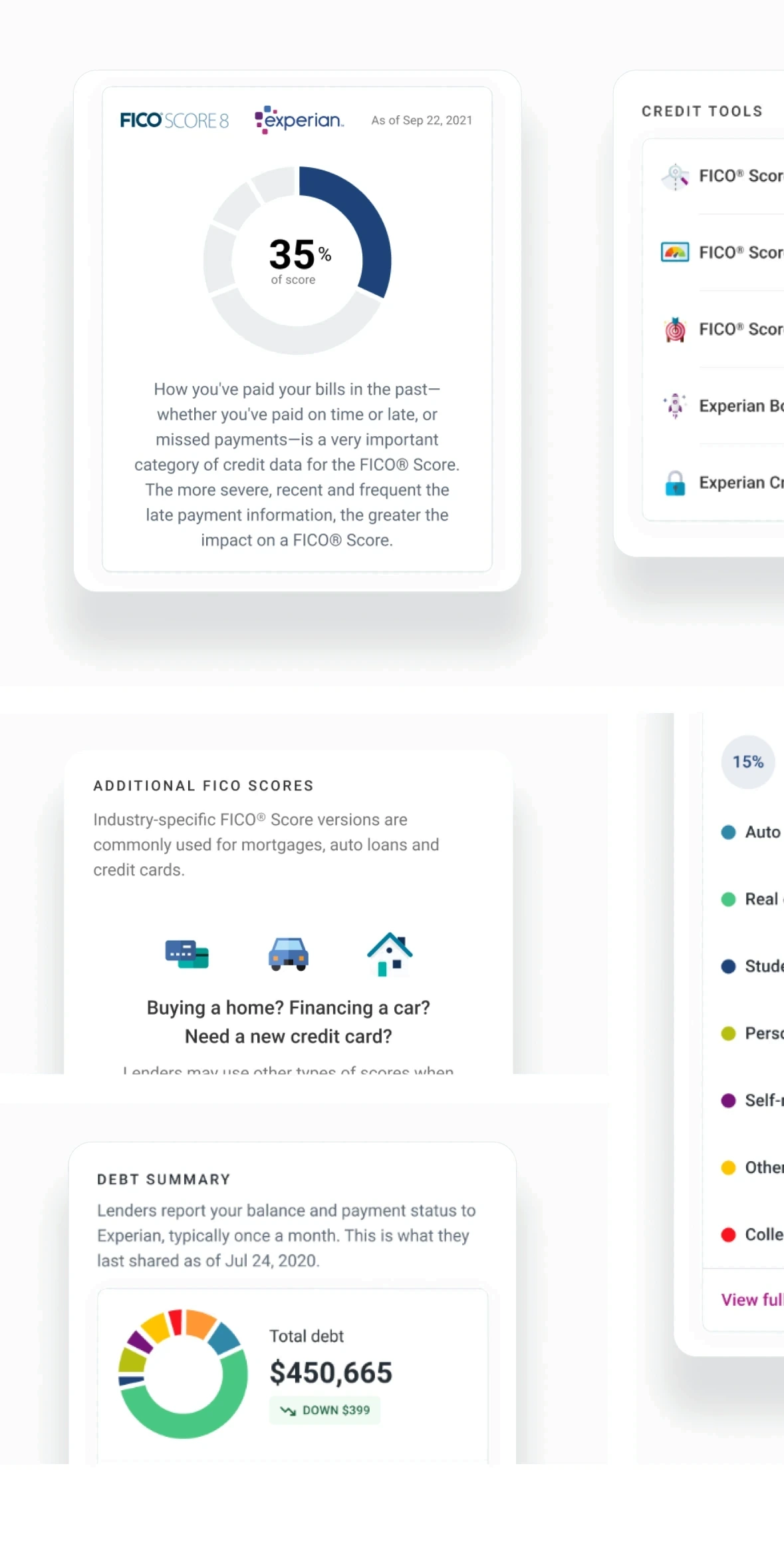
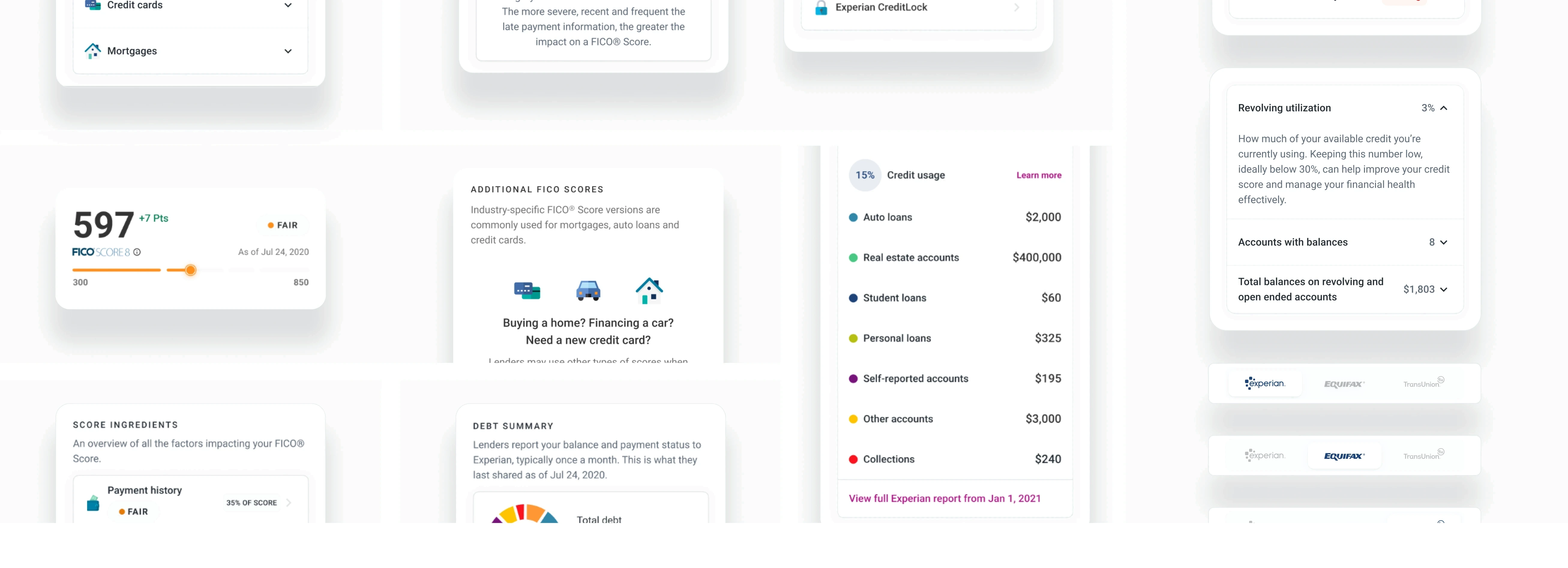
Before: two sections and a screenshot. After: one tab.
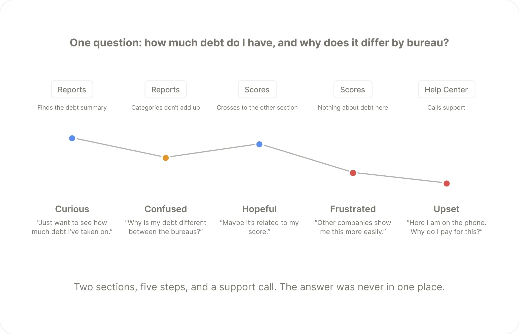
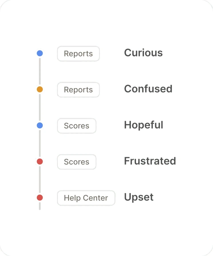
Two places, one question
Users had to cross from Scores to Reports to answer a single question about their own credit. One participant said he even screenshotted both and compared them in his photo app.
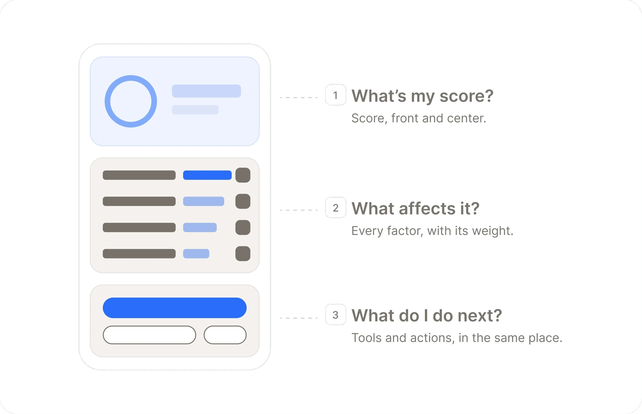
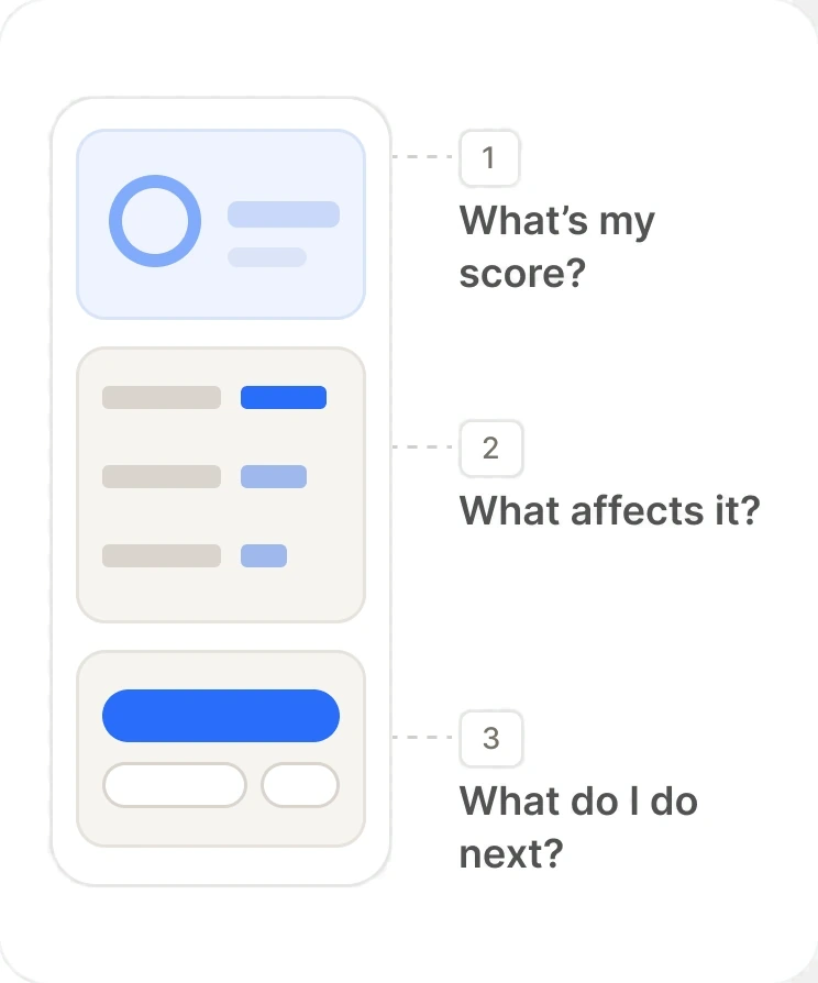
Organized around what users asked
The tab is ordered by the three questions users came with, not by where the data lived inside Experian.
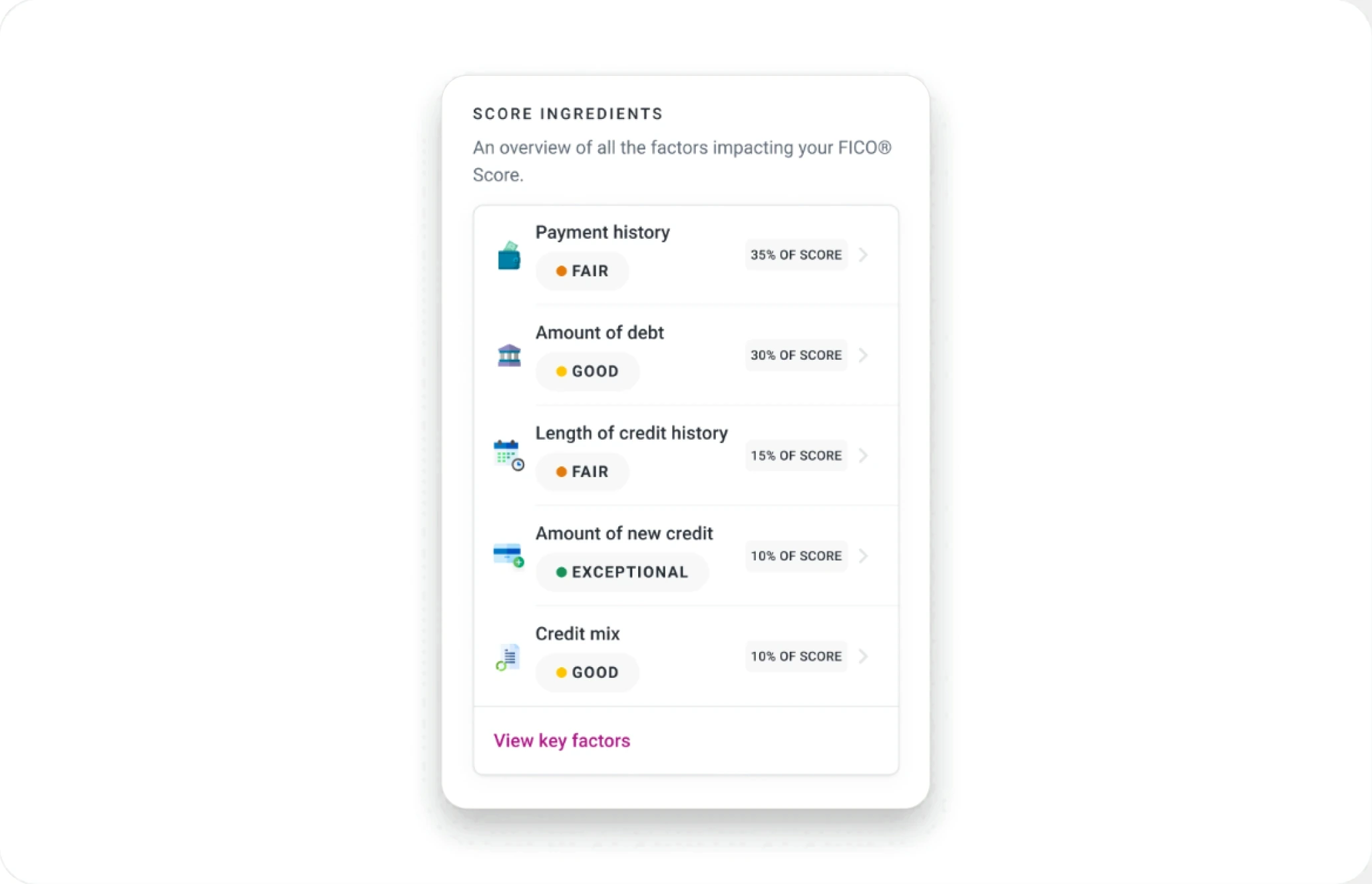
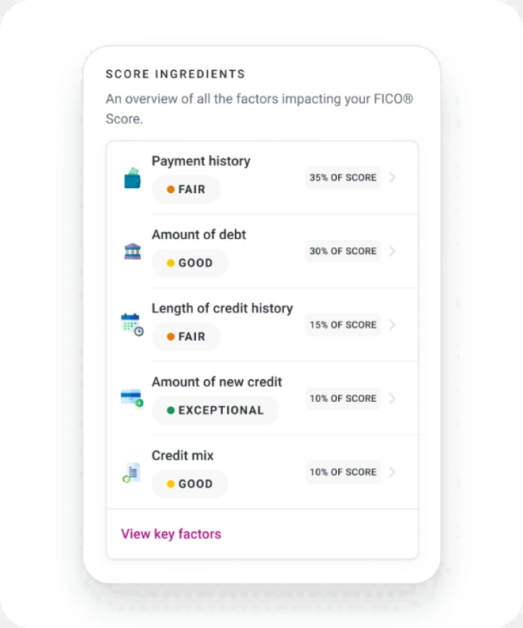
Score ingredients, with weights
Each factor shows how much it moves the score, so “what affects it” is answered on the same screen as the score itself.
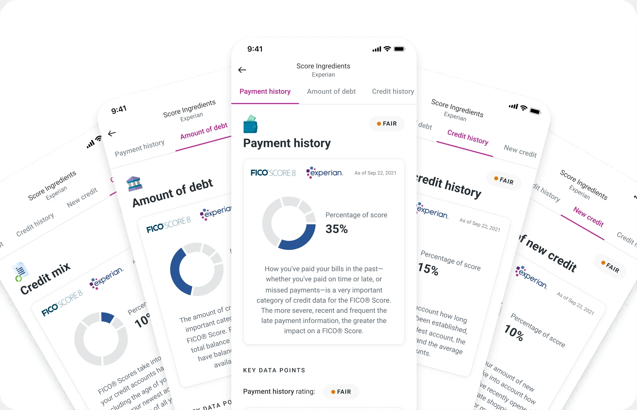
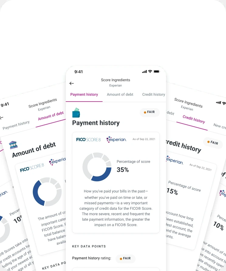
The full report, one tap away
Consolidating didn’t mean hiding. Everything the report offered stayed reachable from the tab. Compliance maintained throughout.
Made the three bureaus comparable in place
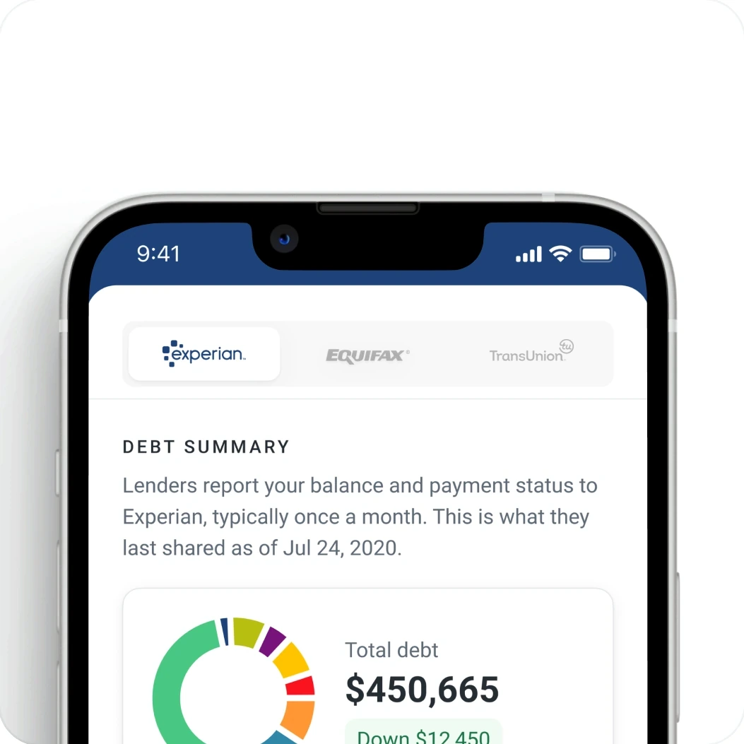
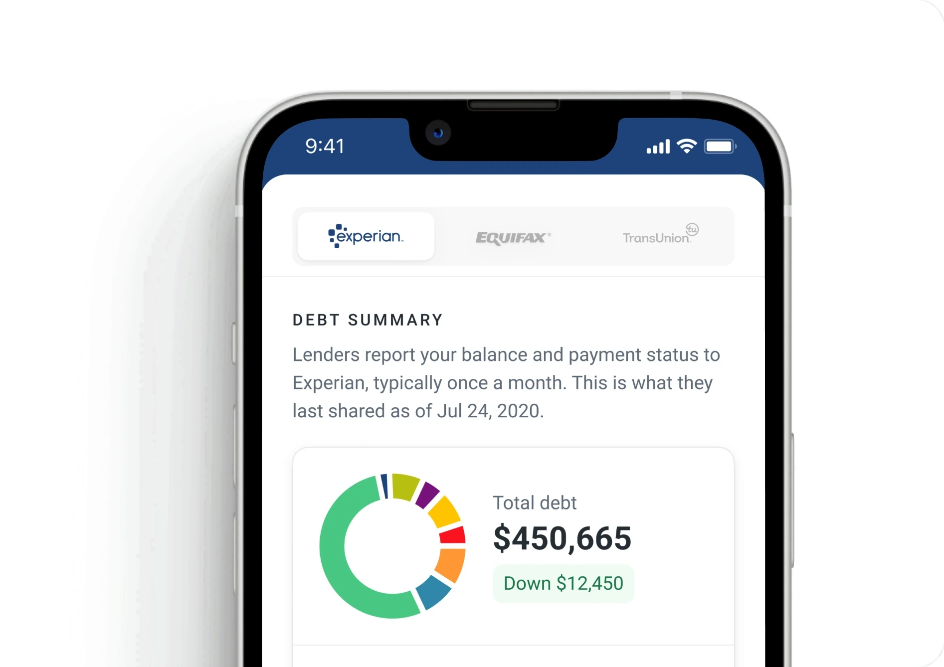
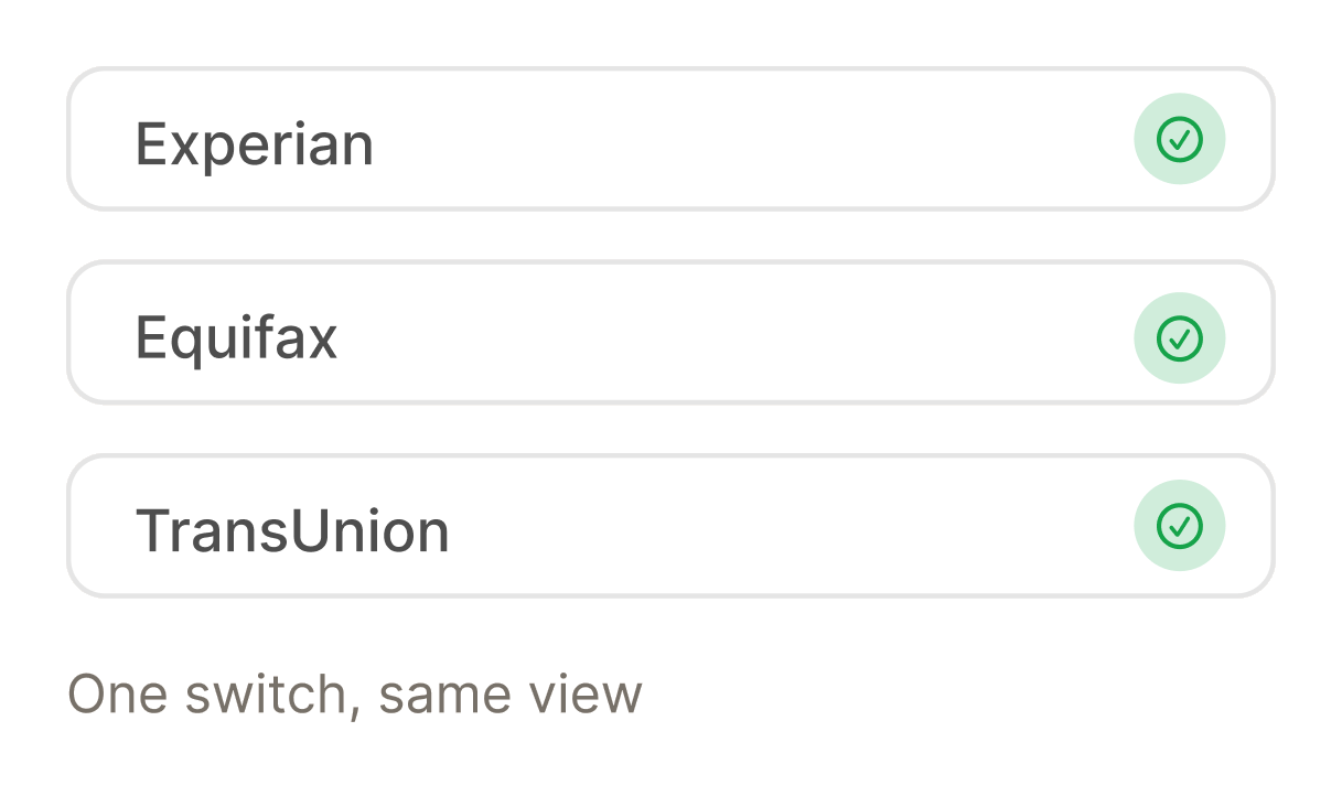
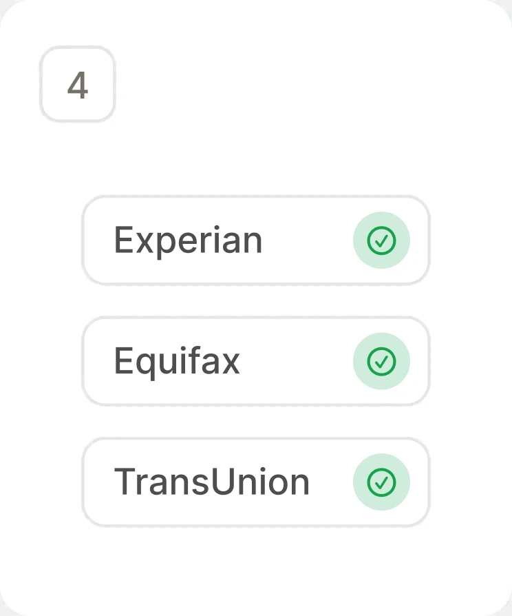
Users needed to compare Experian, Equifax, and TransUnion data, and the old experience made each one a separate trip. A sticky bureau switcher lets them compare without leaving the view. In testing, it was one of the features users valued most.
Switch bureaus without losing your place
One switch, three bureaus
The switcher stays pinned while the data below it changes, so comparing is a tap instead of a separate trip.
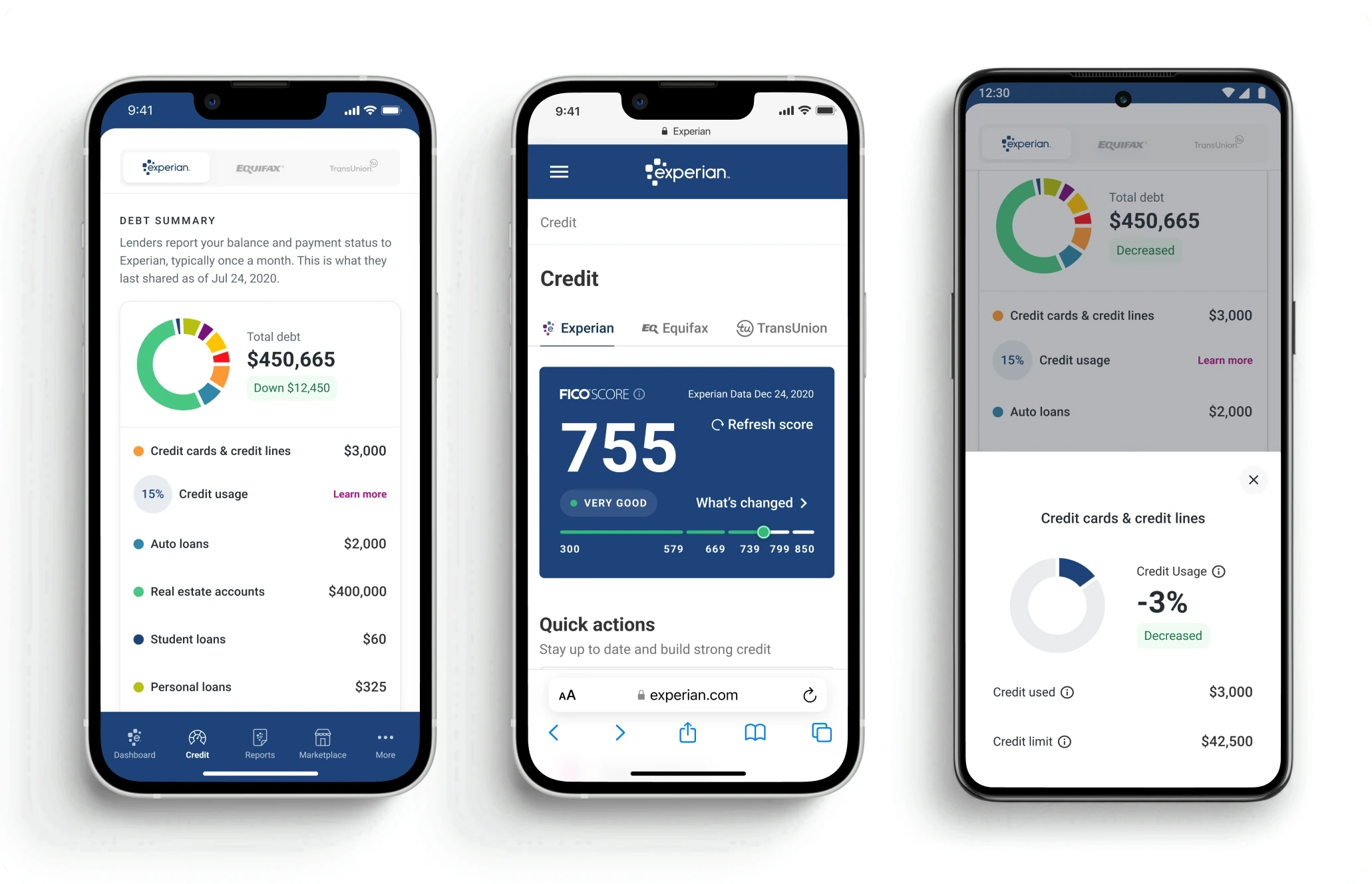
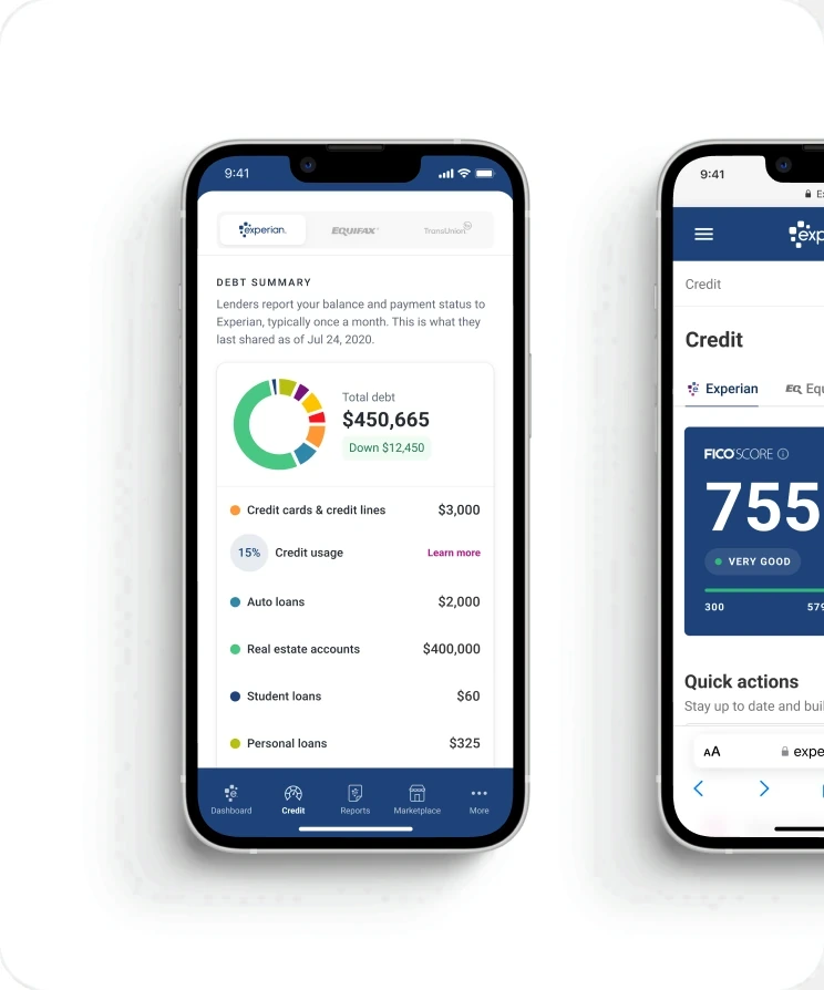
The same data, three ways
Each bureau reports differently, and seeing them in the same layout makes the differences obvious instead of something users have to reconstruct.
What testing said
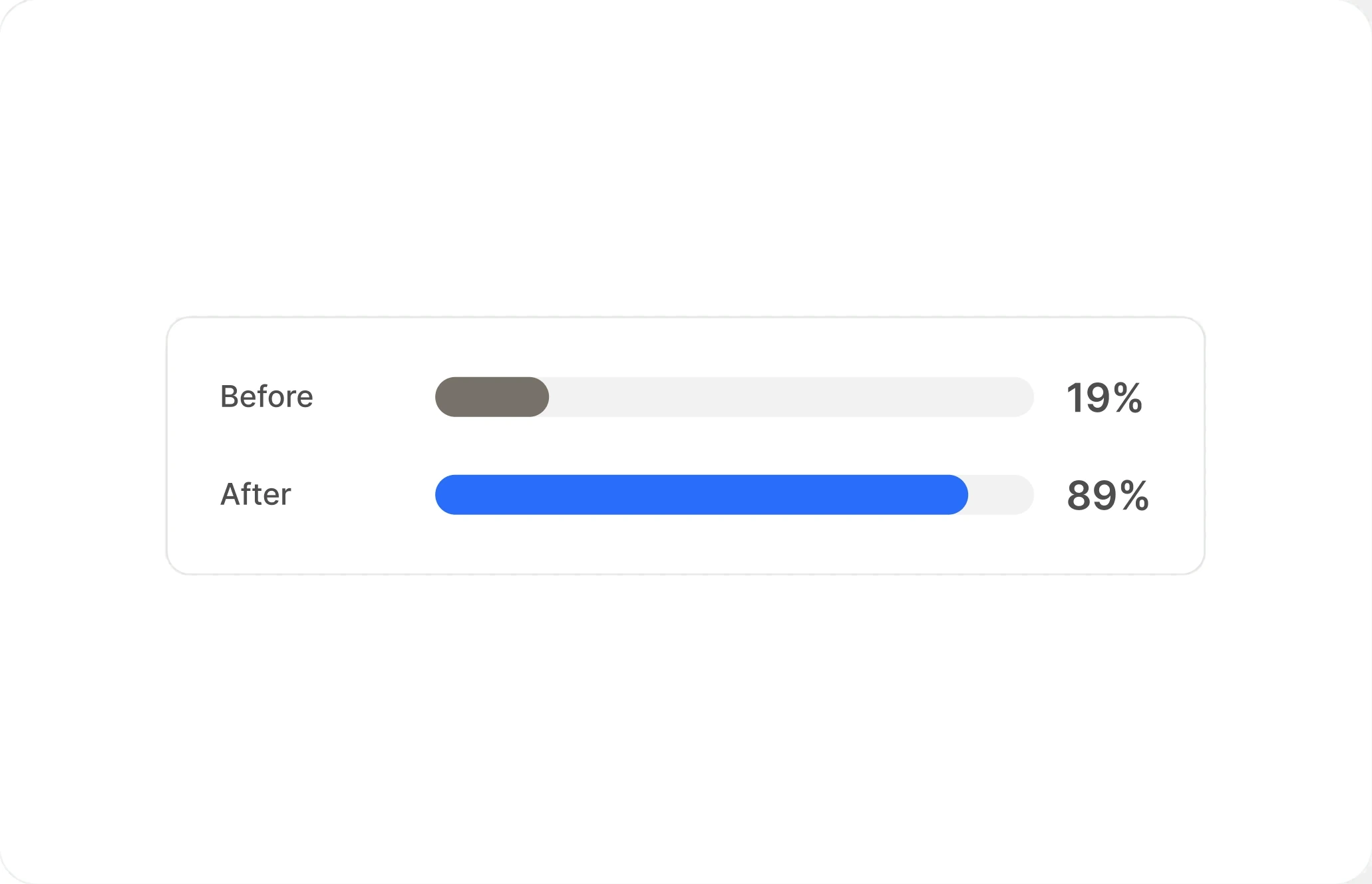
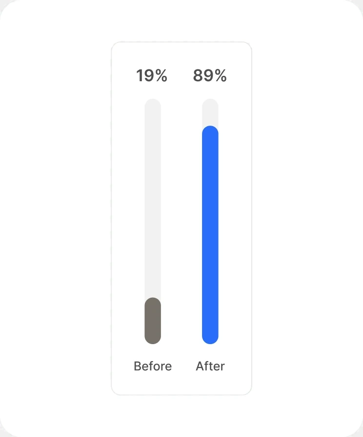
Comparing bureaus went from 19% to 89% task success, and users named the switcher one of the most valuable parts of the redesign.
Shipped in three phases instead of one launch
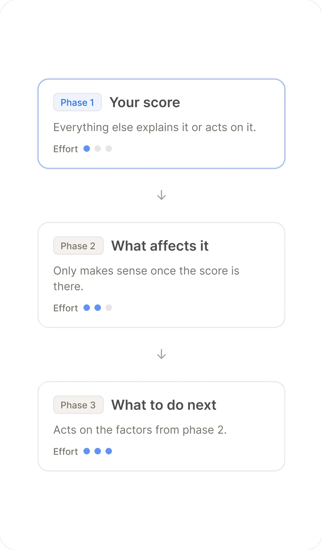
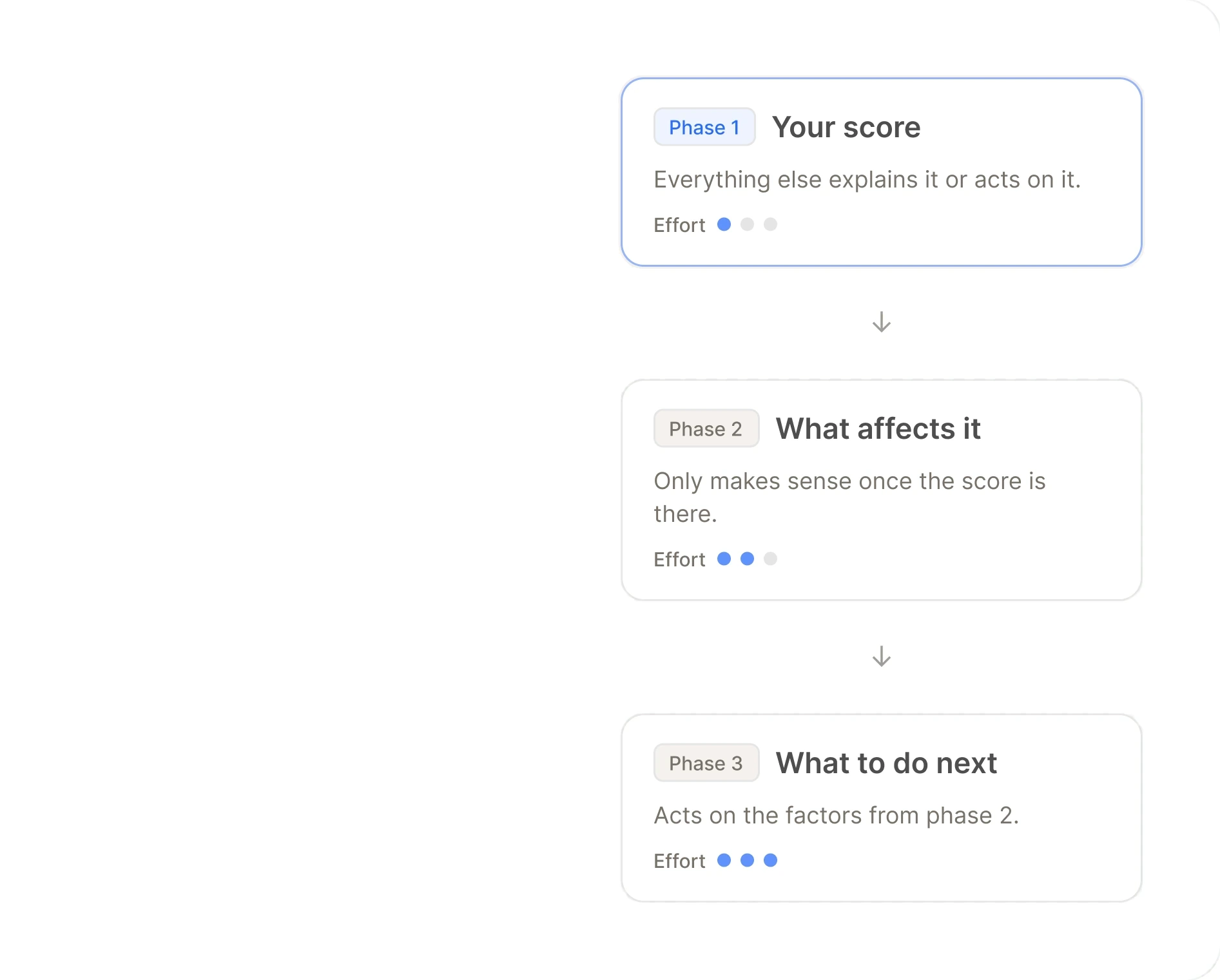
I broke the MVP into three phases with both product and engineering, sequenced by how each section relates to the others, as well as level of effort for each. The score came first because everything else explains it or acts on it. Each release built on the one before, and each went through usability testing before the next, so feedback shaped the product while it was still being built.
Three releases, each tested before the next.
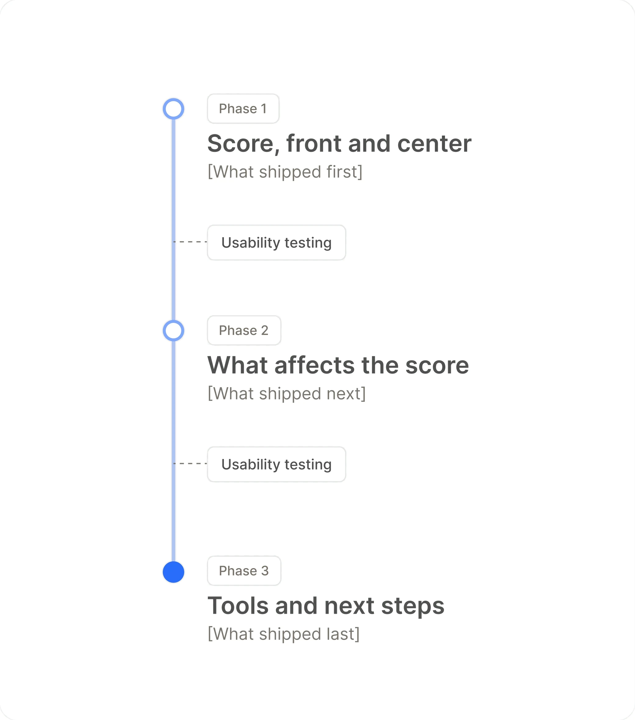
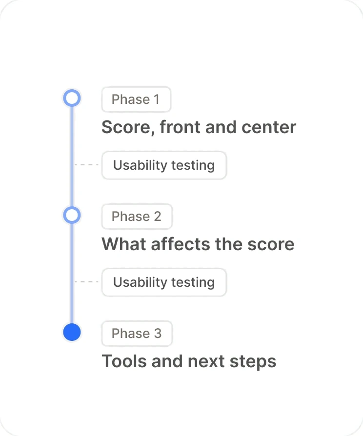
Three phases, not one launch
The MVP shipped in three releases, sequenced so the most important answers reached users first.
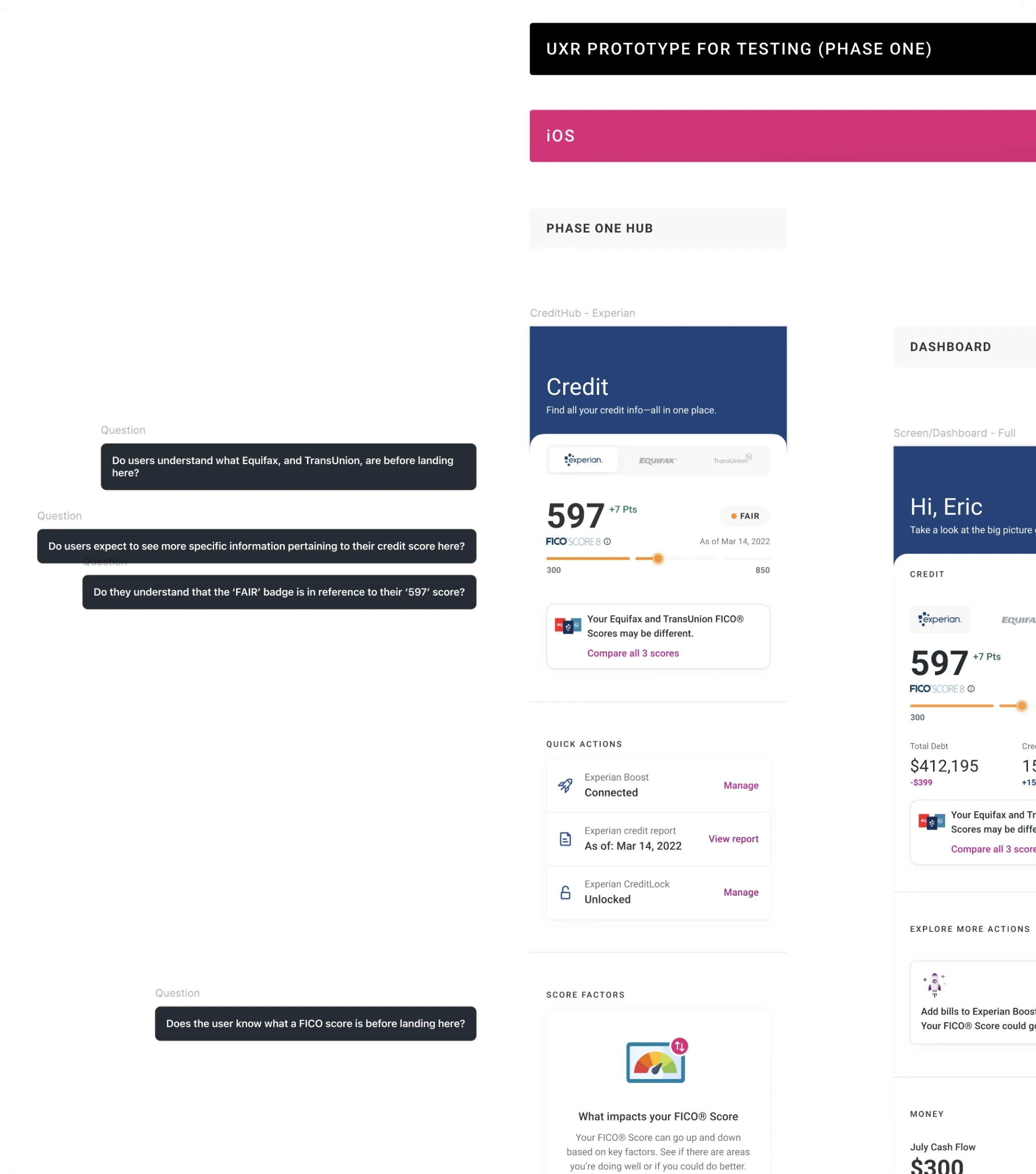
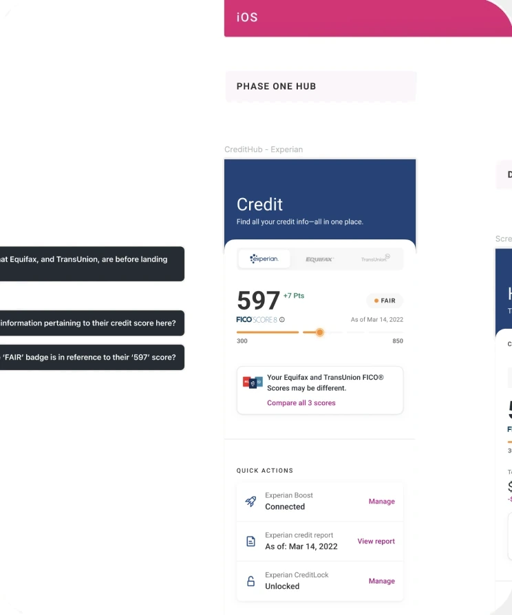
Tested between every phase
Each release went through usability testing before the next was designed, so findings changed what came next instead of landing after launch.
Argued for education, designed for it anyway
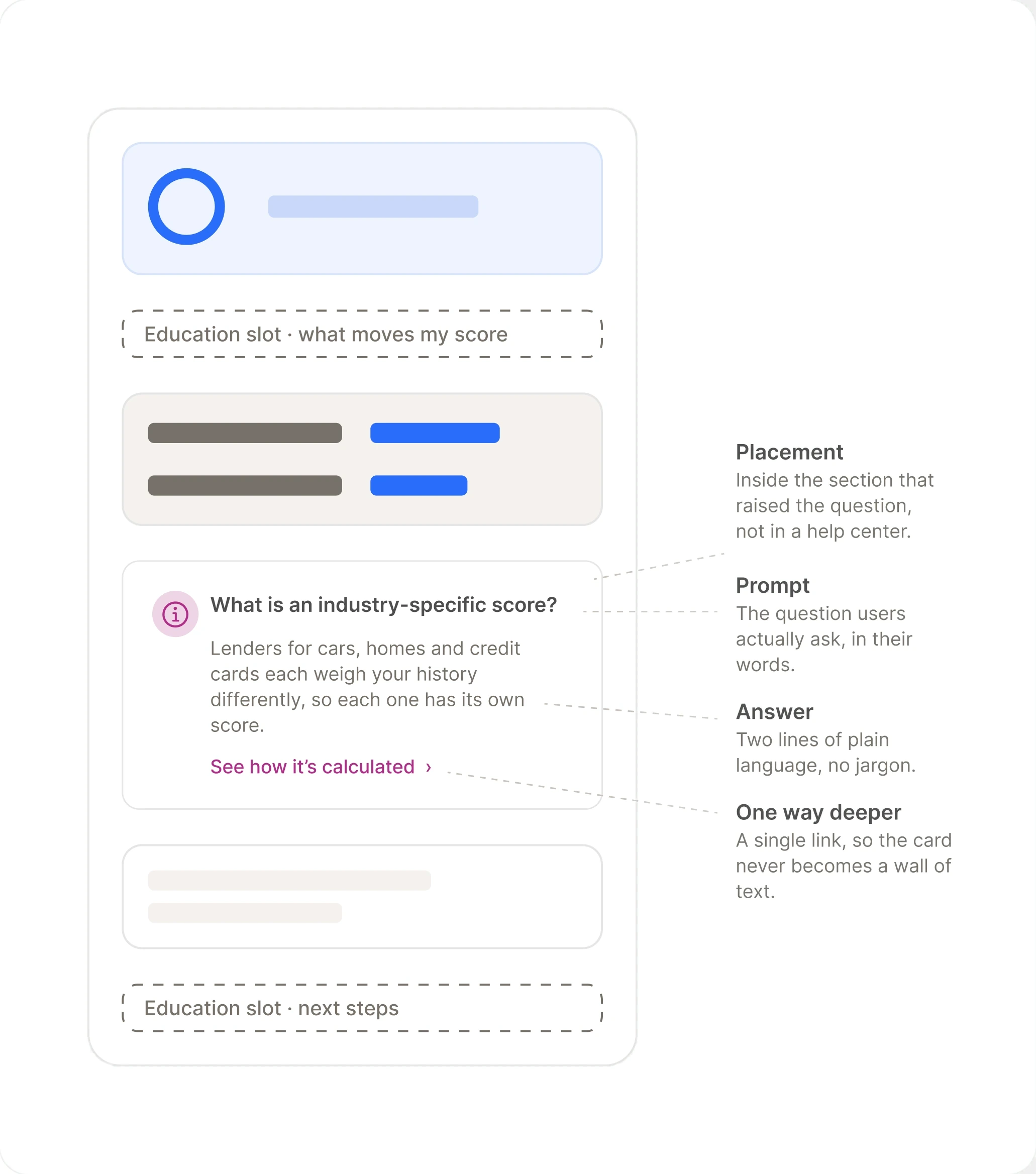
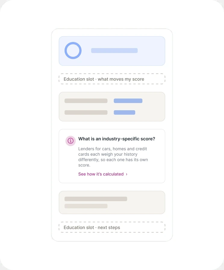
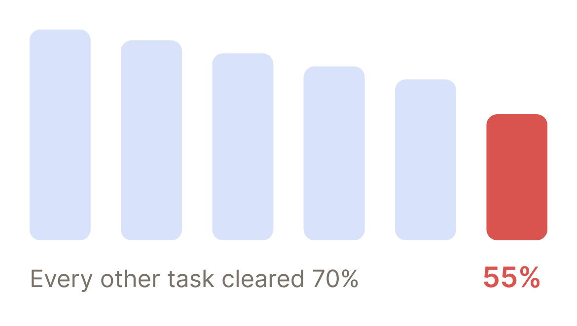
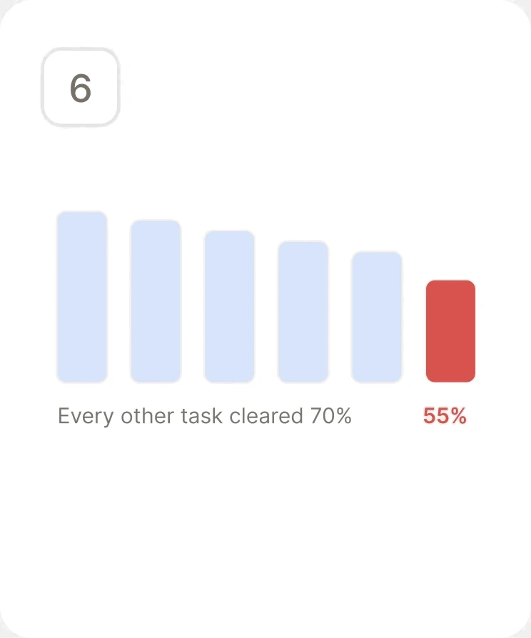
I pushed for contextual education in the MVP and lost. So I built the IA to accept it later. Industry-specific FICO scores stayed at 55% success when every other task cleared 70%.
“I have to go to Reports to view my debt summary and then go back to Scores to access the categories of that debt. I screenshot them both on my phone and go to my photos to compare them.”
What I achieved
Results
Findability, Fixed
Finding score factors went from 9% to 82%. Finding debt and credit usage went from 6% to 92%. Every tested task improved.
More Free Users Upgraded
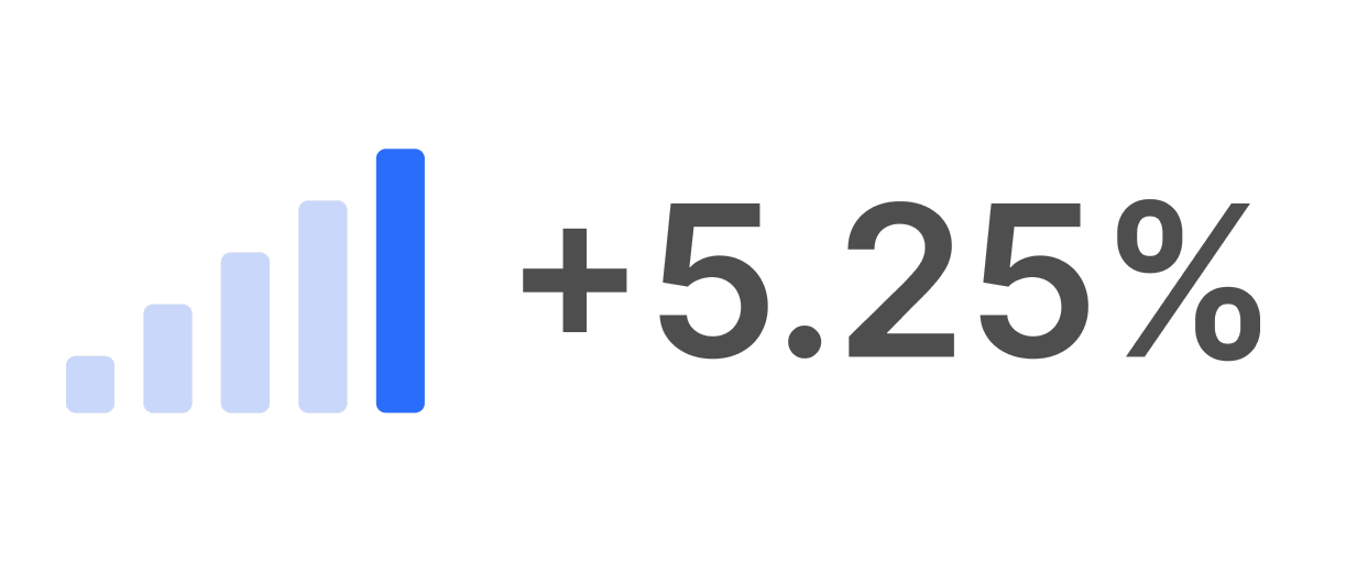
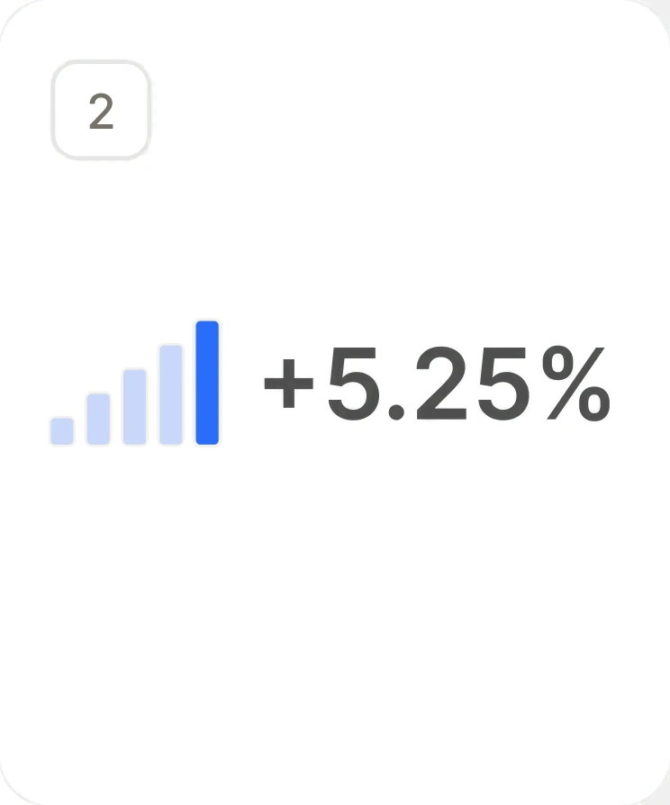
Free-to-paid conversion rose 5.25% in the first month after launch.
Fewer Paid Users Left
Paid churn fell from 7% to 5% in the first month after launch.

Bureaus Side by Side
Comparing Experian, Equifax, and TransUnion went from 19% task success to 89%.
One Experience, Every Platform
The same credit experience across web, iOS, and Android.

Industry Scores Stayed Difficult
Finding industry-specific FICO scores rose from 17% to 55%, well behind every other task.
Findability, Fixed
Finding score factors went from 9% to 82%. Finding debt and credit usage went from 6% to 92%. Every tested task improved.
More Free Users Upgraded
Free-to-paid conversion rose 5.25% in the first month after launch.
Fewer Paid Users Left
Paid churn fell from 7% to 5% in the first month after launch.
Bureaus Side by Side
Comparing Experian, Equifax, and TransUnion went from 19% task success to 89%.

One Experience, Every Platform
The same credit experience across web, iOS, and Android.
Industry Scores Stayed Difficult
Finding industry-specific FICO scores rose from 17% to 55%, well behind every other task.
Task success before and after, across all usability tasks.
Reflection
What I’d change
Strategically
I started this project treating the design system as something to pull components from. Working with that team on the credit data visualizations changed how I saw it. A system is every designer's responsibility, and the people building it are counting on product designers to bring back what we learn, so it gets stronger and more collaborative with every product. Next time I'd work that way from day one. It's also where my move into design systems began.
Technically
Industry-specific FICO scores were the one task that remained difficult: 55% success, when every other task landed between 70% and 92%. Users needed more help understanding what those scores were, and research had flagged it early: participants told us they wanted more education around credit. Next time I'd identify the hardest tasks up front and build that education directly into the moment, where users can pull it up without leaving the task.
Get in touch
Open to new work, and always up for a conversation about product, design systems, or shipping design straight through to code.
Site designed and built by Eric Fillingame