
Foundation Design System
The System Nobody Asked For
Design Systems Lead
Leadership passed on a new design foundation. I built it into Calm Sleep, the app I was designing from zero, and Calm Health adopted it next.
- July 2025 to October 2025
- iOS and Android
The role.
Design Systems Lead, tokens through adoption
The team.
2 designers, 2 engineers, 1 motion designer
The timeline.
July 2025 to October 2025
The shift.
Research showed a strong financial case for a sleep-centric app, so Calm moved to a multi-app strategy, starting with Calm Sleep.
What I proposed.
Rebuild the design foundation before building more apps on the legacy one. Leadership passed. DTC's priority was protecting current shipping speed.
What I did.
I built the foundation into Calm Sleep, which I was designing 0-to-1, then offered it to other teams. Calm Health adopted it and met with me weekly to extend it.
What happened
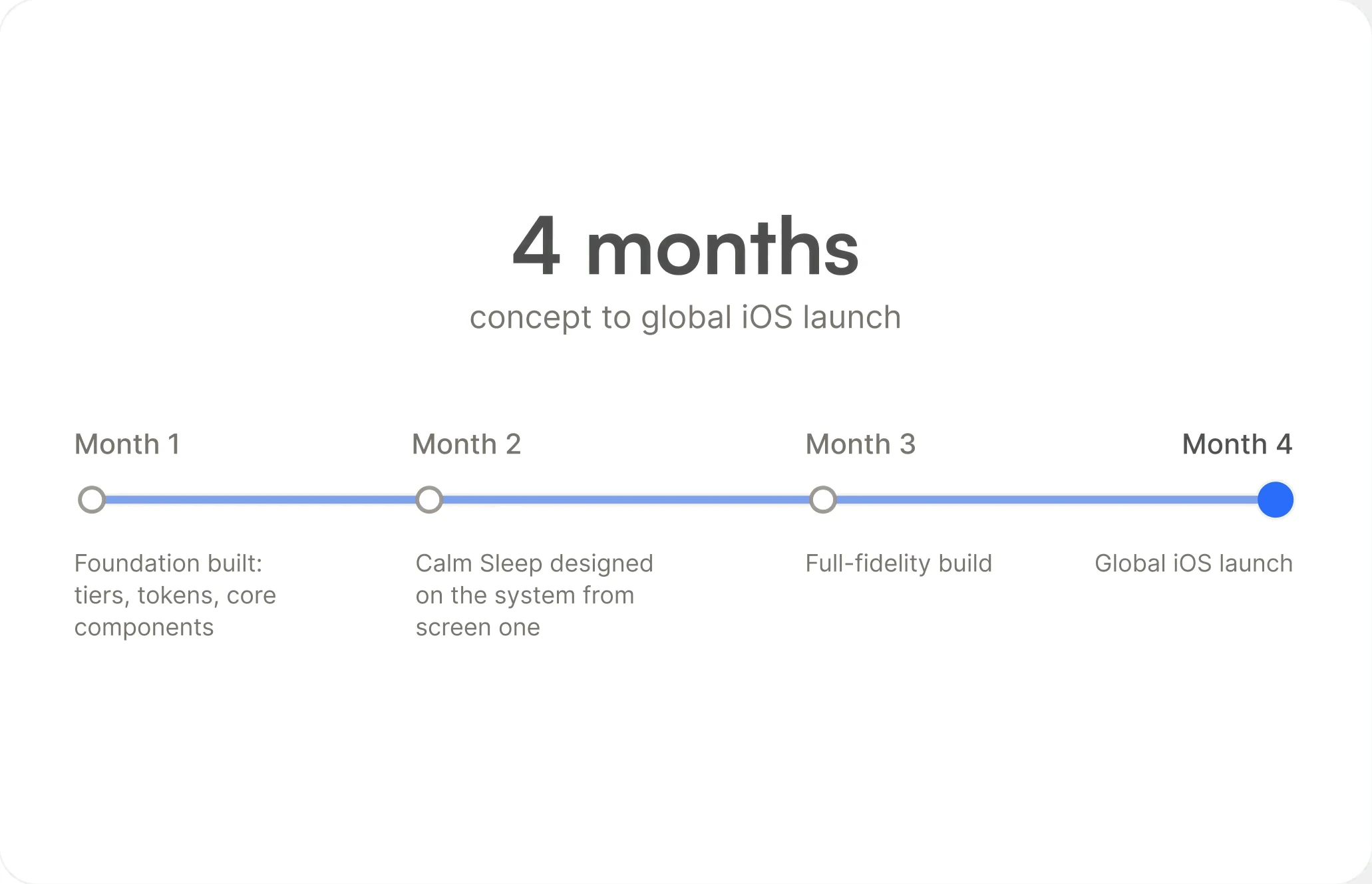
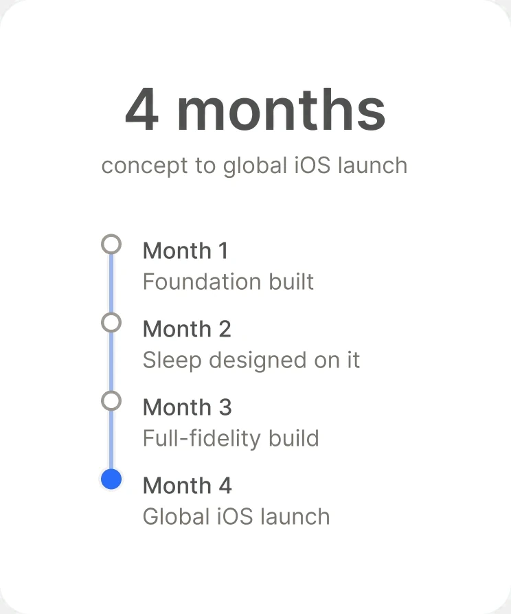
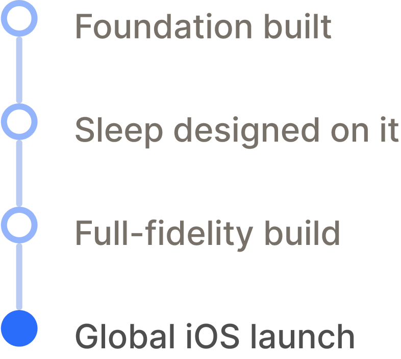
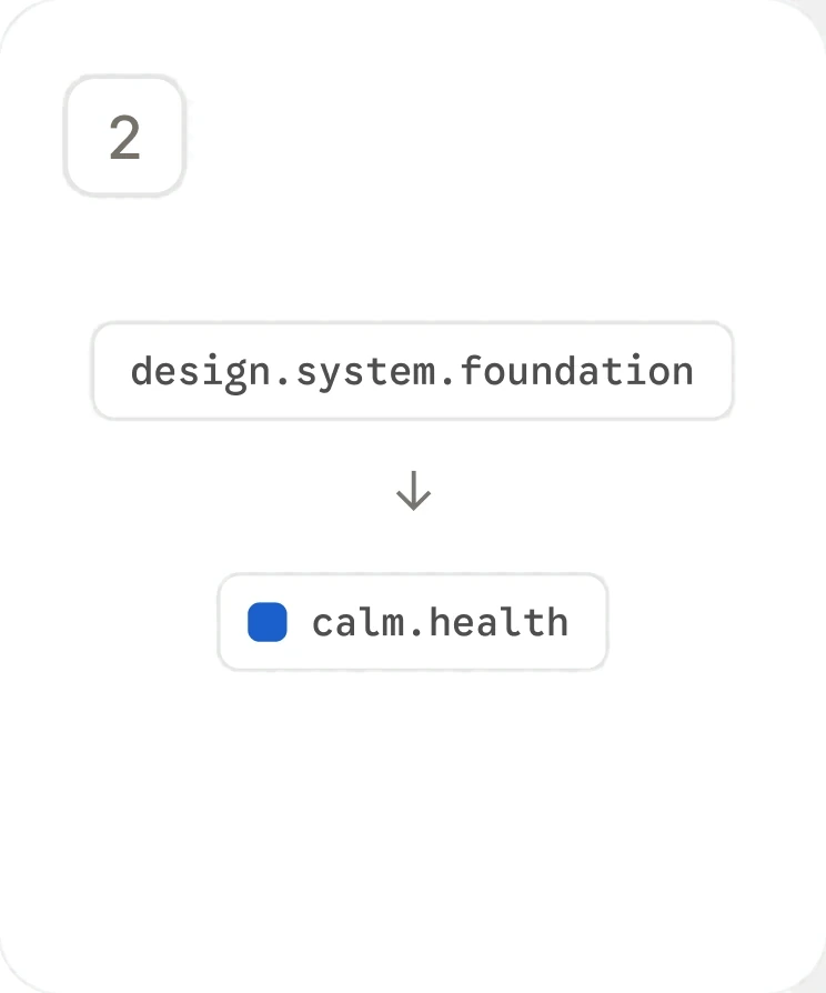
Calm’s first new consumer app in 12 years shipped on the foundation in 4 months, Android followed from the same system, and Calm Health adopted it without a mandate.
4 months
Concept to global iOS launch
2 product lines
DTC (Calm Sleep) and Enterprise (Calm Health)
4 vertical themes
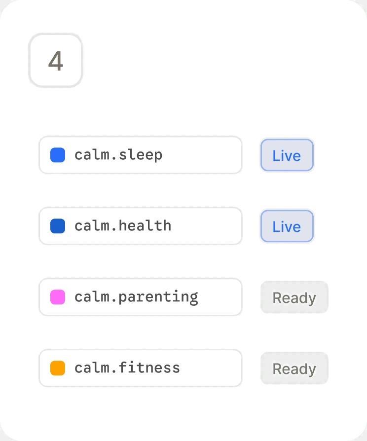
2 live, 2 ready to launch
Three tiers, not two
Primitives, Semantics, and Themes. Two tiers is the common setup and is faster to author. The extra indirection cost authoring time up front and bought the ability to re-theme a whole vertical, including light and dark, without touching a component. Interaction states work the same way: a component picks a role, and the system resolves default, hover, active, and disabled. I used AI heavily to work out the token structure and naming conventions, then pressure-tested every tier boundary by hand.
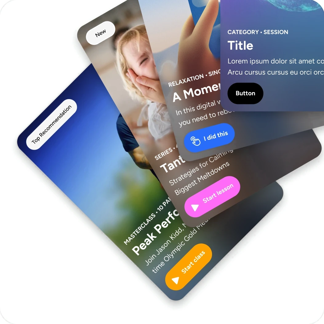
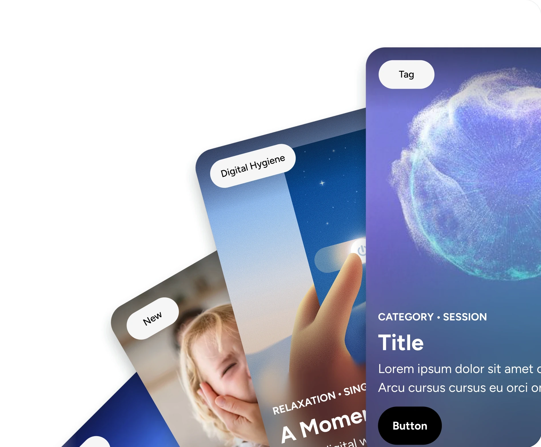
Every surface resolves through a semantic token. The theme decides the value.
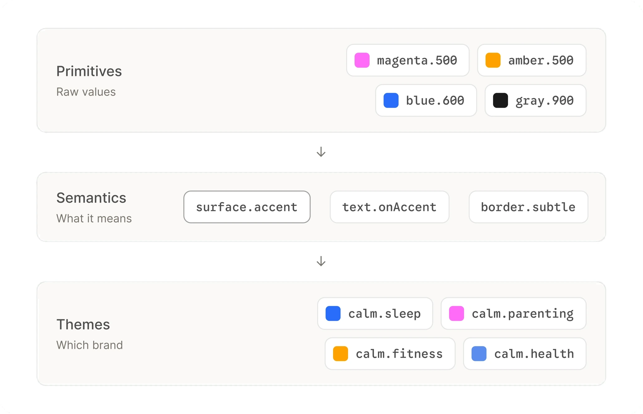
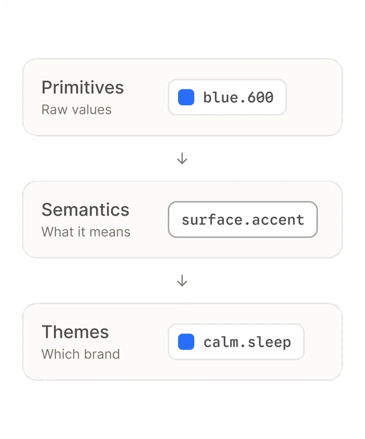
Where the brand lives
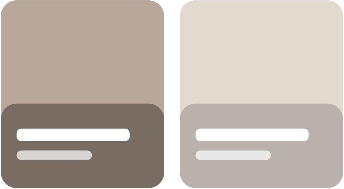
Primitives hold raw values, semantics say what something means, and themes decide which brand answers. Only the theme tier knows it's Sleep or Health. One semantic token, four answers. Only the Theme tier knows what brand it is.
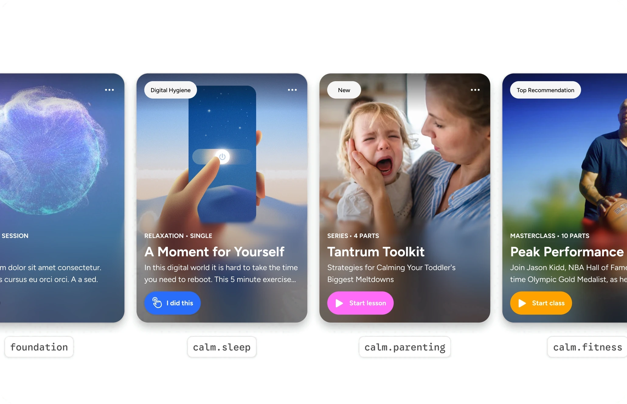
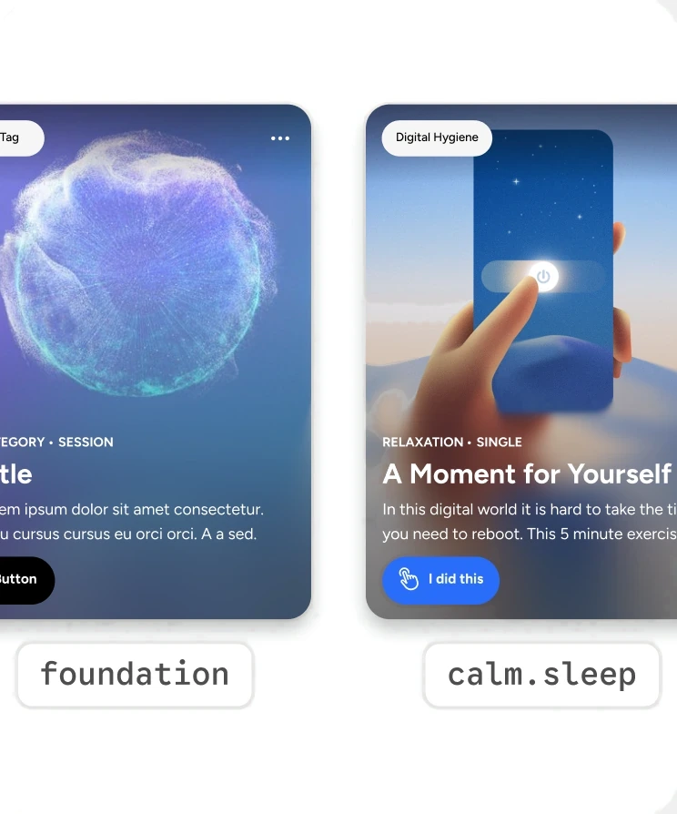
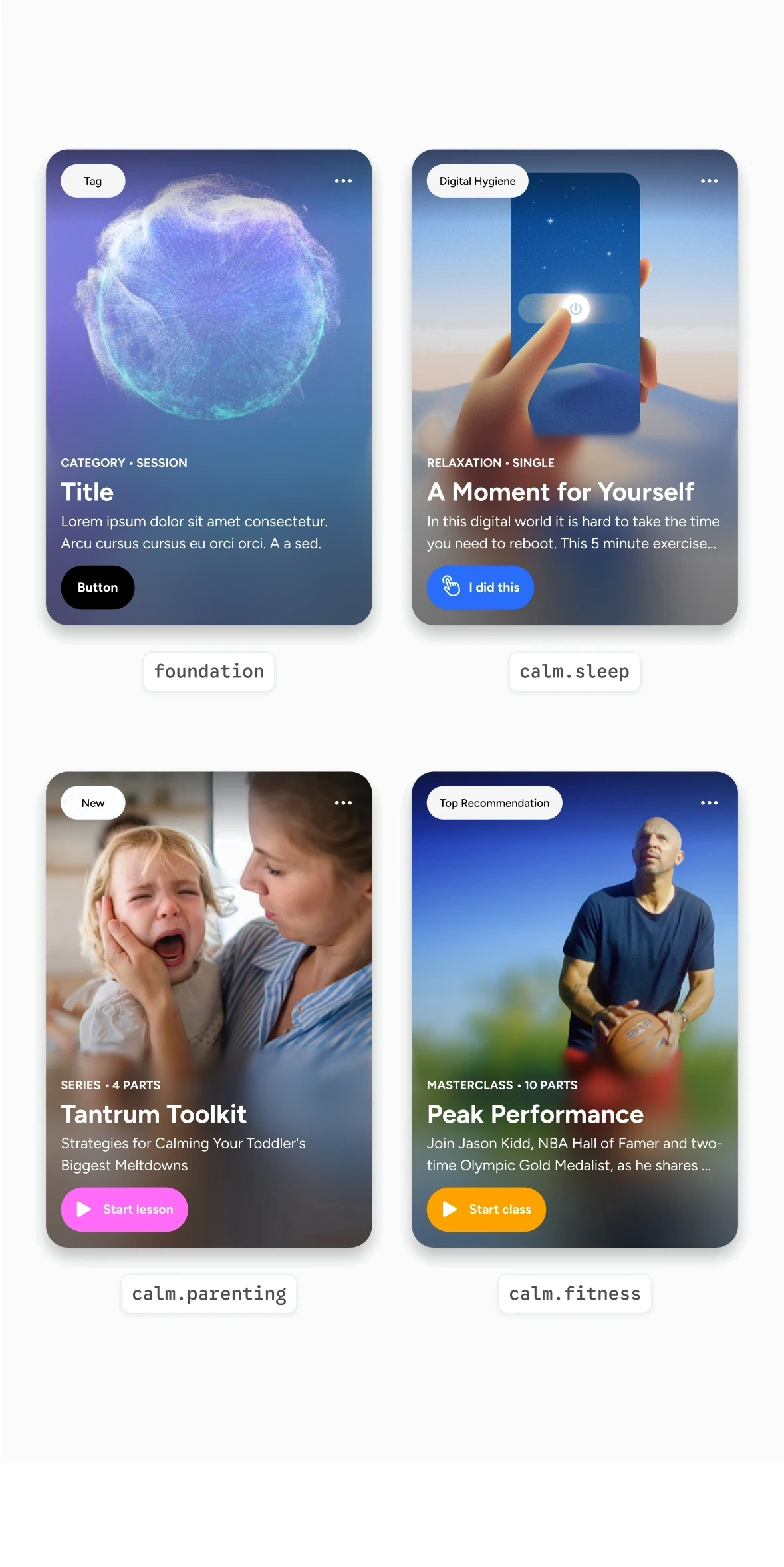
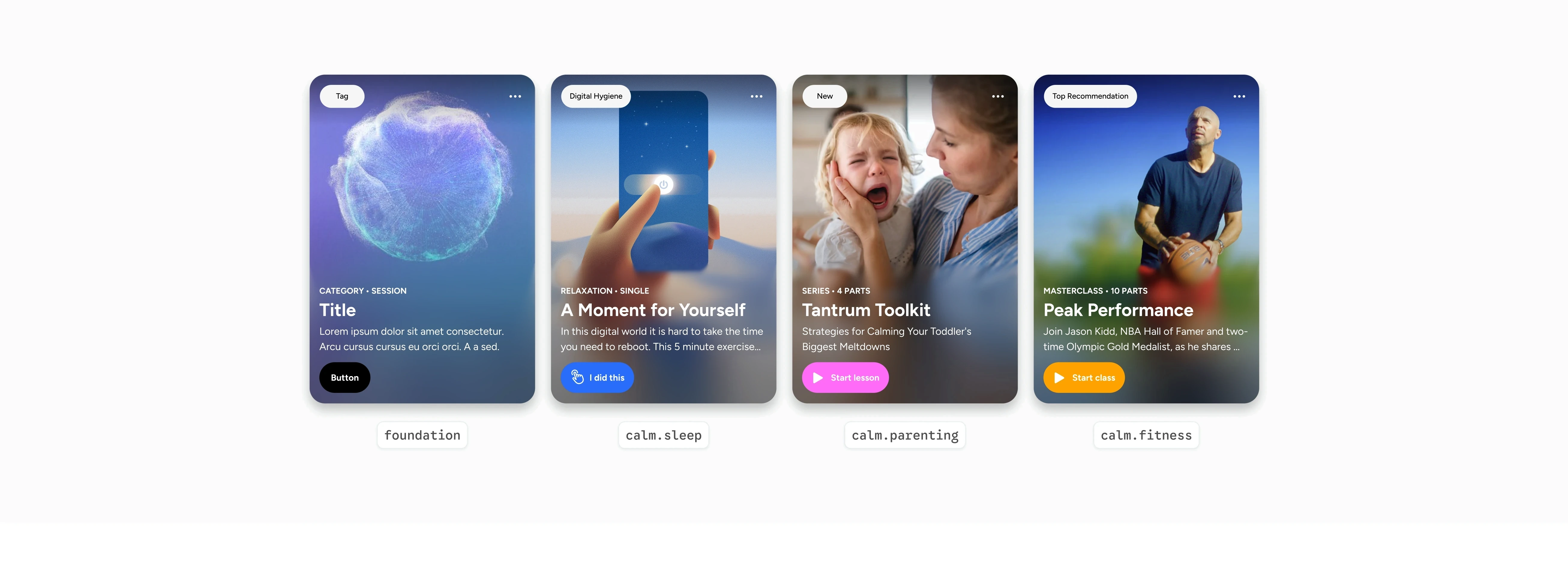
One token, three brands
Nothing inside the component changes between verticals. The theme tier supplies the value, so a new brand is a set of values rather than a new library.
Product-specific components, system values
Sleep needed components the foundation didn't have. They were built in Sleep's own library, but every value in them resolves from the foundation's tokens, so they inherit theming and both modes without being part of the shared library.
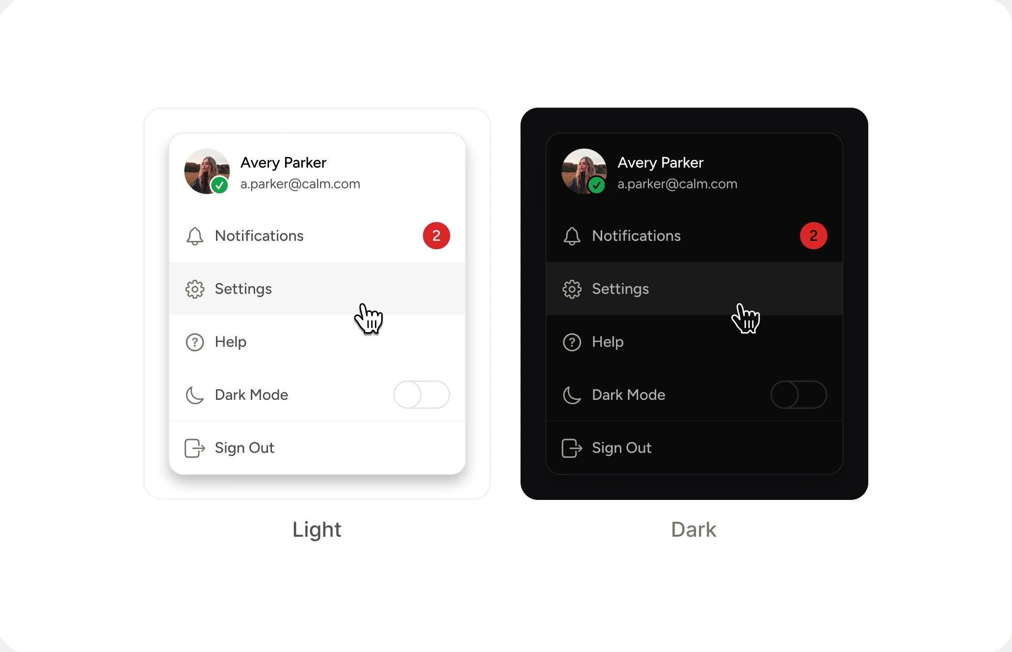
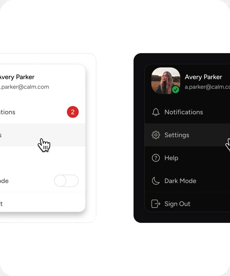
Light and dark come free
Modes resolve at the semantic tier, so a new vertical inherits a complete light and dark palette on day one instead of building a second one. The same component and the same semantic tokens. Only the mode changes the value.
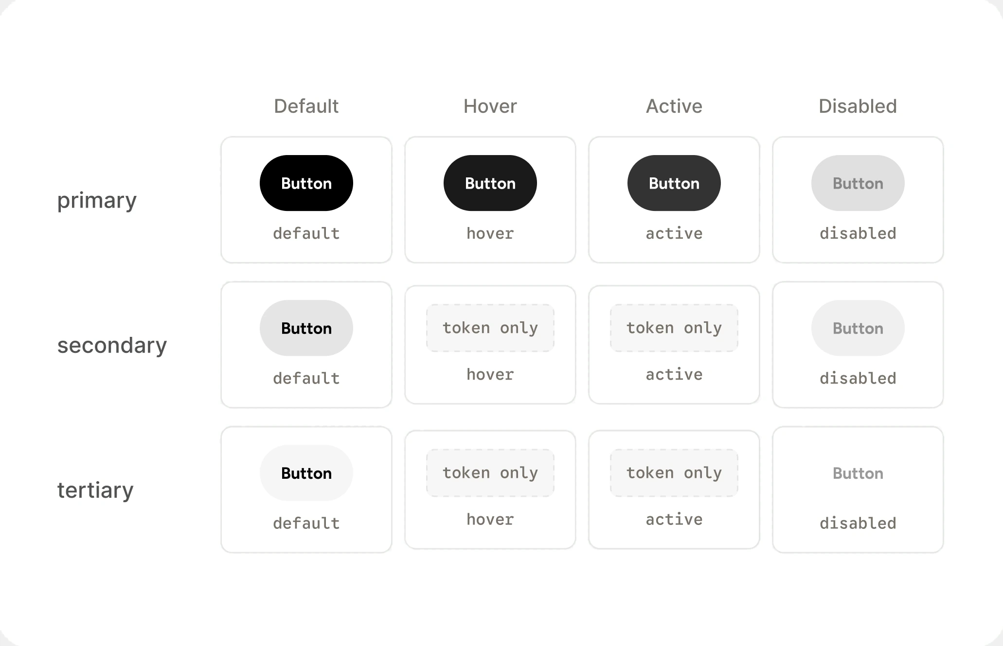
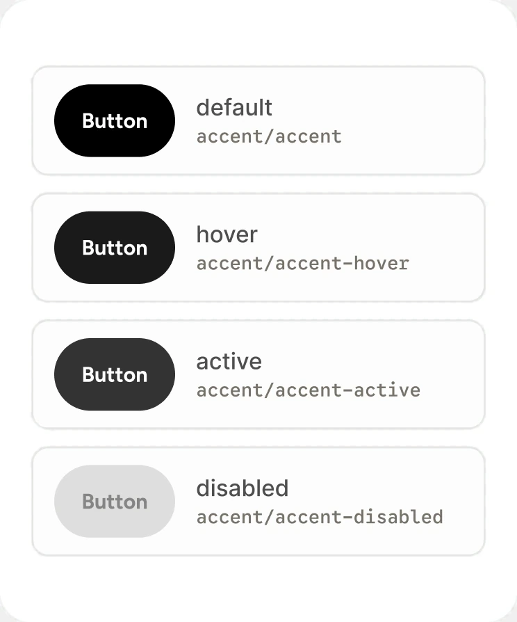
States are tokens, not variants
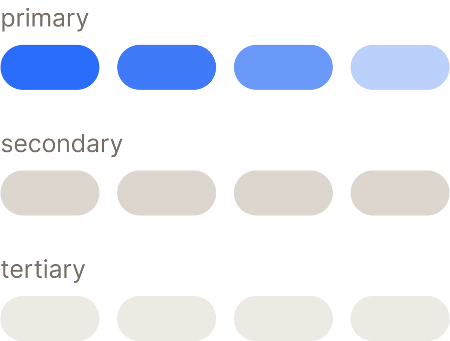
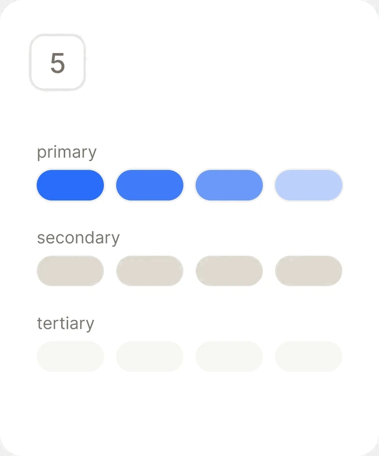
A component picks a role, and the system resolves default, hover, active, and disabled. Twelve states authored once, instead of rebuilt in every component.
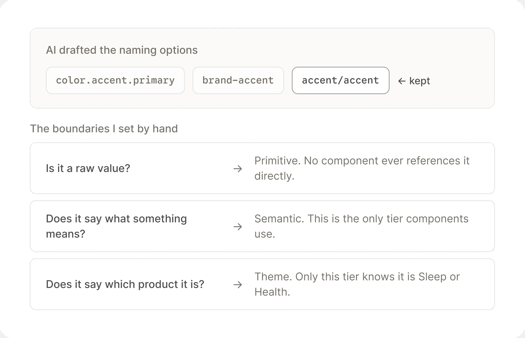
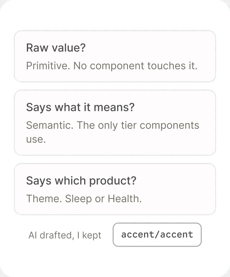
AI drafted the structure. I set the boundaries.
I used AI heavily to work out token structure and naming conventions, then pressure-tested every tier boundary by hand to decide what belonged where.
Built the foundation into the app I owned
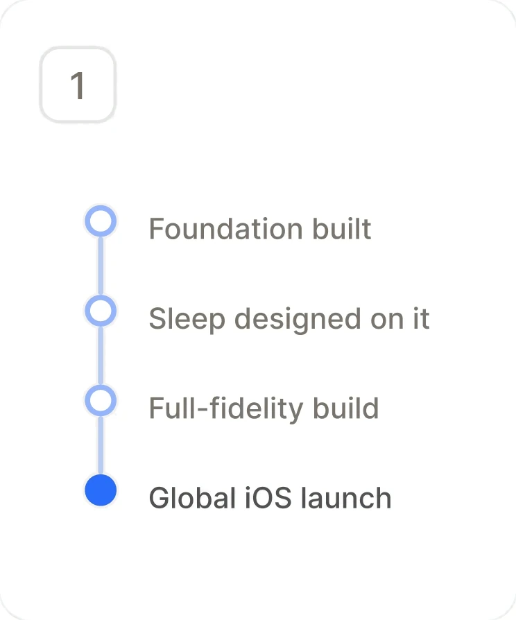
Without a mandate, the system needed a product to ship inside. Calm Sleep had no legacy to protect and I was designing it from zero, so I built it on the new foundation from the first screen, to give the system a real chance to show what it could do. It didn't slow the launch. It sped me up. Sleep became the proof: a full-fidelity app running entirely on the system, pre-MVP through post-MVP, shipped to global iOS in 4 months.
Calm Sleep, built entirely on the foundation, in dark mode. (pre mvp)
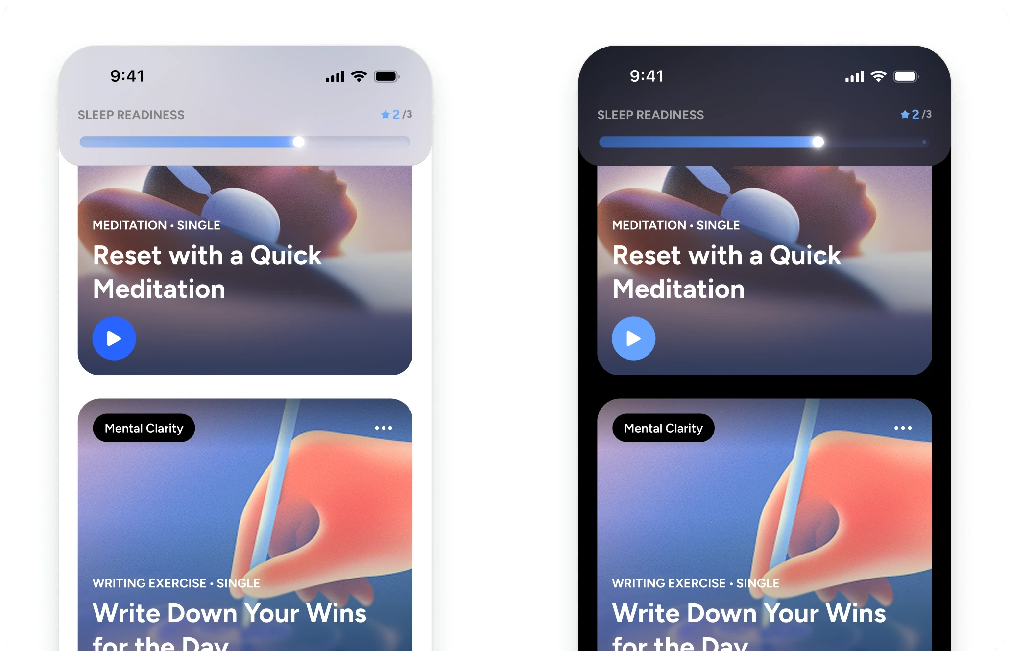
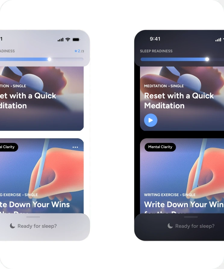
Sleep, from the first screen
Sleep had no legacy to protect and I was designing it from zero, so it ran on the new foundation from the very first screen rather than being retrofitted later.
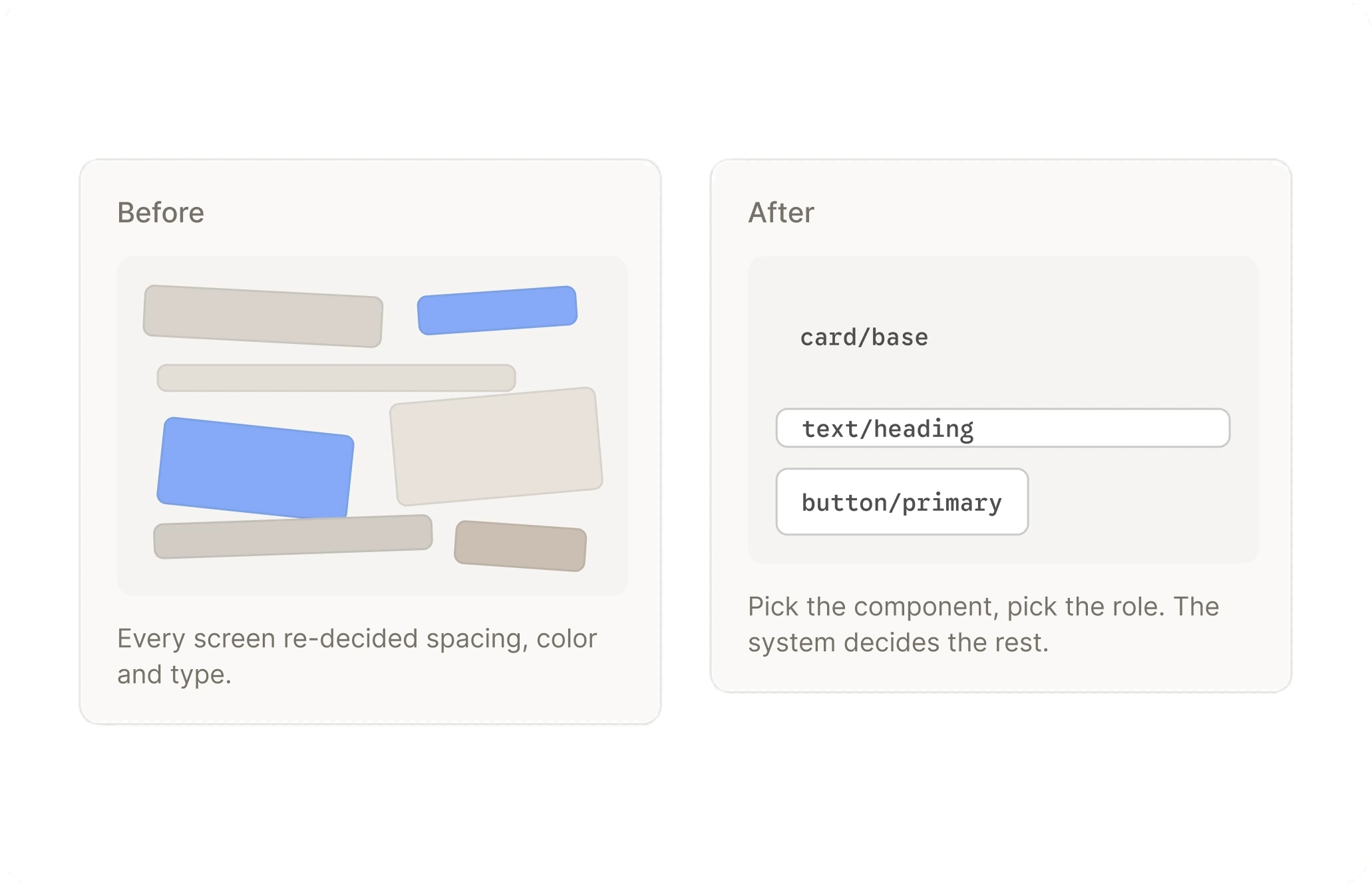
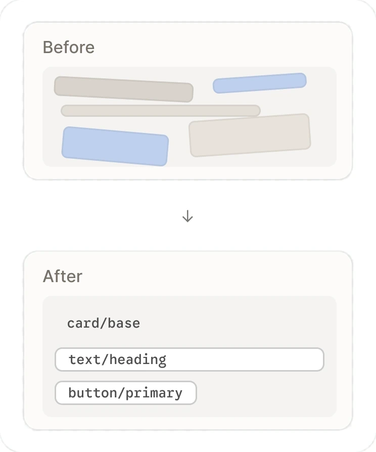
It sped me up
The foundation didn't slow the launch. Designing from a system meant fewer decisions per screen and no rebuilding patterns that already existed. Same screen, fewer decisions. The foundation removed the ones that were never design.
Four months, concept to global iOS
Calm’s first new consumer app in 12 years shipped to global iOS in four months, entirely on the foundation. Android followed from the same foundation, with no separate design library.
Dark mode is a value swap, not a second design
The same components and the same semantic tokens resolve to different values in dark mode. Nothing is duplicated, so a new vertical inherits both modes on day one.
Full fidelity, not a stripped-down version
Depth, elevation, and type all resolve from the system, so Sleep shipped at full fidelity instead of a stripped-down version of the design.
Made the image the card
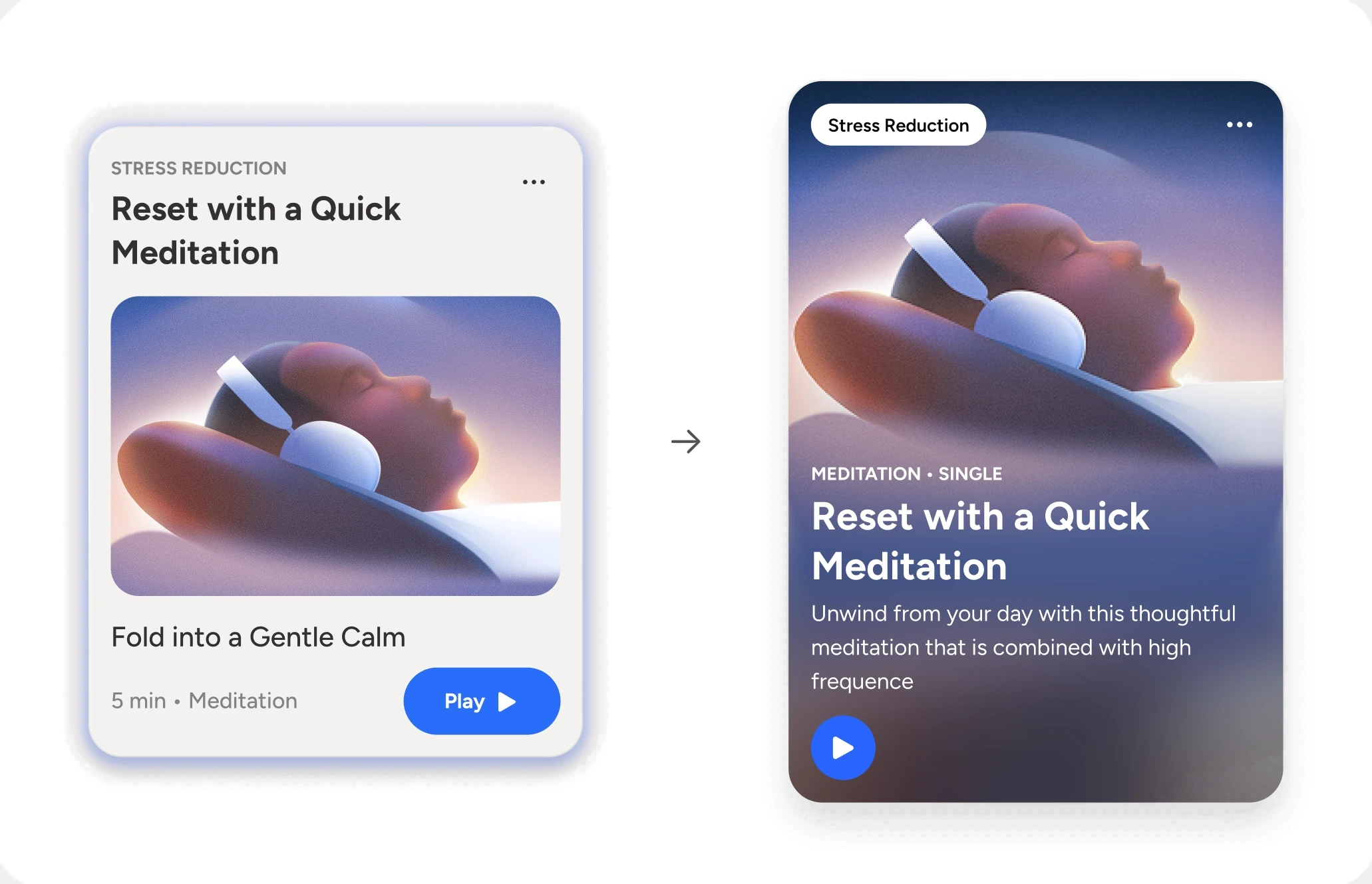
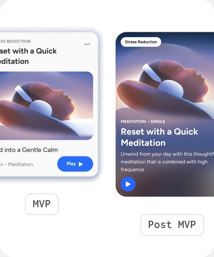
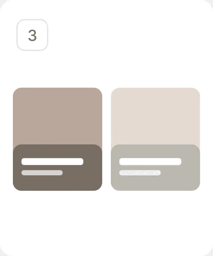
Contrast couldn't be guaranteed over artwork that changes every session, so the MVP kept text off the image. I pushed for full-bleed cards, and engineering built a scrim that adapts to the image at runtime. It went back into the foundation.
Proving the foundation could absorb Classic
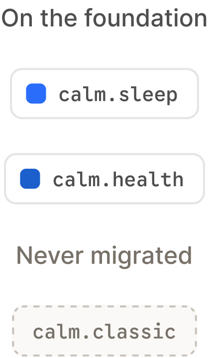
I themed Calm Classic through aliased tokens to show that 12 years of legacy UI could resolve from the same foundation, in dark mode included. It was a proof, not a migration. DTC never prioritized moving Classic over.
Earned adoption instead of mandating it
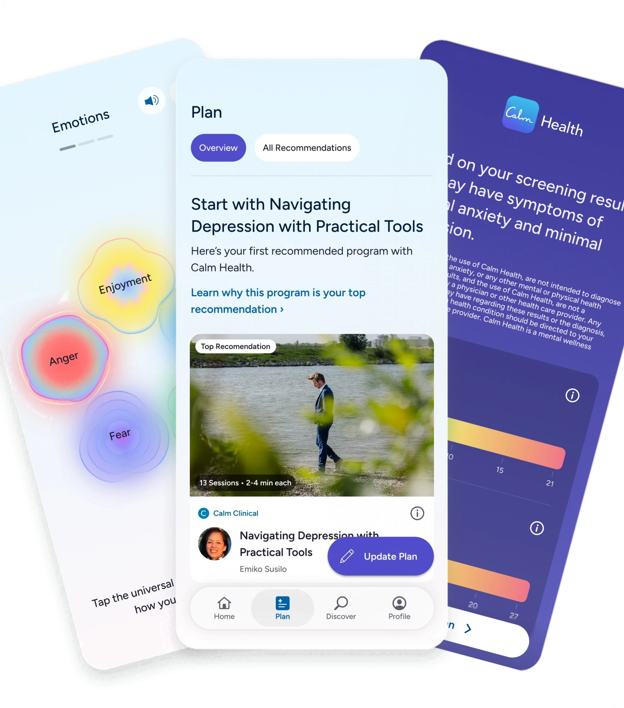
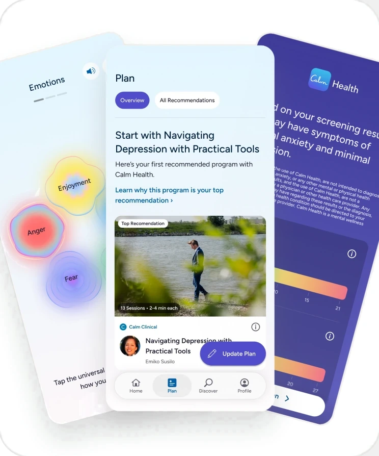
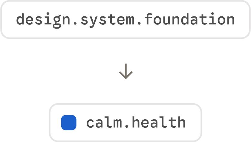
I took the system to other teams directly. Calm Health, on the Enterprise side, adopted it and kept building on it. Their team met with me weekly to learn the system and push it further. In those sessions I showed their team how to use AI to build token structures and naming the same way, and how the approach extends into the AI-assisted build workflow I use on my own iOS app.
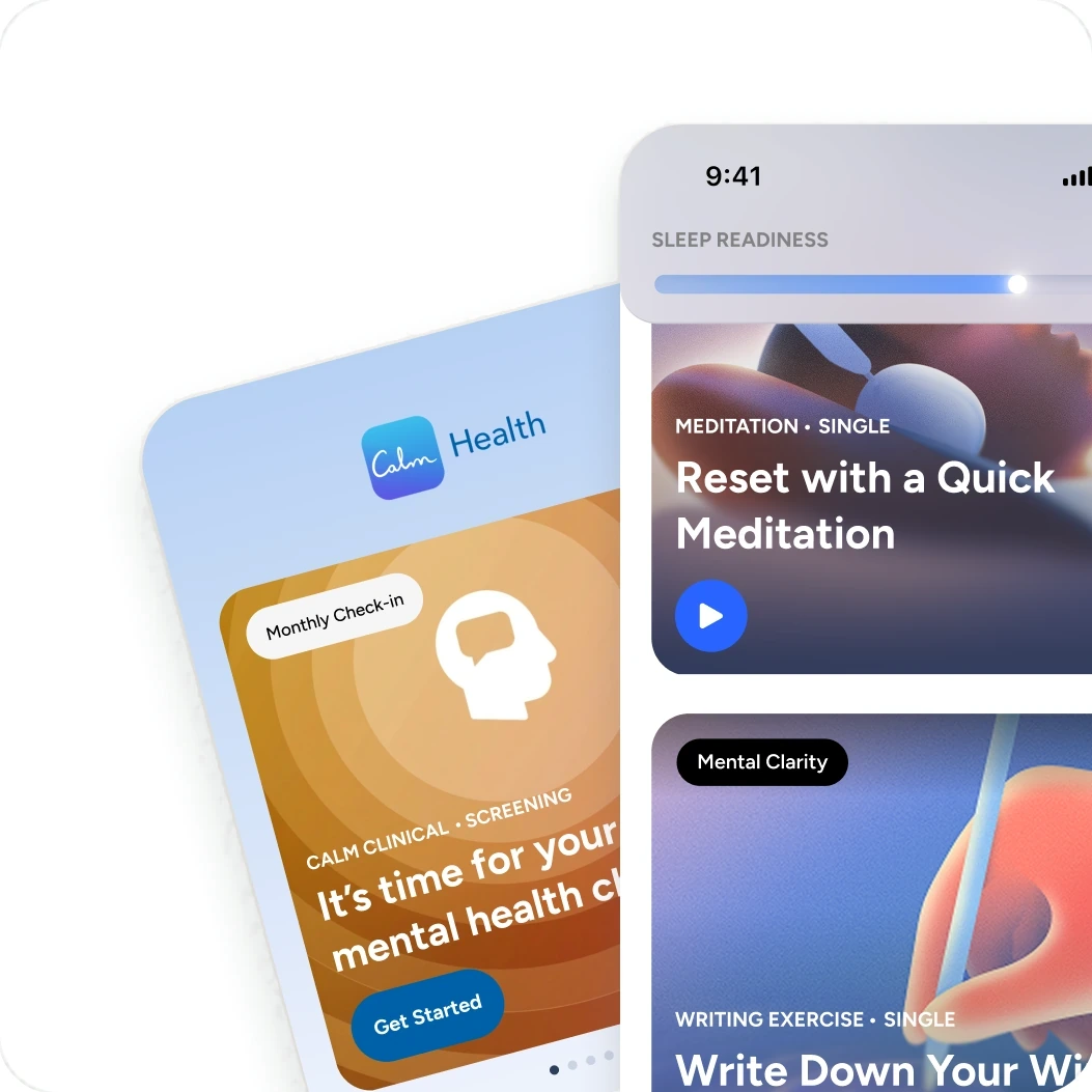
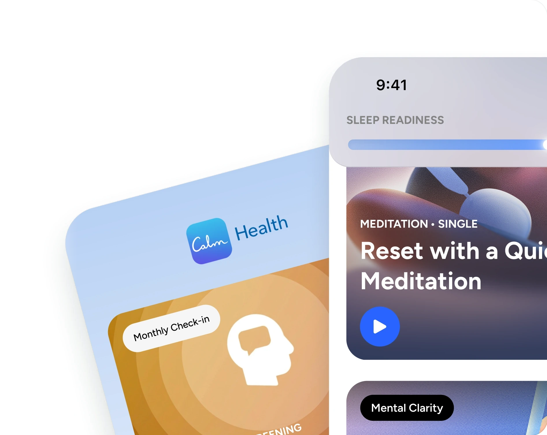
Two shipped product lines on one foundation. One adopted by choice, and two more ready when the business is.
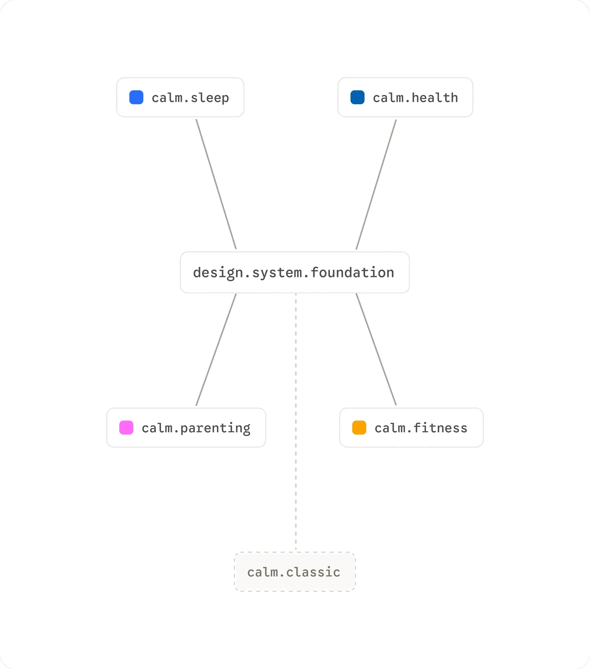
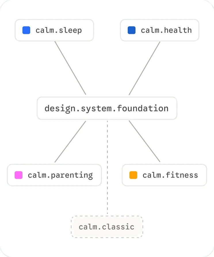
Who adopted it
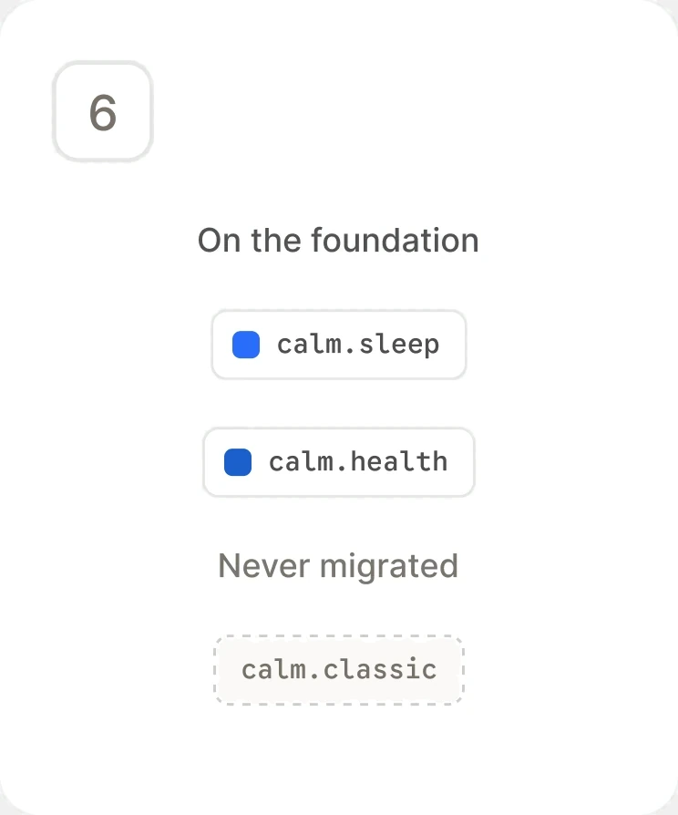
Two product lines run on one foundation. Calm Health chose it without a mandate, and two more vertical themes are ready when the business is. Classic was themed as proof, never migrated.
Weekly, for months
Health's team met with me weekly for 3 to 4 months to learn the system and push it further. The sessions kept running because they were getting something out of them.
Handed over the structure, not just the library
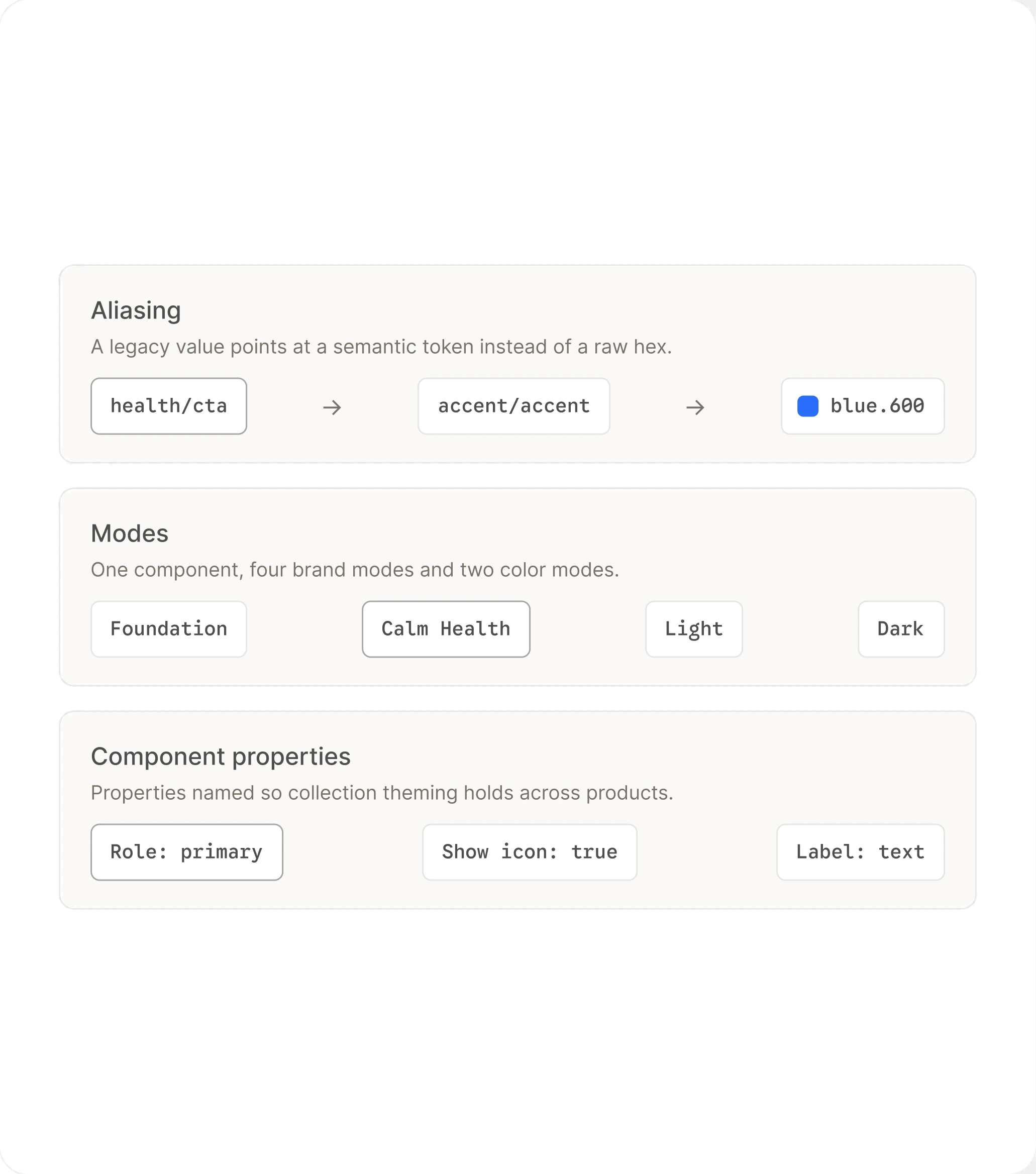
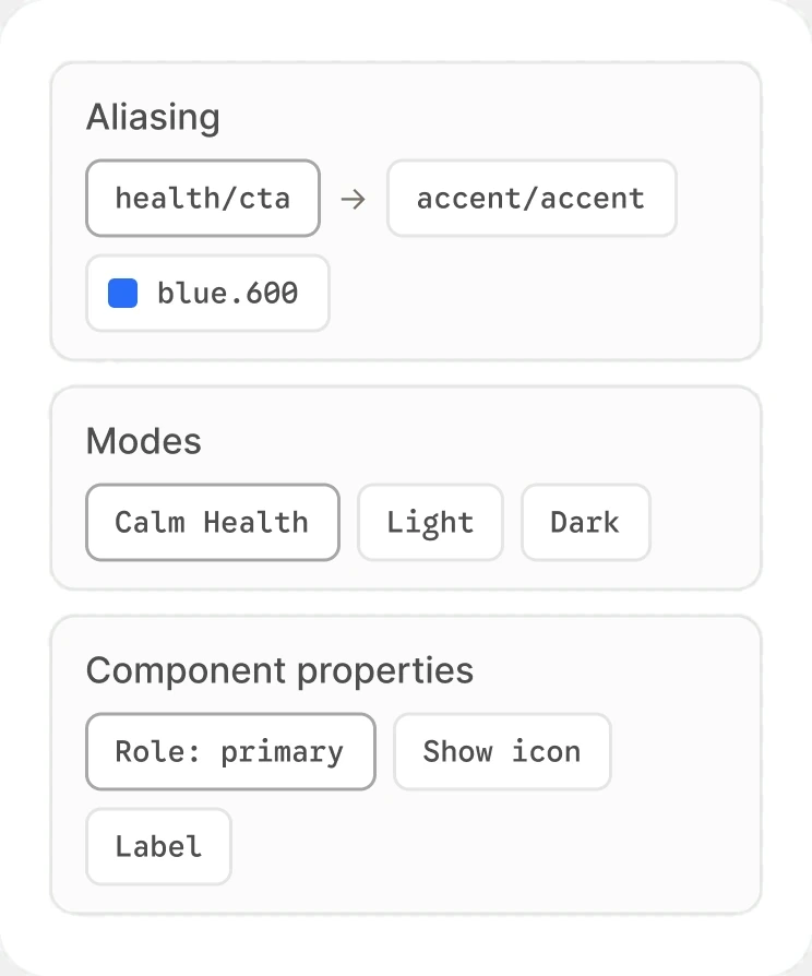
I built Health's token structure with them and taught the mechanics: how aliasing works, how modes resolve against a component, and how to build component properties so collection theming actually holds. They left able to extend the system without me.
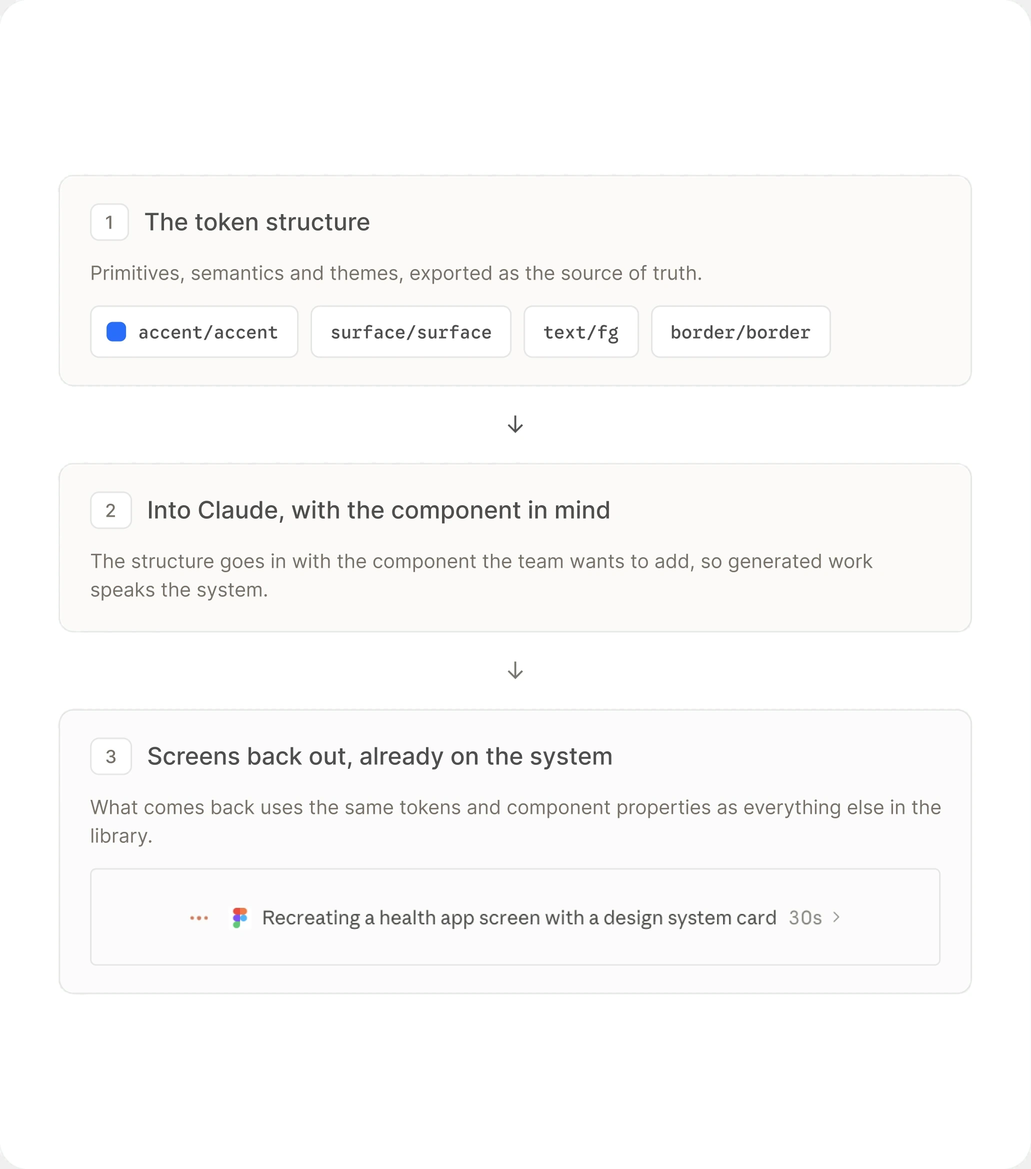
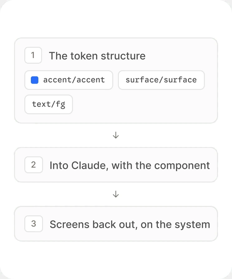
Tokens into Claude, screens back out
I showed Health's team how to feed the token structure into Claude and generate screens for the components they wanted to add, so new work came back already speaking the system's language.
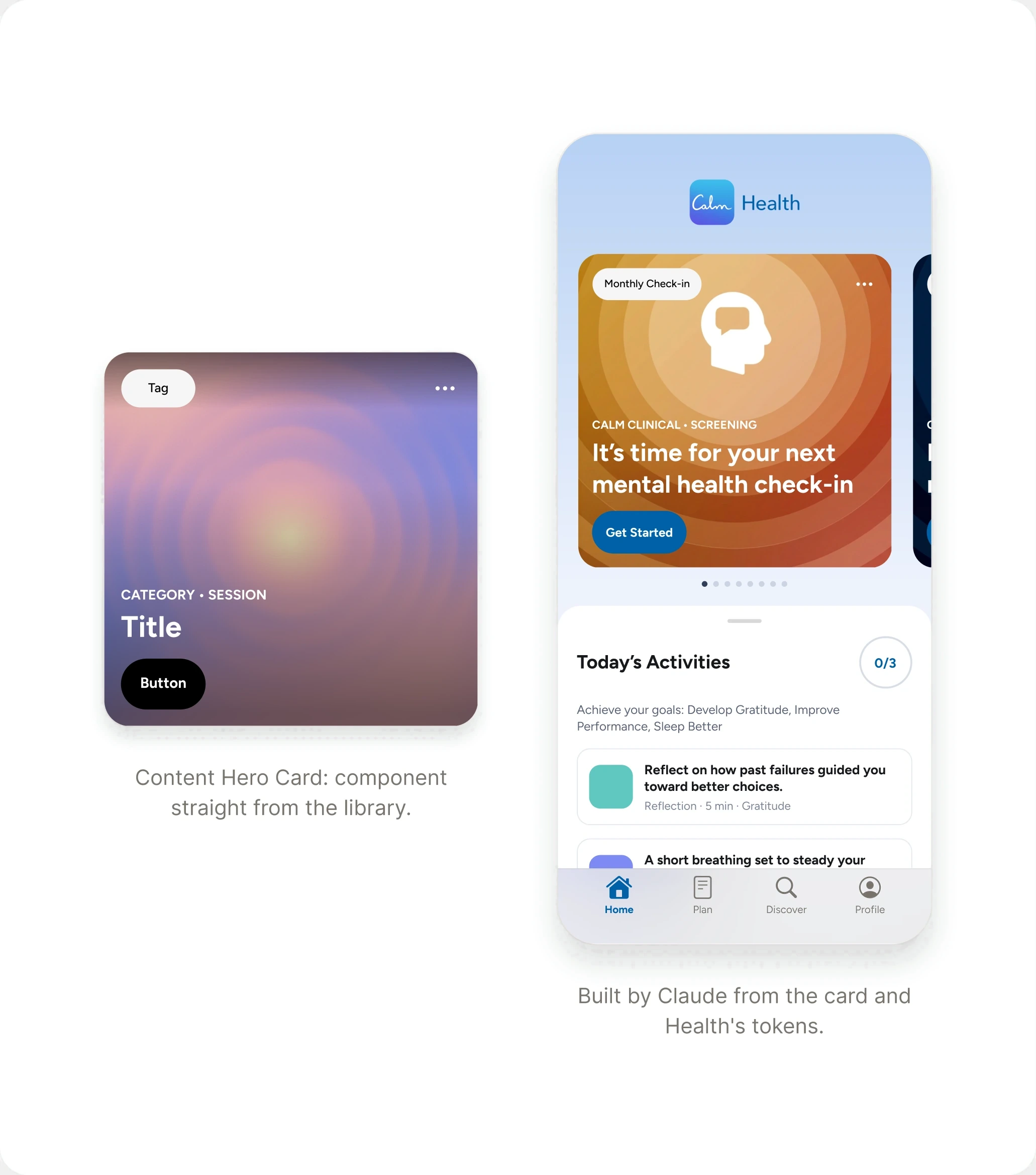
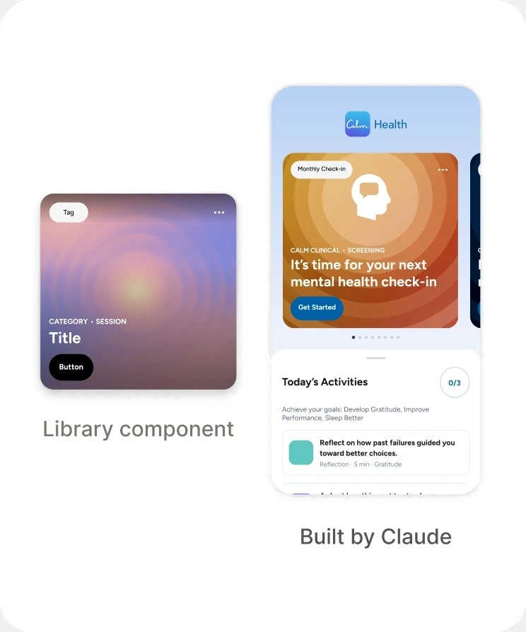
One component, a themed screen
The same Content Hero Card, with Health's theme applied through collection theming, rendered into a full screen. Nothing was redrawn: the card, the tab bar, and the tokens all came from the foundation.
What it looked like from their side
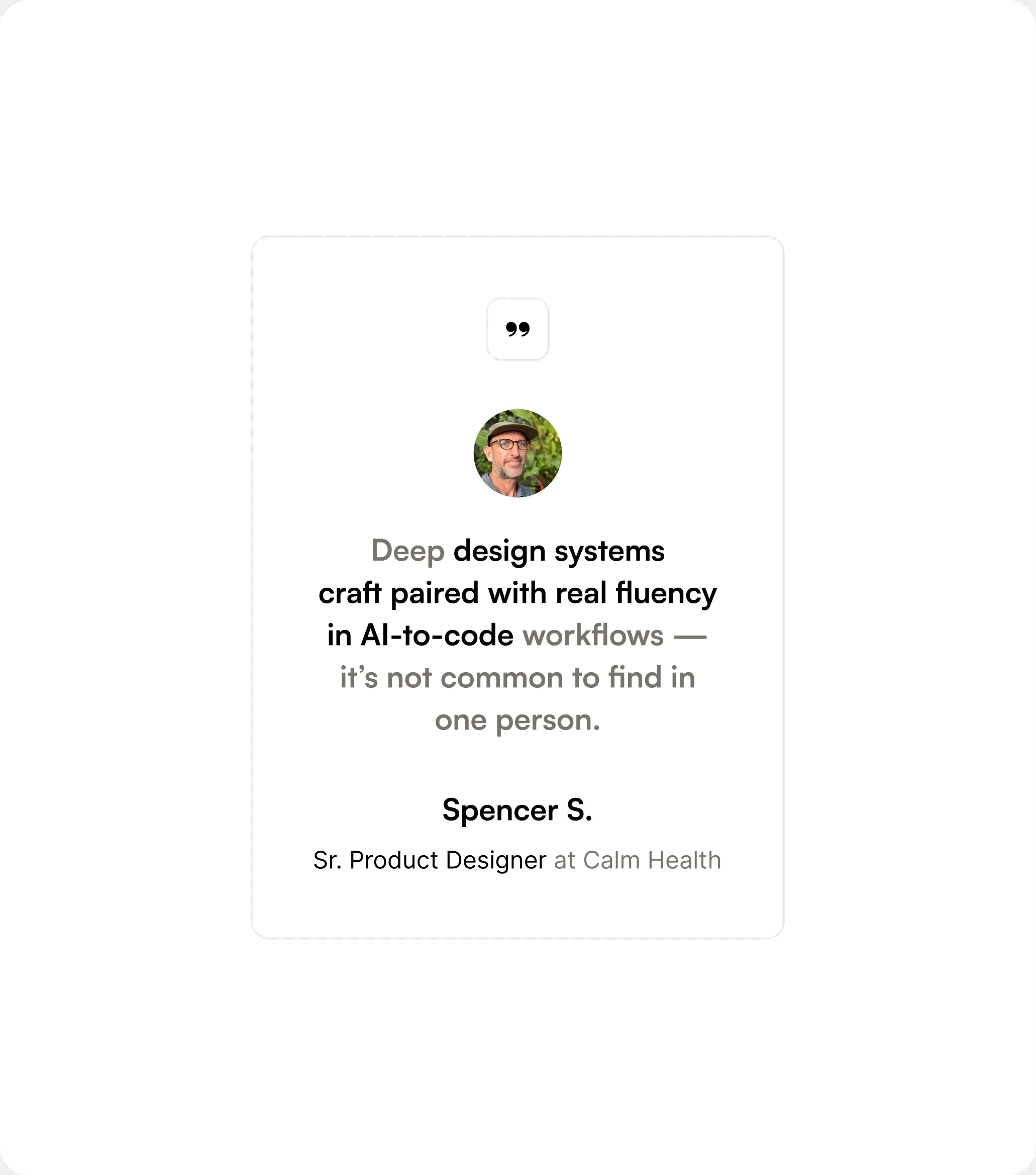
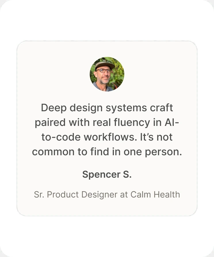
“Deep design systems craft paired with real fluency in AI-to-code workflows. It's not common to find in one person.” Spencer S., Sr. Product Designer, Calm Health.
“One of the most thorough systems designers I’ve ever worked with. He refreshed our outdated design system, brought it to parity with industry standards, and built relationships with engineering so handoffs were smoother and production matched design.”
What I achieved
Results
4 Months to Launch
Calm Sleep, Calm's first new consumer app in 12 years, went from concept to global iOS in 4 months, built entirely on the foundation. Covered by Fast Company and TechCrunch.
Adopted Without a Mandate
Calm Health, on the Enterprise side, built on the foundation and met with me weekly for 3 to 4 months to extend it.
Adaptive Scrims, System-Wide
A contrast-aware scrim built for Sleep's cards went back into the foundation, so every product on the system inherited it.
Four Verticals, One Token Set
Sleep and Health ship on it today. Parenting and Fitness themes are built from the same semantic tokens and ready to launch.

States Authored Once
3 roles × 4 states: 12 interaction states resolved by the system instead of rebuilt in every component.
Calm Classic Never Migrated
DTC kept its focus on current shipping speed, and the legacy migration was never prioritized.
4 Months to Launch
Calm Sleep, Calm's first new consumer app in 12 years, went from concept to global iOS in 4 months, built entirely on the foundation. Covered by Fast Company and TechCrunch.
Adopted Without a Mandate
Calm Health, on the Enterprise side, built on the foundation and met with me weekly for 3 to 4 months to extend it.
Adaptive Scrims, System-Wide
A contrast-aware scrim built for Sleep's cards went back into the foundation, so every product on the system inherited it.
Four Verticals, One Token Set
Sleep and Health ship on it today. Parenting and Fitness themes are built from the same semantic tokens and ready to launch.
States Authored Once
3 roles × 4 states: 12 interaction states resolved by the system instead of rebuilt in every component.
Calm Classic Never Migrated
DTC kept its focus on current shipping speed, and the legacy migration was never prioritized.
Two product lines on one foundation, and one team that chose it.
Reflection
What I’d change
Strategically
DTC saw the system as a distraction from shipping speed. Calm Sleep was proof of the opposite: the foundation sped up the build rather than slowing it. I should have made that case in DTC's terms, with the Sleep timeline as the evidence.
Technically
Disabled states resolve as a primitive at 40% opacity instead of carrying their own value. That halved the accent group and reads correctly on every flat surface we shipped. It also means a disabled control inside a dimmed container lands at 16%, and nothing in the system prevents it. Next time I'd spend the tokens.
Get in touch
Open to new work, and always up for a conversation about product, design systems, or shipping design straight through to code.
Site designed and built by Eric Fillingame